

Designing a responsive, Retina-friendly site. It's hard to believe I have been blogging for more than 7 years.
Michael Wozniak, my hallmate during my freshman year at Georgia Tech, had gotten me into Gentoo Linux the year prior and told me he was playing with WordPress 1.2. Compared to the MediaWiki site I was running at the time that piqued my curiosity and I began blogging on WordPress on my G4 Mac Mini that summer. I immediately fell in love with it and began learning CSS and PHP to tweak the theme1. Eventually I found my thing – writing technical guides, product reviews and tech editorials.
Groundwork CSS ♥ A Responsive HTML5, CSS & Javascript Framework. 9 Amazing CSS Rules that Save Designers and Developers. A web designer certainly has to memorize a lot of stuff related to his work.
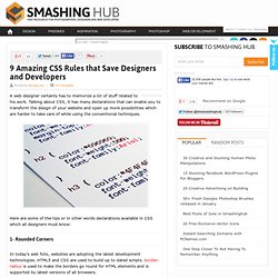
Talking about CSS, it has many declarations that can enable you to transform the design of your website and open up more possibilities which are harder to take care of while using the conventional techniques. Here are some of the tips or in other words declarations available in CSS which all designers must know: 1- Rounded Corners In today’s web folio, websites are adopting the latest development technologies. HTML5 and CSS are used to build up to dated scripts. border-radius is used to make the borders go round for HTML elements and is supported by latest versions of all browsers. Advertisement We can also use the combined version or shorthand of above code like below. To avoid browser compatibility issue, make sure to declare them separately. PXtoEM.com: PX to EM conversion made simple. Ultimate Responsive Web Design ToolKit.
When it comes to web designing industry, technology is evolving a lot with the passage of time and things are still growing with every passing day.

Because of this constant evolvement, nothing can be considered as a sure shot idea to have a nice, responsive web design. This article will help designers in building a strong toolkit to make a responsive website. Getting Started In order to have a strong responsive website, there is a lot that designers have to do. However, having a strong responsive web design toolkit is indeed very important as it can make a huge difference to your website, off course in an utterly positive manner. Important Elements in making a Website Responsive As mentioned earlier, this field is very vast hence, important elements can be many. Understanding Responsive Web Design: Clear Concepts and Practical ApplicationsBuildMobile. Some readers may wonder, not unreasonably, why there’s been such a rapidly growing interest in “Responsive Web Design” (RWD) and why it has become more and more essential for developers to achieve a deep and detailed knowledge of this nascent technique.

This term is often brought up as an anecdotal buzzword uttered to convey an understanding of cutting-edge mobile technology. We’re not going to talk abstractly or philosophically about responsive web design; we’re going to define it clearly and demonstrate some real-world technical applications of the technique. The advantages of responsive web design becomes very clear if you take a moment to examine and understand the realities of modern web and mobile technologies, and implementing a responsive design is easier than you might think.
How we experience the Internet is changing very quickly, and the impetus for this change is the advent of powerful and diverse mobile devices. What size is my viewport? – Tyson Matanich. Using JavaScript to get the actual viewport width Responsive Web design is making a positive and lasting impact to the web as we know it.

Along with most change comes new scenarios. I think it's safe to say that supporting a flexible viewport is at the top of the list. While CSS if often enough, sometimes JavaScript is required. Currently, there are several outdated and incorrect ways to get the viewport size using JavaScript. Browser differences Cross-browser compatibility still remains an issue with many features, CSS viewport size is no exception. The iOS Design Cheat Sheet Volume 2 - Ivo Mynttinen / User Interface Designer. Responsive Times Call For Responsive Measures.
You like apples? It took no real science to convince us that Responsive websites would outperform their non-mobile-optimized brethren.
We’d made that leap of faith (more of a small step, really) long ago. Without objective data, though, it’s hard to separate the facts from the closely held beliefs. We should start by noting that optimizing sites for mobile screens takes time. Responsive Tables - The Easy Designs Blog. A few smart folks have already put together their thoughts on responsive tables and, while I think the proposed methods are pretty good, I think there might be room for improvement.
As such, I’ve been tinkering for a while and came up with the following strategy when it comes to tables. Step 1: Use data-* attributes to hold information about the column header(s) associated with the markup: You are being redirected. Step 2: When the screen is below a certain threshold, set the table elements to display: block (thereby linearizing the table), hide the thead where assistive tech won’t see it, and use generated content to expose the data-* attributes.
Here’s a snippet of SASS & Compass that does that: Where to Start. When making the transition to building responsive websites, the hardest part can be getting started.
I get my fair share of questions about how to choose a direction and chart out the first few steps from industry comrades and potential clients. It can seem daunting, so I thought I’d attempt to sum up a few of my own current thoughts on the matter. Consider RWD From the Beginning. I believe this starts with a shift in perception. Whether massive or minute, this shift usually involves letting go of a lot of assumptions that center around desktop-centric browsing. Responsive Web Design Prototyping Tool - UXPin newest solutionUXPin. Responsive Web Design becomes a huge trend in the design industry, and no without a reason.

According to Google Mobile Research, “Our Mobile Planet”, only about 15% of the Internet users are completely satisfied with the user experience of the mobile web, while the share of the mobile in the Internet traffic grew at the astonishing rate of 163% since 2010. We all live at the verge of the mobile era and it’s hard not to be excited. All the new devices and possibilities… it’s just overwhelming. However with all this excitement comes the great responsibility. We need to get the web ready for people with their smartphones, tablets, ebook readers, iWatches and smartfridges. Top Drawer - A smooth dropdown menu for responsive web design. Tap the menu icon in the top right.

The click event will assign the class of active to the drawer container which alters the translate value to bring it into view. Modernizr will detect whether the user's device is capable of CSS transforms, if it isn't we simply show and hide the menu after the button is pressed - no point in animating if it isn't going to work smoothly. Awesome Responsive Type: Adjust Font Size via Face Detection. 11 February '13, 08:11pm Follow Responsive design has recently become a buzzword, and for good reason: it captures the idea of displaying your content beautifully on each and every device.
Responsive typography has also received attention, and various techniques have emerged to encourage type legibility across devices: like displaying different font weights to compensate for Retina displays. Now, an experiment by web designer Marko Dugonjić has taken the concept of responsive typography to a new level: using face detection, Dugonjić calculates the proximity a user is from his or her screen, and then adjusts font size accordingly. As my mug approaches the screen, text gets smaller. Of course, this isn’t an exact science; there are varying opinions on how large body type should be for proper legibility, and the eyes of the user plays an important role (that’s difficult to calculate). ➤ Responsive Typography (found via Mike Rundle) Image credit: Thinkstock.
Beginner’s Guide to Responsive Web Design. Whether you’re a beginner or a seasoned web professional, creating responsive designs can be confusing at first, mostly because of the radical change in thinking that’s required. As time goes on, responsive web design is drifting away from the pool of passing fads and rapidly entering the realm of standard practice. In fact, the magnitude of this paradigm shift feels as fundamental as the transition from table based layouts to CSS.
Simply put, this is a very different way of designing websites and it represents the future. Useful Responsive Web Design Tools - The DesignPin Blog. Designing In The Transition To A Multi-Device World. Advertisement When I think about where we are with the Web in comparison to other media in history, pinpointing it is really hard. Is it like when the Gutenberg Press was just invented and we’re experimenting with movable type, or are we still embellishing pages and slavishly copying books by hand? Our knowledge of building digital things changes rapidly, taking us from newborn to adult and back again every couple of years. Mobile-friendly: The mobile web optimization guide. By Bruce Lawson Updated April 2012 to modernise references, eg "will be supported in IE9" and to change the default assumed width in Opera Mobile from 850 to 980 pixels.
Contents Introduction If I had a Euro for everyone who asks me at conferences how they can mobilise their web site, I'd be extraordinarily rich as well as breathtakingly handsome. It's easy to see why people wish to make their sites mobile friendly; Gartner research suggests that by 2013, mobile phones will overtake PCs as the most common Web access device worldwide. Many customers are already using mobile devices as their main method of Web access, particularly in emerging markets — the July 2009 Statistical Report on Internet Development in China states that the proportion of [people] accessing the Internet by mobile increased enormously from 39.5% in late 2008 to 46% in June 2009, while the proportion of using desktops and laptops decreased.
The difficulties of cross-device design.