

Butterick’s Practical Typography. The 100 best free fonts. Best Free Font for Designers. Fonts are always useful for designers and high quality professional free fonts just like treasure for graphic designers.
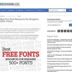
This blog post is very useful for those, who wants to update there fonts library with modern and unique free fonts. We are understand the requirement of market and gathered best and unique fonts and typefaces for you. Facilities include the design of a new typeface, modification of existing fonts, addition of accents, logo’s and special glyph. You might be interested to read: Recieve our RSS updates via email, simply enter your email address & click subscribe. Free Fonts - New Fonts for Desigenrs. This is a collection of modern and beautiful design best free fonts for web and graphic trends.
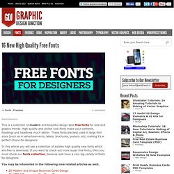
High quality and stylish look fonts make your contents, headings and headlines much better. These fonts are best used in large font sizes (such as in advertisements, labels, brochures, posters. etc) making it’s a perfect choice for designers. 60+ of the best typographic designs of 2013. Creative Free Fonts for Designers. As a Designer, I know the importance of Typography.
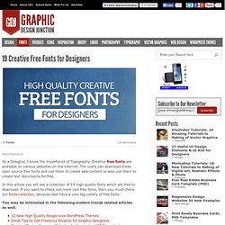
Creative free fonts are available on various websites on the internet. The users can download these open source free fonts and use them to create web content or also use them to create text documents for free. Top 10 Fonts Web Designers Love. When I was starting out with Web and graphic design, I was always wondering about the fonts that real designers use.
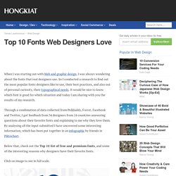
So I conducted a research to find out the most popular fonts designers like to use, their best practices, and also out of personal curiosity, their typographical needs. It would be nice to know which font is good for which situation and today I am sharing with you the results of my research. Through a combination of data collected from Polldaddy, Forrst, Facebook and Twitter, I got feedback from 34 designers from 14 countries answering questions about their favorite fonts and explaining to me why they love them. By analysing all the input submitted I have uncovered some interesting information, which has been put together in an infographic by friends in Piktochart. A Tale of Many Fonts. Once upon a time lived a lonely webdeveloper.
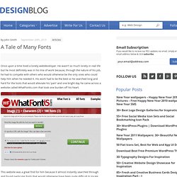
He wasn’t so much lonely in real life but he most definitely was in his line of work because, through the nature of his job, he had to compete with others who would otherwise be the only ones who could help him when he needed it. His work had to be the best so he searched long and hard for the tools that would alleviate his ‘pain’ and one bright day he came across a website called WhatFontIs.com that took one burden off his heart. This website was a great find for him because it almost instantly searched through and found particular fonts that would otherwise have been quite difficult to locate. What made it even better was that he didn’t need to know the name of the font to be able to grab it, all he needed was an image or a website where he had seen the font that he wanted to use.
The software behind the website did all the rest. That’s not so much a story as it is real fact. Une histoire filmée de la typographie ! Free Fonts, Best for Posters, Flyers and Logo Designs. This is the another excellent fonts collection for graphic designers.
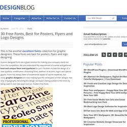
These fonts are best for posters, flyers and logo designing. Custom designed fonts are a great solution for making your company stand out from the competition. We are understand the requirement of market and gathered best and unique fonts and typefaces for you. Lisibilité des sites web, font-size : 100% – 16px. Dans ce nouvel article je vais présenter les solutions mises en place par les webdesigners pour améliorer la lisibilité de leur contenu textuel.
Je ferai une analyse des « bonnes » pratiques typographiques pour optimiser la lisibilité du contenu et présenterai une sélection de sites web affichant leur contenu textuel à la taille par défaut de 100% soit 16px. Les codes de la Typographie #1 - Structure et vocabulaire de la lettre - typographie. Pour ce mois d'avril, nous allons réaliser un dossier complet sur la Typographie.
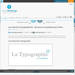
Essentiel dans la réalisation d'un logo ou d'un slogan elle peut véhiculer des messages puissants et différents selon ses formes. Dans ce premier numéro nous allons compre. Abstract Fonts (13,707 free fonts) 10 Excellent New Free Fonts. Here at WDL, we know how important it is for our readers to have as many good resources as possible in their design library.
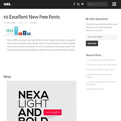
That’s why we do our best to gather what is new out there and deliver it to you. So today we have a new round of free fonts to give you plenty of typography options for your upcoming designs. Enjoy! Nexa Maven Pro Corki. Create Your Own @font-face Kits. Typography in Mobile Design: Important Aspects and Examples. What makes mobile typography special is the restrictive nature of mobile screens; they are small and used in brightly lit areas so that it is difficult to see anything.
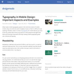
Therefore, when it comes to typography for mobile devices you have to be very careful about how you go about it. Most people would agree that there are three big components that help making mobile typography great: size, contrast and spacing. Readability Readability is defined as the amount of effort a user has to put in, in order to read and understand text. This is a very important usability issue that should never be underrated as text is the number one way in which information is communicated online – by a big run. Typography in Mobile Design: Important Aspects and Examples. Free Fonts, Best for Posters, Flyers and Logo Designs. Le magazine de la NBA. Johnhouzi : Focus #typographique... Focus typographique #1. Graphiste et dessinateur de caractères typographiques, Emmanuel Rey fait partie de la fonderie swiss typefaces. Avec des polices telles que le Simplon et l’Euclid, il a marqué le milieu du design graphique contemporain.Régulièrement appelé à diriger des workshops à l'ECV Provence, il y a animé un atelier de conception typographique en aout 2012.
Après avoir été initiés à RoboFont, les étudiants ont réalisé plusieurs familles de caractères réunies par la suite dans un projet de magazine baptisé Pavane. Étudiants: Ghjuvan Dumenicu Aletti, Marie Bechade, Rosalie Begalla, Romain Boyer, Valentin Breyne, Noémie Chardon Grenier, Jessica Cheix, Quentin Colle, Emmanuelle Drin, Céline Dubois, Clémentine Girardeau, Cyril Graziani, Alexandre Lanza, Clara Lapprand, Géraldine Moury, Elsa Pothin, Sonia Schlaeintzauer et Pierre-Antoine Teychene. bit.ly/QDnfdh. Johnhouzi : L'expo "Pencil to Pixel" par... L'expo "Pencil to Pixel" par Monotype arrive à NY. Du 03/05 au 09/05/2013 / Tribeca Skyline Studio, New York Après être passée à Londres en novembre dernier, l'exposition "Pencil to Pixel" arrive à New York pour trois jours !
Organisée par la célèbre fonderie américaine Monotype — qui commercialise notamment l'Helvetica, la Gill Sans ou encore la Times New Roman —, c'est plus de 100 ans de création typographique qui sont présentés. L'événement réunit le passé, le présent et le futur d'une institution typographique unique au monde, dont l'expertise et le savoir-faire ont formé notre manière de voir et de lire notre environnement.
À travers les évolutions techniques par lesquelles elle est passée, de la typographie au plomb aux logiciels sur ordinateur en passant par la photo-composition, Monotype présente ses archives et continue de questionner la forme des lettres. L'exposition offre un regard particulier sur la création typographique digitale et se penche notamment sur le caractère sensible du dessin algorithmique. Johnhouzi : Théorèmes #typographiques... Théorèmes typographiques. Une typo marquée à l'encre bleue.