
Edward Tufte sur Twitter : "London underground+worldwide subway maps 50 maps analyzed … #dataviz #designthinking #design. London Underground maps (+ worldwide subway maps) An installment of a recent series about subway signs and wayfinding in Slate focused on London.
In a nutshell, wayfinding signage with carefully-designed maps are being used on the street to supplement the geographical inaccuracies of Mr Beck's map. Wayfinding signage for city streets is very different from the wayfinding programs you find in transportation environments like Penn Station or Heathrow. In an airport, the signs boss you around: Check in, go to security, proceed to your gate. On city streets, good signs are more like valets: They give you options, telling you about nearby attractions and helping you figure out where you want to go. Transport wayfinding gets you from point A to point B, but good urban wayfinding systems help you develop your own mental map of a place. (Continue on Slate.) Edward Tufte sur Twitter : "A+ Richard Serra, Te Tuhirangi Contour, Gibbs Farm, Kaipara Harbour, New Zealand #sculpture #designthinking. Gianni renda’s beer glass: drinking for the no longer young. Designer and researcher Gianni Renda has designed a beer glass that’s age-friendly: it’s got a grip-enhancing shape, eliminates condensation and features a no-slip base—a design that’s subtly targeted for users with less-than-steady handling or weakened muscles or joints.
Renda’s also a scholar interested in aging and assistive cutlery, especially how design choices can shape technology adoption. He’s now a research fellow and lecturer in industrial and interior design at Swinburne University. I emailed with Renda about the product, his interest in design for aging, and what might be learned from giving greater design attention to these everyday products. Abler: Walk us through the design of your glass. Renda: This design was a response to a competition brief, where the charge was to design something around beer for the 60+ market. While the glass is only a concept, the features that I included in its design are technically feasible. The final element was the non slip base.
Designer3. Dirty Car Art by Scott Wade. In search of the ultimate wireframing tool - Wolf's Little Store. Over the past year I’ve made a lot of wireframes.
This post is about some tools I’ve used and my findings. I realize I’m coming from a slightly odd perspective here: I know how to work fluently with the Adobe Creative Suite, as well as write HTML/CSS (and some basic JS) fluently, whereas most dedicated UX practitioners can’t do either. London's Futuristic New Double-Decker Bus Hits The Streets. London rolled out a new look for its iconic double-decker bus late last week.
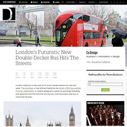
The prototype, a fuel-efficient hybrid by the studio of Brit-boy wonder Thomas Heatherwick, is cleverly designed to speed up passenger boarding and represents the first time that the city has commissioned a new bus in more than 50 years. The big inspiration here was the '50s-era Routemaster, beloved for an exposed deck that let riders hop on and off quickly. The new bus reinstates that feature--which had been eliminated on all but a few routes in 2005--with a rear open platform. It additionally has three doors and two staircases to streamline the passenger-boarding process. Lookswise, the New Bus for London is as slick and as futuristic as any bus is going to be. The first fleet of buses is expected to arrive on the streets early next year. Why The Best Brands Eventually Leave Their Names Behind. In our business, we often have the opportunity to bring a new brand to life.
With that comes a question we often hear from clients: “Do you do naming?” And then, “What’s your process?” It’s a regular part of our process to struggle with naming a new company, product, merger, or acquisition. You might be asking yourself, Did he mean to write "struggle"? Blogography. Have you every been in the situation where the client keeps requesting tweaks to the design or changes in functionality?
As you sit moving boxes around the page, the budget is slowly draining away and you’re no longer sure whether the project can be completed on target? In these situations what do you do? Some designers will push back on the client, claiming that these changes were never in the agreed brief and that they had only budgeted for 2 or 3 rounds of design. Others will simply swallow the cost in the hope that the changes are almost finished and in the knowledge that they’ll never find themselves in this situation again. Well not until the next time. Sick of that Gap clerk telling you to buy those...
Webdesign. Web-design. Javascript. Logo-design. Tundro - Greetings from the iceberg. The SitePoint Corners Store. Generator To use the generator select your preferred foreground color (hex), background color (hex), corner radius (pixels: 5-60) and hit 'Spank Me!
'. The generator will reload 'wearing' your selection while providing you 4 corner GIFs, the basic CSS and the HTML to obtain the effect. Or if you're lazy, try these preset values. Spanky Corners What? 'Spanky Corners' is an experimental technique for using only CSS to produce 'round-cornered content boxes' with semantically pure markup. Why? SpankyCorners has a number of advantages over alternative rounded corners methods. Spanky requires no extra HTML markup to act as 'CSS hooks'. News We're always happy to hear any feedback/suggestions for Spanky via this blog entry. Update: 8 May, 2006: Fixed a Firefox 1.0 render bug which was making the site look wacky. Update: 3 May, 2006: Solved the IE6 scaling problem. Update: 28 April, 2006: A few changes. Update: 15 April, 2006: Updated the way the images are generated and the code algorithms. Taking the Guesswork Out of Design.
Creativity breathes life into successful websites.
However, creative ideas and solutions can sometimes seem like guesswork—and guessing is risky business. So what can designers do to show clients they’re using a solid strategy and have the best intentions? The following exercises are a great way to start discussing and documenting aspects of design to help clients shed their fear of creativity and encourage them to join the design process.
Set clear goals#section1 Some people feel they know why a website should exist, but struggle to create direct and measurable goals. A modified acceptance criteria exercise is the simplest and most effective tool I’ve found for setting clear and powerful goals. Example request: Fullflow - Syphonic Drainage Specialists - Home. Stream.