
Which tool should I use? There are tons of tools, programs and websites that can aid in the reporting and publishing process.
With so many to choose from, the options can be overwhelming. These videos are designed to give you a quick look at some of the different options and help you decide which ones meet your needs, skill level and budget. These tutorials were created specifically for IRE. If you want to suggest a tool or program for this gallery, contact us! StoryMap JS Cost: Free! Tutorials: Scroll down to the help section of the StoryMap JS page for useful tips and tricks Timeline JS Tutorials: Scroll down to the help section of the Timeline JS page for useful tips and tricks Mapbox. Search: The Data Visualisation Catalogue. Fellowships for Data Journalism. CORRECT!
Jolidata : All about Data Visualization, Self Tracking and Open data. Are You a Code-Curious Journalist? Here’s a Quick Guide to Online Tutorials. “I definitely think that coding now is a kind of a literacy, no matter what position you are in.”
–Louise Ma, WNYC’s data news interaction designer, in CJR Here’s a fact: The occupation of newspaper reporter was recently rated by one career services website as the No. 1 worst job of 2013. With a negative 6 percent projected job growth and a painfully low median salary, it’s become clear that the concept of the “traditional” journalist is a dying breed. As a student myself, this translates into, “If you leave j-school with only an improved comprehension on how to write words on a page, you’re in trouble.” The solution? Prior to Medill, I spent a good five years dabbling in web-making, compelled by an introductory computer science course I took on a whim during my senior year as an undergraduate. Googling “journalism” + “coding” serves as an omnipresent reminder. Pieces about why journalists need to integrate technology skills into their repertoire have become commonplace.
Video only. 2012 King's Summer School in Data Journalism. LocalData — A digital toolkit for communities. Source - Journalism Code, Context & Community - A project by Knight-Mozilla OpenNews. Six ventures bring data to the public as winners of Knight News Challenge. Watch the winners present their projects via web stream at 1 p.m.
PDT/ 4 p.m. EDT Saturday Sept. 22 here. SAN FRANCISCO -- (Sept. 20, 2012) -— Six media innovation ventures that make it easier to access and use information on local communities, air quality, elections, demographics and more received a total of $2.22 million today as winners of the Knight News Challenge: Data. The data challenge, one of three launched by the John S. and James L. Knight Foundation this year, accelerates projects with funding and advice from Knight’s network of media innovators. “The winning projects go well beyond collecting data to unlocking its value in simple and powerful ways, so journalists can analyze numbers and trends, and communities can make decisions on issues important to them,” said Michael Maness, vice president for journalism and media innovation at Knight Foundation. The winners of the challenge will present their projects via live Web stream at 4 p.m. About the John S. and James L. School of Data - Learn how to find, process, analyze and visualize data.
Data Journalism Awards - Data journalism and data visualization from the Datablog. Infographics. Data Driven Journalism. The Best Data Visualization Projects of 2011. I almost didn't make a best-of list this year, but as I clicked through the year's post, it was hard not to.
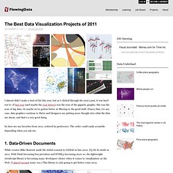
If last year (and maybe the year before) was the year of the gigantic graphic, this was the year of big data. Or maybe we've gotten better at filtering to the good stuff. (Fancy that.) In any case, data graphics continue to thrive and designers are putting more thought into what the data are about, and that's a very good thing. So here are my favorites from 2011, ordered by preference. 1. While creator Mike Bostock made the initial commit to GitHub in late 2010, D3 hit its stride in 2011. 2. Who knew carrying around a stick that detects WiFi vertically could be so informative?
3. Media artist Roger Luke DuBois used online dating data to show the uniqueness of cities in America. 4. School of Data - Learn how to find, process, analyze and visualize data. Journalisme graphique. Refine, reuse and request data. Knight Foundation finance ScraperWiki for journalism. ScraperWiki is the place to work together on data, and it is particularly useful for journalism.
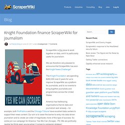
We are therefore very pleased to announce that ScraperWiki has won the Knight News Challenge! The Knight Foundation are spending $280,000 over 2 years for us to improve ScraperWiki as a platform for journalists, and to run events to bring together journalists and programmers across the United States. America has trailblazing organisations that do data and journalism well already – for example, both ProPublica and the Chicago Tribune have excellent data centers to support their news content.
Our aim is to lower the barrier to entry into data driven journalism and to create (an order of magnitude) more of this type of success. So come join our campaign for America: Yes We Can (Scrape). Data Journalisme. Looking 4 data visualization. Visual Literacy: An E-Learning Tutorial on Visualization for Communication, Engineering and Business. Visual Cards for Collaboration and Team Creativity Making the Complex Clear Visual Literacy for Managers - How Sketching enables Visual Problem Solving and Communication (get the hardcopy edition at sketchingatwork.com) By clicking on a map or diagram thumbnail below, you can access an interactive graphic overview on tools, books, researchers in different visualization fields, as well as on key success factors of visualization.
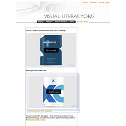
There is also an interactive organizing table that shows (incl. examples) one hundred visualization-based methods. Clicking on a particular tool, book, person, document, principle or method within a map opens the respective website or homepage in a new browser window or reveals an example (most maps were created with lets-focus).
Collates the most creative and innovative visualisations of information. Actu data & Journalisme de Données.