
Thimble for Journalists Hacktivity Kit. How to Analyze Data: 6 Useful Ways To Use Color In Graphs. See Plotly’s Blog for Interactive Versions of the Plots Below Effectively using color means your graphs clearly communicate your data.

This post shows how. We summarize and apply visualization research to real-world examples. You can make graphs like these with Plotly’s web app, or APIs for Python, MATLAB, andR. For users who want to securely share graphs and data within a team, or make interactive dashboards, contact us about Plotly on-premise. We’ve released maps for our Python API.We’ve released a free version of our JavaScript graphing library.Plotly has a brand new R API for interactive plotting and maps. 1. Hue refers to the color’s name (green, red), value is the perceived lightness of the color (dark green, light green), and saturation describes its colorfulness relative to its own brightness. The chart below shows sequential, diverging, and categorial scales. 2. Love is red, nature is green. Here they are made in Plotly. Color associations can vary by culture. 3. 4. Your Friendly Guide to Colors in Data Visualisation · Lisa Charlotte Rost.
22 Apr 2016 A few days ago, I approached my Twitter followers with a request to help me in an urgent matter: “Can somebody tell me how to get better with color?

,” I wrote. “ My color decisions are awful.” Thanks to a retweet by Scott Murray I got a lot of replies with links to websites and tools. They were awesome. And I want to share them with you, annotated with my own thoughts about them. Why color? First, watch this video about why color decisions are important and how to mix colors. Both aspects are important for data visualisations. So how should you choose colors for your project? The challenges for these two use cases are different ones. When working with qualitative data, your mission is to find colors which go well together and attract the reader’s eye. 1. ColorBrewer 2.0 NEEDS to be mentioned first. Journalism Courses. Which_chart_v3_fr_0.pdf.
Trafic de graphiques (Lazarus) L'infographie expliquée en images. Comment les graphistes définissent-ils aujourd’hui l’infographie et la datavisualisation?
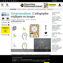
La réponse, visuelle, de 81 auteurs dans le livre «Infographics, a Visual Definition», paru en 2012 et à feuilleter ici. “L’infographie est un genre de journalisme, au même titre que les interviews, les articles, ou les photographies, c’est même plus que cela c’est un genre qui combine tous les genres”, écrit Javier Errea (qui a réalisé la nouvelle formule de Courrier international en octobre 2012), en préface du livre “Infographics, a Visual Definition”, publié en 2012 par la SND (Society for News Design) espagnole, qu’il préside. Chaque année depuis 1992, se tient à Pampelune un sommet mondial de l’infographie, les rencontres de Malofiej. En 2014, la 22e edition se tiendra du 23 au 28 mars. 15 Resources For Journalists To Learn About Statistics.
Datajournalisme Keynotes. TEDxCarthage - Nicolas Kayser-Bril - INFObésité.