
Students vs. Prisoners. Nice, clean, simple infographic design.
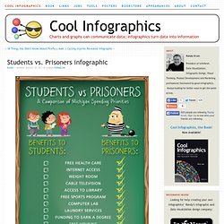
Students vs. Prisoners by the law firm Buckfire & Buckfire in Michigan visually communicates one message really well: In Michigan, the average spending per prisoner is close to three times that spent per student. Potentially a controversal budget topic in Michigan, I appreaciate that they clearly listed the link to the data source. A couple things I would change about this design: Facebook vs. Twitter. Facebook vs.

Twitter is a good one from DigitalSurgeons.com. They’ve done a great job of compiling the data from at least 10 different sources, to create an overall profile of the standard Facebook and Twitter users. One has over 500 million users, the other just over 100 million. But who are they and what’s their behavior? What’s their value to a brand?
Google's Acquisition Appetite. From Scores.org, a data-heavy Google(graphic) by Jess Bachman, Google’s Acquisition Appetite.
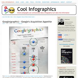
Visualizing almost 10 years of Google’s acquisitions and investments, and there’s hardly a month that Google didn’t invest in something. I like the multiple dimensions to the data. Three columns show how the acquisition helped Google, the colors of each acquisition show what assets were gained, an additional circle shows the value of the acquisition (if it is known) and of course the timeline aspect. Comparing Apples to Oranges.
Designer Jess Bachman, in partnership with Smarter.org, has accomplished the seemingly impossible.
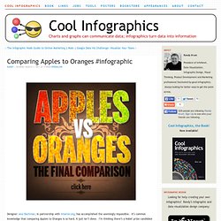
It’s common knowledge that comparing Apples to Oranges is so hard, it just isn’t done. I’m thinking there’s a Nobel prize candidate here… ;) I’ve done it!