
Creating the Best e-Commerce User Experience (UX) 15 Signs You Work in UX. November 1, 2012 2:19 pm by User Experience Team in Uncategorized Have you ever found yourself scrutinizing the wording and diagrams in instruction manuals?

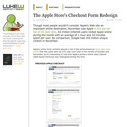
Do friends ask you for help figuring out how to work a device and your first impulse is to ask, “how do you think it should work?” Prognosis: you’re probably a UX researcher with a keen eye for detail. The UX consultants at GfK crafted a list of tell-tale signs that you work in UX: 1. Researchers, what other “signs” would you add to this list? The Apple Store's Checkout Form Redesign. Though most people wouldn't consider Apple's Web site an important online destination, November saw Apple in the top ten list of US Web sites. 62 million Internet users visited Apple online during the month with an average of 1 hour and 18 minutes spent per user.

By comparison, Google had 155 million unique visitors in November. Apple's online store certainly played a role in this achievement as retail sales data shows that Mac sales were up 21% year-over-year in the months of October and November. So it's interesting to note that Apple's primary online sales channel (Web-based checkout) was redesigned during this time. The previous design of Apple's checkout form spanned multiple pages and utilized a top-level progress indicator to highlight where people were in the proces. Errors were displayed at the page-level and did not reference the fields responsible for errors nor provide actionable remedies when error messages showed up.
Credit card numbers follow a consistent structure. 9 Things Designers Can Learn from Target’s Checkout Form. By anthony on 09/13/11 at 9:31 pm Target recently redesigned their website.

While many have their own opinions about it, there a few positive things designers can learn from Target’s checkout form. At first glance it may not look like much, but once you dig deeper you’ll find a diamond in the rough. 1. Crystal Clear Page Headings When the user gets to the checkout form, there’s no question in their mind where they are. 2. Phone numbers are one of the toughest things to get from a user. Do it yourself: Masked Input Plugin 3. Most forms that use instant field validation only validate for user errors. Learn how to do it the right way: Why Long Forms Need Instant Field Validation 4. Text fields and dropdown lists are widgets on forms that easily catch users’ attention. 5. Target treats their primary and secondary buttons differently. Learn more about primary and secondary actions: The Visual Weight of Primary and Secondary Action Buttons 6. Fundamental Guidelines Of E-Commerce Checkout Design.
Advertisement Here is the harsh reality of e-commerce websites: according to recent e-commerce studies, at least 59.8% of potential customers abandon their shopping cart (MarketingSherpa puts it at 59.8%, SeeWhy at 83% and MarketLive at 62.14%).

The main question is why do customers abandon their shopping cart so often? Designing A Better Mobile Checkout Process. Advertisement A record number of shoppers are turning to their smartphones to research potential purchases1.

Meanwhile, the bigger question — are those same users willing to complete the purchases on their mobile device? — is quickly being answered. The US, for example, saw an 81% spike2 in mobile e-commerce (m-commerce) sales in 2012, comprising a $25 billion market. And it’s not just apps. In the days and months to come, it will become increasingly important for retailers to fuel this growth by creating seamless, user-friendly checkout processes that inspire trust and that make full use of all of the advantages the medium has to offer. Let’s dive into some examples of mobile checkout processes and see what we can learn. 1. The State Of E-Commerce Checkout Design 2012. Advertisement A year ago we published an article on 11 fundamental guidelines for e-commerce checkout design here at Smashing Magazine.

The guidelines presented were based on the 63 findings of a larger E-Commerce Checkout Usability research study we conducted in 2011 focusing strictly on the checkout user experience, from “cart” to “completed order”. This year we’ve taken a look at the state of e-commerce checkouts by documenting and benchmarking the checkout processes of the top 100 grossing e-commerce websites based on the findings from the original research study. This has lead to a massive checkout database with 508 checkout steps reviewed, 975 screenshots, and 3,000+ examples of adherences and violations of the checkout usability guidelines. Here’s a walkthrough of just a handful of the interesting stats we’ve found when benchmarking the top 100 grossing e-commerce websites’ checkout processes: 81% Think Their Newsletter Is A “Must Have” (And Don’t Value Customer Privacy) Large view.
Are You a Human - The Ultimate Captcha Alternative. Email et Responsive Design : analyse de quelques réalisations. Depuis quelques mois, la tendance s'accélère et les réalisations d'emails adaptés à la lecture sur mobile se multiplient.

Il semble que le responsive design soit la technologie actuellement la plus déployée plutôt que d'adapter le contenu sur des formats (tableaux) qui se redimensionnent quelle que soit la taille de l'écran. Les emails adaptatifs sont assez délicats à réaliser, car maintenir un code compatible avec les plateformes Outlook, Yahoo Mail notamment, et celle d'iOS, est assez difficile et complexe. Il faut une certaine habitude et j'ai vu quelques agences développer du code responsive mais sans toujours tester l'impact sur les autres environnements.
Enfin, dernière précision importante et décevante : le responsive ne fonctionne pas sur Android client gmail, quelle que soit la version de ce dernier. Design Archives.