
MYTHE #2 : LA REGLE DES 3 CLICS. Les tests de facilité d’utilisation ont longtemps contesté la soi-disant règle des 3 clics.
Contrairement à la croyance populaire, les utilisateurs ne quittent pas un site ou une application s’ils ne parviennent pas à trouver l’information désirée en 3 clics. En réalité, le nombre de clics nécessaires à la réalisation d’une requête ne modifie ni la satisfaction des utilisateurs, ni le taux de réussite de l’action. Ce qui compte vraiment ici c’est la facilité de navigation, il faut impérativement pister l’information le long du parcours de l’utilisateur. Si vous le faîtes correctement, les utilisateurs ne seront pas dérangés par quelques clics supplémentaires. 40 Essential CSS Templates, Resources and Downloads - Speckyboy Design Magazine. Every web developer should have in their toolbox a collection of CSS tools and resources like the ones outlined in this article.
A set of techniques that you rely on and that are always at the ready to cover any possible eventuality. You will find not a selection of the latest innovative CSS techniques (there are some) in this article, merely a collection of tools, resources and downloads that can be used by web designers for solutions to everyday CSS design and coding solutions. The resources below have been split into four categories: CSS Download Packages (all of the CSS resources offer multiple variations of each technique), Downloadable CSS Tools (the resources within this category offers specialized templates), Web, Mobile & Form Frameworks (+ tools and templates to help you get started with each); Feature-Rich and Outstanding Mobile & Web Templates and finally, a selection of tools to help with cross browser compatibility.
CSS Technique Download Packages & Resources 15 CSS3 Buttons. Free Vector Post it Notes + Push Pins. Adhesive Notes and pushpins are pretty popular in web design and so to make my life easier – and hopefully yours too :) – I made a pack of vector post-it notes and drawing-pins.
There are 9 unique post-it notes, out of which I made 6 color combinations (yellow, blue, green, white, pink and orange) for a total of 54 colorful sticky notes plus shadows; and if you need a worn out look some of the paper notes are wrinkled as well. About the vector Push Pins – there are 3 kinds (tall, flat and round) in 7 color variations (red, green, yellow, white, blue, pink and orange) and from different angles; over 100 vector thumbtacks in total. At the bottom there are two format versions for downloading, one contains ai + png files and the other eps + png. They are the same but I kept them in separate files as the eps files are larger and if you only need the ai there’s no point in downloading the whole thing. 16 Web & Graphic Design Trends To Watch In 2016. 16 Web & Graphic Design Trends To Watch In 2016 As a web & graphic design agency with an accent in visual storytelling, my team and I need to pay close attention to the everchanging trends of design, on and offline.
These are what I believe will be the 16 most prominent trends of graphic design in 2016. Why is this important to you, even if you’re not a designer? Well, if you spend lots of hours writing your blog, wouldn’t you like to stand apart visually? Jump on board these trends before everybody does: 1. In 2016, design will be all about the user. No one will care about how cool your design looks, if it’s not usable. Engaging your users really comes at the front in 2016. Google’s algorithmic changes, customer behavior data… They all point in the same direction, and that is “your website needs to load fast and be easy to use”.
Page Load Speed is a great issue with ecommerce sites. 2. We all know a responsive site is not optional anymore. Usability is very important in all platforms. 3. The Fold Manifesto: Why the Page Fold Still Matters. Ergonomie : le scroll augmente, l'importance du premier écran baisse. Toute l'actualité "Chiffres-clés" Edition du 20/01/2015 - par Bertrand Lemaire Le changement de comportement des utilisateurs, notamment à cause des habitudes prises sur tablettes, implique un bouleversement des règles d'ergonomie sur les applications web et mobiles. « Tout dans le premier écran » : cette règle fondamentale de l'ergonomie des sites web et des applications mobiles doit-elle être remise en cause ?
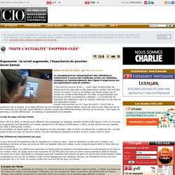
C'est ce qu'indique une étude menée par le cabinet de conseil ContentSquare. En effet, la généralisation des terminaux tactiles (smartphones, tablettes...) a transformé les habitudes des utilisateurs dans la manière d'aborder un site web ou une application mobile.L'étude s'est penchée sur le « taux de scroll », c'est à dire la proportion de la hauteur de la page affichée par les utilisateurs en faisant défiler l'écran de haut en bas. Le bas de page sort des limbes Entre 2013 et 2014, le dernier pixel affiché a peu progressé sur desktop, passant de 810 à 850 lignes (+5%).