
Cheat Sheets on Pinterest. 10 Fun Tools To Easily Make Your Own Infographics. People love to learn by examining visual representations of data. MAKE YOUR OWN INFOGRAPHIC. Principles of Data Visualization. Quick & Easy Study Charts. Creative Examples Of Infographics.
Sep 29 2010 Today we have an exciting and enticing post which covers handy and innovative infographics. Infographics is basically derived from two words: ‘information’ and ‘graphics’, and it stands for the graphical representation of data and information. Data visualization techniques have been often used in modern maps to incorporate variety of information, for instance for network designs, destination points, and local landmarks. Ideas, issues, knowledge, data - visualized! A visual exploration on mapping complex networks. 50 great examples of infographics - FrancescoMugnai.com. The Data Visualisation Catalogue. 15 Stunning Examples of Data Visualization.
10 Steps To Designing An Amazing Infographic. Information can be useful—and even beautiful—but only when it’s presented well.
In an age of information overload, any guidance through the clutter comes as a welcome relief. That’s one reason for the recent popularity of information graphics. Infographics are visual designs that help to explain complicated data in a simple way (mental-health emergencies at Burning Man, anyone?). But how are they created? What can we learn from the designer’s process? How to Make an Interactive Network Visualization. Networks!
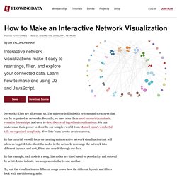
They are all around us. The universe is filled with systems and structures that can be organized as networks. Recently, we have seen them used to convict criminals, visualize friendships, and even to describe cereal ingredient combinations. We can understand their power to describe our complex world from Manuel Lima's wonderful talk on organized complexity. Now let's learn how to create our own. In this tutorial, we will focus on creating an interactive network visualization that will allow us to get details about the nodes in the network, rearrange the network into different layouts, and sort, filter, and search through our data. In this example, each node is a song. Try out the visualization on different songs to see how the different layouts and filters look with the different graphs. Technology This visualization is a JavaScript based web application written using the powerful D3 visualization library. jQuery is also used for some DOM element manipulation.
Functions. 10 Infographic Geared Toward Designers. News designers and web developers know that a good informational graphic is more than just flashy images or statistics slapped on a three dimensional bar graph. The best infographics should attract an audience’s attention with simple, relevant images, and hold their attention with a compelling story told in visual shorthand. Strong infographics have concise, accurate headlines that let readers know the significance of the story at a glance. At the core of a truly captivating infographic is the grain of truth it conveys. For this reason, designers in particular should enjoy and learn something about their craft from these 10 clever design-focused infographics. 55 Interesting Social Media Infographics. 10 of My Favorite Infographics.
Datavisualization. 40 Useful and Creative Infographics. Six Revisions Menu Main Categories CSS HTML JavaScript Web Design WordPress Web Development Design Inspiration UX Design UI Design Freebies Tutorials Tools Links About Contact Advertise RSS Twitter Facebook.
50 Great Examples of Data Visualization. Wrapping your brain around data online can be challenging, especially when dealing with huge volumes of information.

And trying to find related content can also be difficult, depending on what data you’re looking for. But data visualizations can make all of that much easier, allowing you to see the concepts that you’re learning about in a more interesting, and often more useful manner. Below are 50 of the best data visualizations and tools for creating your own visualizations out there, covering everything from Digg activity to network connectivity to what’s currently happening on Twitter. Music, Movies and Other Media Narratives 2.0 visualizes music. Visual Mapping.com. How To Create Outstanding Infographics. In this tutorial you will learn that data doesn't have to be boring, it can be beautiful!

Learn how to use various graph tools, illustration techniques and typography to make an accurate and inspiring infographic in Adobe Illustrator. Start by using the Rectangle Tool (M) to draw a shape. Give it a subtle radial gradient too. The entire design is based on a grid of four columns. To make the columns first select the rectangle and drag a guide onto the centre of the shape. Condense the shape so it fits within the left-most guide and centre guide. Move the shape over to the right and add another guide to the centre here. Using the Rectangle Tool (M) draw a thin white box on the centre line that will be the width of the gap between the columns. Repeat the process for the other columns with your final result being below. How to Create an Excel Dashboard - The Excel Charts Blog The Excel Charts Blog. Excel dashboards and executive reports are powerful, fairly easy to design and a great way to improve your Excel and data visualization skills.
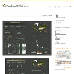
Because of its flexibility, you can virtually design any dashboard in Excel exactly the way you, or the users, imagined. And, best of all, you may want to implement it yourself or consider it a prototype and ask IT to implement it. Once you know what will the Excel dashboard be used for and what kind of metrics users expect, there are three major areas that you must address when creating it: Create and design your own graphs and charts online. The Best Tools for Visualization.
Visualization is a technique to graphically represent sets of data.
When data is large or abstract, visualization can help make the data easier to read or understand. There are visualization tools for search, music, networks, online communities, and almost anything else you can think of. Whether you want a desktop application or a web-based tool, there are many specific tools are available on the web that let you visualize all kinds of data. Here are some of the best: Infographic App & Presentation Tool. 9 Ways You Can Improve Your Infographic Pitches to Blogs & Websites.
Over the past year, I’ve worked on approximately 20 different infographics for a single client. One of the most frustrating things about the process has been the unevenness of the response. Even if we do everything seemingly right, an infographic might not take off. After a string of disappointing infographics, I decided to go back over every step and figure out what we had missed. Vizualize.me: Visualize your resume in one click.
InfoGraphic Designs: Overview, Examples and Best Practices. Information graphics or infographics are visual representations of information, data or knowledge.
These graphics are used where complex information needs to be explained quickly and clearly, such as in signs, maps, journalism, technical writing, and education. They are also used extensively as tools by computer scientists, mathematicians, and statisticians to ease the process of developing and communicating conceptual information. They can present a rich amount of information without intimidating you. Or sometimes they intimidate you, but make the digesting of the information much more bearable. Here in this article below, we are going to discuss best practices for designing infographics followed by some examples which might help you learn a thing or two. You may be interested in the following related articles as well. Create cool infographics - Tutorials.