
Kitty Sabatier. Kitty Sabatier. Terres d'écritures, Kitty Sabatier. Werner Schneider. Werner Schneider was born in Marburg/Lahn, Germany in 1935.
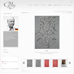
He studied lettering arts under Prof. Friedrich Poppl at the Werkkunstschule Wiesbaden. Later he became a teacher there with a special emphasis on calligraphy and design. He has been a professor of Graphic Design at the Fachhochschule Wiesbaden (University of Applied Sciences) since 1971. He is also a freelance calligrapher and font designer.
He has been a member of Type Directors Club, New York since 1987. He is an Honoured member of Letter Exchange, London (1988), Society of Scribes Ltd. Schneider designed typefaces for Berthold AG Berlin (later Chicago), Schneider Antiqua, Schneider Libretto, Vialog, Sunetta, and Satero. Numerous exhibitions in Europe, the United States of America, Australia, Canada, China, India, Israel, Japan, South Korea and South Africa. Numerous publications in international professional editions.
Alberto Seveso. Alberto Seveso is a graphic designer and illustrator from Italy.
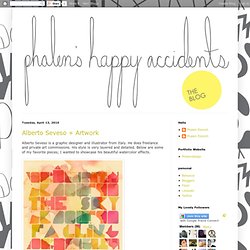
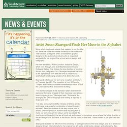
He does freelance and private art commissions. His style is very layered and detailed. Below are some of my favorite pieces; I wanted to showcase his beautiful watercolor effects. Paul Shaw. Susan Skarsgard. Washtenaw Community College's yearlong "At the Junction" series at GalleryOne culminates with Susan Skarsgard's "At the Junction: Calligraphic Design.
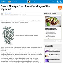
" Courtesy of GalleryOne at Washtenaw Community CollegeUntitled giclee inkjet print drawn from the series "26 of 26: An Edition of Twenty-six Alphabets," by Susan Skarsgard, now showing at Washtenaw Community College's GalleryOne. Skarsgard's display is built around the 26 letters of the Latin alphabet via media that range from a short-subject video and a wall scroll to books and art prints, including 26 spectacular sets of a single giclee inkjet series. With two books - the sumi ink, gouache and silver leaf "Alphabet Book" and copper stardream paper "Pop Up Book" - Skarsgard works with the alphabet's natural ally. With "Alphabet Book," slightly larger than 2 feet rectilinear, Skarsgard plays visually with, naturally enough, the alphabet.
In "Pop Up Book," Skarsgard cleverly works with fold-out, copper-colored casing. It's a remarkable show. To the letter. Calligraphy, in the hands of artists like Carl Kurtz and Susan Skarsgård, can be abstract, gestural, conceptual, or simply beautiful.
It is always surprising. What does a calligrapher do in the 21st century? The role of scribe, writing out manuscripts, was long ago usurped by the printing press. The job of copying out documents for governments and business disappeared with the invention of the typewriter. Some eke out a living filling in diplomas, writing out invitations to social events and addressing envelopes. The champions of calligraphy as art have suggested several models: abstract imagery in the manner of Jackson Pollock, gestural mark-making à la Franz Kline or Cy Twombly, or conceptual art rooted in language like the work of Ed Ruscha or Jenny Holzer. Susan Skarsgard. At the Junction: Calligraphic Design. WCC › News & Events › Artist Susan Skarsgard Finds Her Muse in the Alphabet.
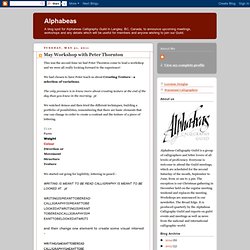
Artist Susan Skarsgard Finds Her Muse in the Alphabet One of the alphabets created by Skarsgard for her "26 of 26: An Edition of 26 Alphabets" series.
More of her work is available on WCC's Flickr stream. One of the alphabets created by Skarsgard for her "26 of 26: An Edition of 26 Alphabets" series. More of her work is available on WCC's Flickr stream. One of the alphabets created by Skarsgard for her "26 of 26: An Edition of 26 Alphabets" series. Many artists must work outside their passion to pay the bills, but there are those who reside contently at the crossroads. Her new exhibition, “At the Junction: Industrial Design,” which runs through June 5 at Washtenaw Community College’s Gallery One, follows the long tradition of creating fine art from calligraphy. Skarsgard will discuss her work at a reception and lecture on Tuesday, April 21. “I do take seriously the skillful interplay of letters, words, and image as a powerful combination of visual thought,” she said. John Stevens. John Stevens.
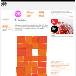
John Stevens. John Stevens brush writing demonstration. LetterArts book by John Stevens. John Stevens Book. Neil Tasker. THEOSONE. Theosone brush pen calligraphy. Peter Thornton. This was the second time we had Peter Thornton come to lead a workshop and we were all really looking forward to the experience!
We had chosen to have Peter teach us about Creating Texture - a selection of variations. The only pressure is to know more about creating texture at the end of the day than you knew in the morning. pt We watched demos and then tried the different techniques, building a portfolio of possibilities, remembering that there are basic elements that one can change in order to create a contrast and the texture of a piece of lettering.
SizeFormWeightColourDirection orMovementStructureTexture We started out going for legibility, lettering in pencil - WRITING IS MEANT TO BE READ CALLIGRAPHY IS MEANT TO BE LOOKED AT. pt and then change one element to create some visual interest - Clarify your intentions. If you have taken a class with Peter you know that quotes and Peterisms fly around the room constantly. Edwige Timmerman. Nathalie Tousnakhoff. Laurent Tripoteaud. Tyrsa.