
Brave Knights of Castile: Battle to the Last - Medieval Kingdoms Total War 1212AD Mod Gameplay. COWARD OF THE COUNTY. Dezeen. Porcelite Seasons Storm Coupe Plate 11" / 28cm - Stephensons. Porcelite Seasons Storm: Porcelite Seasons offers outstanding performance, stunning rustic colours and handsome shapes.

The Porcelite Seasons crockery range is well suited to meet the rigorous demands of the catering and hospitality industry. Porcelite Seasons Storm - Stephensons. Porcelite Seasons Storm: Porcelite Seasons offers outstanding performance, stunning rustic colours and handsome shapes.
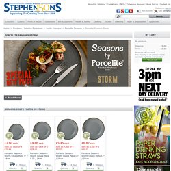
The Porcelite Seasons crockery range is well suited to meet the rigorous demands of the catering and hospitality industry. Porcelite Seasons Storm - SPECIAL NETT PRICESRustic plates, bowls, mugs, jugs and potsStriking Grey crockery from Porcelite SeasonsFrom Stephensons catering equipment suppliers Porcelite Seasons crockery is a handsome and resilient collection. With a fabulous colour palette and striking tabletop presence, Porcelite Seasons exudes rustic charm. This stone colourway of the Porcelite Seasons range is a stylish and understated base for superb food presentation. 9 favoriete restaurants in Den Haag 2018.
Nancy Sinatra - Bang Bang (Romulus Feat. Yssry Remix) The Dangers of Stopping Event Propagation. By Philip Walton On The following is a guest post by Philip Walton (@philwalton).
He is going to explain why stopping event propagation isn't something you should do lightly, and probably something you should avoid altogether. If you're a front end developer, at some point in your career you've probably had to build a popup or dialog that dismissed itself after the user clicked anywhere else on the page. If you searched online to figure out the best way to do this, chances are you came across this Stack Overflow question: How to detect a click outside an element?. Here's what the highest rated answer recommends: $('html').click(function() { // Hide the menus if visible.}); $('#menucontainer').click(function(event){ event.stopPropagation();}); In case it's not clear what this code is doing, here's a quick rundown: If a click event propagates to the <html> element, hide the menus. The above code is simple, elegant, and clever all at the same time. Javascript - Prevent keydown() from being captured by document binding.
GianlucaGuarini/Tocca.js: Super lightweight script (~1kb) to detect via Javascript events like 'tap' 'dbltap' 'swipeup' 'swipedown' 'swipeleft' 'swiperight' on any kind of device. DROELOE - Wake The Warrior. Jquery - How change keyboard navigation with down and next arrow key?
jQuery disable button — Disabling and enabling buttons with jQuery. Men I Trust - Headroom (Full Album) Ron Eglash et les fractales africaines. MATHEMATIQUES AFRICAINES - Pascalchristian.fr. Eczéma de contact. RED SPАRROW Official Trailer (2018) Jennifer Lawrence Movie HD. Official Trailer [HD] Child Prodigy is a Self-Made Millionaire from Selling Her Incredible Paintings SuperHuman: Geniuses. NADIA (2017) PLANETARIUM Trailer (2017) Natalie Portman, Lily-Rose Depp Movie HD. Google is opening up Maps so game developers can create the next Pokémon Go. There’s been a wave of location-based mobile games announced recently, based on everything from The Walking Dead to Jurassic World.
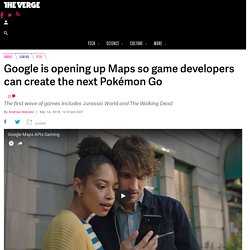
It turns out these games have more in common than just timing: they’re all powered by Google Maps. Today Google is announcing that it’s opening up its ubiquitous mapping platform to allow game developers to more easily create real-world games. The next Pokémon Go might finally be on the way. Responsive Images in WordPress 4.4. WordPress 4.4 will add native responsive image support by including srcset and sizes attributes to the image markup it generates.
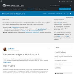
For background on this feature, read the merge proposal. How it works WordPress automatically creates several sizes of each image uploaded to the media library. By including the available sizes of an image into a srcset attribute, browsers can now choose to download the most appropriate size and ignore the others—potentially saving bandwidth and speeding up page load times in the process. Responsive Images Feature Plugin Update. It’s been a busy week over in #feature-respimg world!
We are now using a display filter on the_content to include responsive image markup, and are looking for feedback on the approach. Why filter on display? The sizes attribute describes the intended layout of an image to a browser before the page has been rendered, so that it can choose the appropriate image source. Since the theme knows the layout best, it should be able to filter the sizes values—something that isn’t possible if we save markup within the post content.Ensures future compatibility if the user changes their theme (especially if they regenerate thumbnails) or if WordPress makes changes to the way it handles layouts.Allows us to avoid accounting for the editing of image markup in TinyMCE, including directly through source, or dragging to resize.Extends responsive image support to existing posts.
Implementation. Html5 - Is there something wrong with my srcset definition, or is current browser support just weak? Responsive Images in WordPress with ACF. WordPress 4.4 shipped with an awesome new feature, Responsive Images.
This feature works great for any images within the standard WYSIWYG editor. The srcset and sizes attributes are added to each img tag to inform the browser of the available sizes for each image. If you’re using a plugin like Advanced Custom Fields to store and display images within a custom theme you’ll need to modify your themes to use this new feature. I’ve coded up a simple helper function to make this a little easier.
You can add this function to your themes functions.php file or a functionality plugin: To use this within your custom theme, open an image tag, call the function and pass 3 parameters: Responsive Images in WordPress 4.4. Responsive Images: Using srcset and sizes Attributes. Responsive image techniques, such as the HTML srcset and sizes attributes allow us to serve different scaled images based on the size of the display.
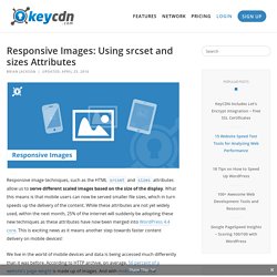
What this means is that mobile users can now be served smaller file sizes, which in turn speeds up the delivery of the content. While these attributes are not yet widely used, within the next month, 25% of the internet will suddenly be adopting these new techniques as these attributes have now been merged into WordPress 4.4 core. This is exciting news as it means another step towards faster content delivery on mobile devices! We live in the world of mobile devices and data is being accessed much differently than it was before.
According to HTTP archive, on average, 56 percent of a website’s page weight is made up of images. What are the SRCSET and SIZES Attributes? “The srcset and sizes attributes extend the img and source elements to provide a list of available image sources and their sizes. Zoom image to larger version from srcset · Issue #1439 · fancyapps/fancybox. Wordpress添加键盘支持左右翻页. Responsive Images in WordPress 4.4. Next and Previous Links. Languages: English • 日本語 (Add your language) The Next and Previous post links guides your visitor through your WordPress site.
When it comes to creating strong site-wide navigation, some of the most powerful tools for moving your visitor around are these link tags. There are two sets of tags that move the visitor through your WordPress site: posts_nav_link(), which displays both the Previous and Next links, and the combination pair of previous_post() and next_post(), which each display one of the Previous or Next links. This article will look at how these two tag sets work. Note: "Previous" and "Next" in this case refer to posts in the order that they are in, not to any particular direction in time. The first set of these site navigation links is featured only on the non-single/non-permalink web pages, such as categories, archives, searches, and the index page.
By default, the posts_nav_link looks like this: How to Use Keyboard Arrow Keys for Wordpress Posts Navigation? Carl Sagan - 'A Glorious Dawn' ft Stephen Hawking (Symphony of Science) Le Manguistaou, la Monument Valley du Kazakhstan. Située au bord de la mer Caspienne, cette région kazakhe n’est que steppes, déserts et canyons.
Une géographie lunaire, accentuée par la quasi absence d’infrastructures touristiques. A l’ouest : la mer Caspienne. A l’est et au sud : les déserts ouzbek et turkmène. Au nord : d’interminables steppes ondulant jusqu’aux confins de la Sibérie. La région de Manguistaou, au Kazakhstan, fait partie de ces territoires que l’on peut qualifier d’« isolés » sans craindre de verser dans la surenchère géographique. "Annihilation": Le vrai sujet du film Netflix avec Natalie Portman, c'est la dépression. Koudlam - See you All. Tim Paris - Rain Feat Coco Solid (Original Mix) _ Dancers. Pizeta - Remedios (official videoclip) Summertime Andrea Motis Joan Chamorro Quintet & Scott Hamilton.
Nada - Ma Che Freddo Fa. Gino Paoli - Sapore di sale (1963) - DERMATOLOGIE eczéma dysidrosique dysidrose pompholyx dyshidrosis - Comment choisir ses chaussettes homme ? Soko - I Thought I Was An Alien [2012] FULL ALBUM. Happy songs for lonely people. THE END OF THE F ** KING WORLD. Thomash & Projeto Mujique - Cosmosamba.