
设计. Designer. Ui_partern. Ribbon. Palettes. Wireframe. Smashing Magazine. Geni. A Case Study of “Designed By Developers”: Stack Overflow. Stack Overflow was set up by two successful high-profile businessmen, attracts over 7 million unique visitors a month, and has received $6 million in funding.

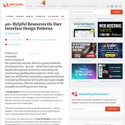
So I found it a little jarring when I visited the site to see this: My eyes puked from the motion sickness of not-knowing-where-to-look-oh-my-god-everything-is-everywhere-ness of the page. It’s a typical case of ‘designed for developers, by developers’, and I’m sure most regular Stack Overflow users have got used to it and don’t mind. Perhaps they even like it. But a little bit of care over the design could make a huge impact on usability for newcomers, and regular users too. Before I get to the details, some caveats: The site may very well be designed for optimum revenue rather than optimum usability. With those caveats in mind, I’ll continue with my public-complaining-because-it’s-easier-to-complain-than-create. This is unnecessary noise. Anyway. Here’s what I’ve come up with so far (click the image for a full-size version). 40 Helpful Resources On User Interface Design Patterns - Smashing Magazine. Advertisement If there is a commonly reoccurring need for a particular solution, there is a great probability that someone has – by now – solved that need and has finished the legwork involved in researching and constructing something that resolves it.
At the very least, you will find documentation on general solutions to related problems that will enable you to gain insight on best practices, effective techniques, and real-world examples on the thing you are creating. A design pattern refers to a reusable and applicable solution to general real-world problems. For example, a solution for navigating around a website is site navigation (a list of links that point to different sections of the site), a solution for displaying content in a compact space are module tabs. There are many ways to tackle a specific requirement – and as a designer – the most important thing you can do is selecting the option that best reflects the needs of your users.
Yahoo! Flickr Collections and Groups. [ i D 公 社 ] · 发现有意味的设计. Extratasty - Get your booze on! - Drink of the day is "oatmeal cookie shot" by sidesmirk. Applications of usability principles on a social network. In October 2008 I joined a great group of guys over at Daily Challenge to lend some creative firepower to an already blazing group of talented young individuals.
At that point, Daily Challenge was merely weeks into its first public beta release of its new socially-conscious-driven social network and sported an undesirable user interface that was begging for some creative attention. But that didn’t matter – as with any new age development team working on a new social media product, the goal was not to release a perfectly designed or developed site, but rather to get an idea out into the market quickly and start listening to the feedback. Fast forward 5 months and Daily Challenge releases its 2.0 website – the product of many long days and nights of usability sessions, focus groups, research, self-reflections, yoga desk calendars, and lots and lots and lots of attentive listening. And that’s what this post is about (in case you were wondering where I was going with all of this…). 1. 2. 3. Design work life.