
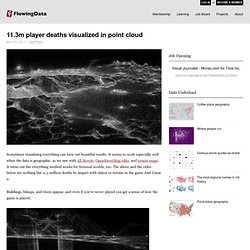
11.3m player deaths visualized in point cloud. Sometimes visualizing everything can turn out beautiful results.
It seems to work especially well when the data is geographic, as we saw with All Streets, OpenStreetMap edits, and tourist maps. It turns out the everything method works for fictional worlds, too. The above and the video below are nothing but 11.3 million deaths by impact with object or terrain in the game Just Cause 2. Buildings, blimps, and rivers appear, and even if you've never played you get a sense of how the game is played. Watch the video in its entirety below, best viewed in full screen HD. Mobile patent lawsuits. It seems like all the mobile groups are suing each other these days.

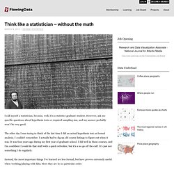
Who's suing whom? What company is suing the most? Who's getting sued the most? There was a mini-wave of graphics last week to help answer these questions. Typographic maps. Fictional map of online communities. Zombie survival guide. Music listening preferences by gender. Last.fm intern Joachim Van Herwegen has a quick look at listening habits by age and gender: The sizes of the artists' names indicate how popular they are, while their position shows the gender mix and average age of their listeners.
Based on the positions of the larger names, it’s already obvious which age category is most common amongst Last.fm users. With age on the horizontal and gender breakdown on the vertical, artists on the bottom left are those popular among young girls. Top right are artists popular among older men. Red Hot Chili Peppers and Radiohead appear to hit the universal sweet spot. How to win Rock-paper-scissors every time. I admit it.

When I first heard there are actual tournaments for Rock-paper-scissors, sanctioned by the World Rock Paper Scissors Society, I laughed. I mean seriously, $50k to the winner of a game that requires no skill whatsoever? Absurd. Boy was I wrong. Rock-paper-scissors isn't just a silly game kids play or a way to decide who has to be the designated driver at parties. Think like a statistician – without the math. I call myself a statistician, because, well, I'm a statistics graduate student.
However, ask me specific questions about hypothesis tests or required sampling size, and my answer probably won't be very good. The other day I was trying to think of the last time I did an actual hypothesis test or formal analysis. 100 Reasons You Should Be Interested in, Want to Share, and Get Excited About Data. Interactive Graph Visualization System – Skyrails. Data Visualization is Only Part of the Answer to Big Data. How can we now cope with a large amount of data and still do a thorough job of analysis so that we don't miss the Nobel Prize?
For the past year, I've been slowly drifting off my statistical roots - more interested in design and aesthetics than in whether or not a particular graphic works or the more numeric tools at my disposal. I've always had more fun experimenting on a bunch different things rather than really knuckling down on a particular problem. This works for a lot of things - like online musings - but you miss a lot of the important technical points in the process, so I've been (slowly) working my way back to the analytical side of the river. What different sorting algorithms sound like. Statistical literacy guides for the basics.
Journalism in the Age of Data. In the words of Terrell Owens, get your popcorn ready, because this video (below) is awesome.
Why I blog. I answered a few questions for Amstat News not too long ago, and the questions were centered around why I, as a stat grad student, take the time to write for FlowingData and why others should give blogging a try.
The questions were more from a career standpoint, but it really all comes down to this. It's fun. I have fun picking apart designs and playing with data. It's fun reading comments. It's fun looking at others' work. 7 Basic Rules for Making Charts and Graphs. Charts and graphs have found their way into news, presentations, and comics, with users from art to design to statistics.
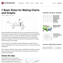
Rule #1: Check the data. Now that we've covered the 7 basic rules to graph design, it's time to go deeper, starting with the first: check the data. Rule #2: Explain your encodings. This is part two in a seven-part series on basic rules for graph design.
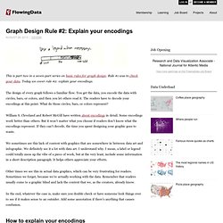
Rule #1 was to check your data. Today we cover rule #2: explain your encodings. Best of FlowingData – August 2010. It's been a hectic month. With one month left until my thesis defense, there's no letting up, and it's time to turn on the after burners. It's definitely been interesting though, culling everything I've learned these past five years. As it turns out, writing for FlowingData is actually a nice break from thesis-writing every now and then, so I've managed to keep things up and running around here. Thanks to everyone who has sent suggestions.