
Colouring. Hip Hop Kandinsky Murals by Nic Hahn on Prezi. Graphs Infographics. So you want to learn hand lettering? Startups, This Is How Design Works – by Wells Riley. The Importance of Frustration in the Creative Process, Animated. By Maria Popova “Before we can find the answer — before we can even know the question — we must be immersed in disappointment.”
Last week, Jonah Lehrer took us inside “the seething cauldron of ideas” with Imagine: How Creativity Works, his long-awaited (by me, at least) new book. Now, from Flash Rosenberg — Guggenheim Fellow, NYPL artist-in-residence, live-illustrator extraordinaire, and Brain Pickings darling — comes this wonderful hand-drawn teaser for the book, distilling one of Lehrer’s key ideas in Rosenberg’s signature style of simple yet visually eloquent line drawings. When we tell stories about creativity, we tend to leave out this phase. Omelas State University. These things should be simple: 1.

When, as an adult, you come come across another adult raping a small child, you should a) do everything in your power to rescue that child from the rapist, b) call the police the moment it is practicable. 2. If your adult son calls you to tell you that he just saw another adult raping a small child, but then left that small child with the rapist, and then asks you what he should do, you should a) tell him to get off the phone with you and call the police immediately, b) call the police yourself and make a report, c) at the appropriate time in the future ask your adult son why the fuck he did not try to save that kid. Adobe Museum of Digital Media. LunaTik Touch Pen: The Evolution of the Stylus by Scott Wilson + MINIMAL. "Thanks for stopping by!
If you have missed the LunaTik Touch Pen project, please come and visit us at LunaTik.com-- where you check out the latest news, updates and purchase product. We hope you will follow our progress!
Hollywood Designers Featured on Video – and a Filter Foundry Exclusive Promo! Inspiration, Resources March 5, 2012 We’ve teamed up with Filter Foundry to give you some videos to devour for a change, from Hollywood designers who have exclusive tutorials up on their network!

They’re also generously giving You The Designer readers an exclusive promo code to sign up on Filter Foundry with, for free. Check all this out below! How to Find the Right Graphic Design Clients. Hitmo - hittin' the web. A CRAP way to improve usability. Within the field of user experience, visual design is sometimes perceived as a bit of an outsider.

LA CÁSCARA AMARGA. How Helvetica Conquered The World With Its Cool, Comforting Logic. This is the second excerpt from Just My Type.
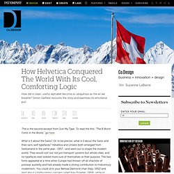
To read the first, "The 8 Worst Fonts in the World," go here. What is it about the Swiss? Or, to be precise: what is it about the Swiss and their sans serif typefaces? Helvetica and Univers both emerged from Switzerland in the same year--1957--and went out to shape the modern world. They would sort out not just transport systems but whole cities, and no typefaces ever looked more sure of themselves or their purpose. A Glimpse of Inspiration: 35 Gorgeous Package Designs. The Horrors of Graphic Design. A very important part of a designer’s ability to create magic is the ability to focus on the project at hand.

The need to stick to the brief and create something that the client wants is of utmost importance, even more so than creativity itself. However, in our quest to hit the highs of our professions, many designers tend to overlook the kind of work they should be doing and replace it with the kind of work they want to do. Here’s a look at some common mistakes that designers tend to make: Missing the Point There are plenty of design creations out there that are completely fantastic when it comes to appearance and the overall effect, however, when it comes to highlighting the product or service, they are complete failures.
The Talented Young Mr. Wiggleworth (Ogilvy New York) - Neat Designs. Nathan Wiggleworth is a talented young Art Director who currently works for Ogilvy in New York.

Only 2 years ago, when his career started to rocket, he was still a student of Art Design. Now, in just 24 months, he has in his portfolio the campaigns from Doritos, Minute Maid or Smartwater.
15 Hilarious Examples Of Poster Designs. I love posters and I collect them either printed or digital.

A great poster can help get motivated, inspired or it will simply make you laugh. In this article you will see 15 hilarious poster printing designs which will surely put a smile on your face. Happily Ever After. 99 Creative Logo Designs for Inspiration. Achieving a well designed logo requires really hard work and being up to date with the latest trends in design.
It's probably the best way of establishing brand identity, making an impact on customers and ensuring that they'll remember your site and come back for a second visit. Most logos communicate ideas, for instance the kind of quality services a company can provide for its customers. Today we've gathered 99 creative logo designs for your inspiration, hope you find them useful. Take a moment and let us know which are your favorites in the comments below. Stylectrical: An Exhibit Exploring Apple's Evolution Under Jony Ive. When Apple held its public "Celebrating Steve" memorial, it’s no coincidence that the eulogy was delivered by Jonathan Ive. Promoted by Jobs to Senior Vice President of Industrial Design in 1997, Ive oversaw the product design of Apple’s incredibly successful return to power.
The Museum für Kunst und Gewerbe Hamburg is running a retrospective exhibition that examines the history of Apple’s industrial design under Ive. The exhibit is curated from a cultural studies context and is a wide survey that ranges from formal influences to the economic effects of Apple’s iconic products. The big attraction of the exhibition is the museum’s comprehensive collection. They boast that it contains every product produced by Apple under Ive. 11 Great Examples Of How A Logo Is Born. Creating a logo is a hard thing to do because you have to emphasize a whole ideology in just one illustration. You can’t afford to screw it up because the logo will be as important as the company’s name, so that’s why is vital to create something great. What to Do When Someone Steals Your Work. How do you feel when someone steals your ideas? Nike Better World. Why Infographics Matter [Video] Photoshop vs Fireworks in Web Design - The Last Battle.
Most people try to compare Fireworks and Photoshop in the field of web design. Everybody knows that a lot of things you can do in Fireworks, can also be made in Photoshop. This is a fact but is not demonstrating that Photoshop was built for making screen layouts. It was built for image editing, image manipulation. In fact, it’s the best image editing software available on the market, since 2003, when it first appeared.
15 Top Resources For Learning Photoshop Online. Adobe Photoshop is one of the most powerful and impactful photo editing program that can turn your imagination into reality without any hitch. 45+ Free Lessons In Graphic Design Theory. Sep 15 2011 Considering how many designers are self-taught, either in whole or in part, the importance of a solid foundation in graphic design theory is often overlooked. Open Source CartoSet Makes Beautiful Maps Fast & Easy. Don’t Do TOO Good Of A Job! Maybe this is happened to you. Adobe's Muse Lets Designers Make Websites Without Knowing Code.
Adobe makes programs like InDesign, Illustrator, and Photoshop, which enable nearly every graphic designer on the planet to create nearly every piece of visual content you've ever laid your eyes on. Naturally, their bread and butter is making graphic designers happy. So their newest product, Muse, hopes to make life even easier for designers--specifically ones working in more traditional mediums who are being tapped to take on more web-based projects--as an ultra-simplified, graphically focused tool for making websites. Muse's biggest selling point is that designers don't have to learn code (or "markup languages") like HTML, CSS, or Javascript to break through the barrier of designing for the Internet.
Periodic Table of Typefaces. Beautiful Catalog Design Ideas to Spark Creativity. Inspiration August 17, 2011. Make Grids Quickly in InDesign. This article originally appeared in InDesign Magazine #37, August/September 2010. Understand the Psychology of Design. ChangeOrder: How to Conduct Post-Mortem Project Evaluations. These Brands Allow Users To Design Them. How'd They Pull It Off? An Ex-Pixar Designer Creates Astounding Kids' Book On iPad. Sylvia Harris : 1953-2011. Create. propagate. motivate. Citizen Research & Design. Competition: five copies of Folding Techniques for Designers to be won. Adobe Fireworks For Beginners. Lord of Design - Download free graphic design, vector, brushes, psd, photoshop.
UCreative.com.