
Multi-column layout. Home / CSS3 Previews / Multi-column layout W3C offers a new way to arrange text “news-paper wise”, in columns.
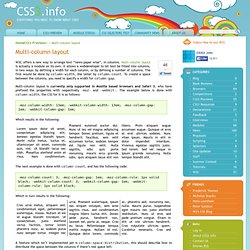
Multi-column layout is actually a module on its own. It allows a webdeveloper to let text be fitted into columns, in two ways: by defining a width for each column, or by defining a number of columns. The first would be done by column-width, the latter by column-count. To create a space between the columns, you need to specify a width for column-gap. Selectivizr - CSS3 pseudo-class and attribute selectors for IE 6-8. LESS « The Dynamic Stylesheet language. v0.3.8 documentation - lessphp. Documentation v0.4.0 lessphp is a compiler that generates CSS from a superset language which adds a collection of convenient features often seen in other languages.

All CSS is compatible with LESS, so you can start using new features with your existing CSS. It is designed to be compatible with less.js, and suitable as a drop in replacement for PHP projects. LESS compiler in PHP - lessphp. New: lessphp 0.4.0, compiles Bootstrap 3, breaking changes, see Changelog (August 9th 2013) About lessphp is a compiler for LESS written in PHP.

The entire compiler comes in a single includable class, but an additional command line interface to the compiler is included. It will run on PHP 5.1+. #928292: Use LESS or other CSS preprocessor. v0.3.8 documentation - lessphp. Using SVG in CSS with JavaScript detection. Warning This article was written over six months ago, and may contain outdated information.

With the release of IE9 and Firefox 4 all major browsers are going to support using SVG in the img element or as a CSS background image, which is great news as SVG images are good for high definition, scalable websites. I’ve written a couple of posts recently about using SVG with the background-image property, and how to cope with browsers that don’t support it. The method I came up with works, but is far from elegant; for one thing, it doesn’t allow for transparency. Another approach we can take to the problem is to use JavaScript to detect SVG support. Alexis Deveria wrote a script which detects if your browser supports SVG and, if not, replace the images with PNG. I’ve come up with a script based on Alexis’s, but which simply adds a class to the body of the document, allowing you to specify alternative images if SVG support isn’t implemented on a visitor’s browser.
Here’s the script: Generateur d'ombrage via box-shadow en CSS3 - Design et programmation web2 - Dji. Download Hundreds of Free @font-face Fonts. CSS Typography: The Basics. CSS Typography: Examples and Tools. In the previous part of this series, we discussed some techniques and best practices for CSS typography.
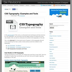
Let’s now delve into the subject further by looking into some case studies, tools, as well as a showcase of excellent CSS typography on the web. This is the third part of a three-part series of guides on CSS typography that will cover everything from basic syntax to best practices and tools related to CSS typography. Typetester – Compare fonts for the screen. Typograph – Scale & Rhythm. This page falls somewhere between a tool and an essay.
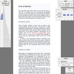
It sets out to explore how the intertwined typographic concepts of scale and rhythm can be encouraged to shake a leg on web pages. Drag the colored boxes along the scale to throw these words anew. For the most part, this text is just a libretto for the performance you can play upon it. Choosing sizes Don’t compose without a scale. Of course, good typesetting requires something more than selecting a series of font sizes, just as music consists of something more than choosing notes. Vertical Tempo Most pages of continuous prose pulse with a particular vertical rhythm, established by the lines of its main words, sentences, and paragraphs. For this, Bringhurst suggests another rule of thumb: Add and delete vertical space in measured intervals. Size and rhythm make each other interesting.
Sizing up the <body> The first step: establish the size of the main text. Here, it pays to work with the grain. Declare <body> font-size using % The em. CSS Typography: Techniques and Best Practices. In the first part of this series, we discussed some fundamental concepts pertaining to CSS typography.

Now we are going to cover some excellent techniques, tips, tricks and best practices for dealing with typography on websites. This is the second part of a three-part series of guides on CSS typography that will cover everything from basic syntax to best practices and tools related to CSS typography. Better Web Typography with @font-face For normal text blocks, using smart font stacks (as discussed in the first part) is a good idea, but for headings and short text blocks, more interesting fonts can be used with the help of @font-face.
When implemented correctly, @font-face is compatible with a wide range of browsers — yes, even IE. Just include a copy of the font’s file on your web server and use the @font-face rule in your CSS code as follows: Linear Gradients. Layout Galaj. All layouts use valid markup and CSS, and have been tested successfully on Internet Explorer/win 5.0, 5.5, 6 and beta 2 preview of version 7; Opera 8.5, Firefox 1.5 and Safari 2.

Each of the columns could be the longest, and for testing columns length I've used the script filler text on demand. Each layout could represent a site with five main sections: header, content, navigation, other stuff and footer. The basic markup, common to every layout, is the following: Animate.css - a bunch of plug-and-play CSS animations. Typekit. CSS3 Gradient Generator.