
DAN CASSARO - YOUNG JERKS - Design/Animation/Illustration. Typography. Beautiful black and white labels for Buddy’s 2012 holiday mulled wine. Not only does the wine come with a beautiful label, it is wrapped with a minimal version of the logo and sealed with a custom wax seal. Tags | mulled wine, wax seals, wine design. Design / typography. BREANNA ROSE. A Beginner’s Guide to Pairing Fonts. Pairing fonts can be a challenge.

Selecting two or more fonts which work well is one thing - selecting two which work together to achieve your typographic aims may have you reaching for the aspirin. Let's see if we can alleviate any headaches. This guide will help you get started with font pairing for the web. Luckily, typography has been around a lo-oong time. Typographic rules and conventions have had plenty of opportunity to establish themselves and there are loads of resources to help you out.
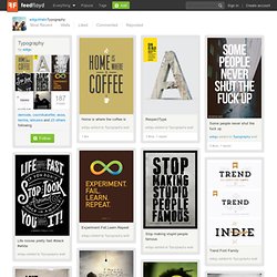
Here's a quick breakdown of what we'll cover in this guide: Your Aim Keep the essentials in mind. How Many Fonts Should I Use? How many fonts you throw into the mix is entirely up to you, but bear in mind the overall effect you're trying to achieve. Make sure that there is some charisma in the group though; eight people with little to say just results in a toe-curling wait for the speeches.. There are no rules to say you should or shouldn't use a specific number of fonts on a page layout. Suggested Users to Follow. Typography by edigu. EdiguWallsTypography Typography by edigu demode, cezmikalorifer, esse, temha, ebruska and 23 others following Follow RepostLike Home is where the coffee isedigu added to Typography wall 1 like RespectTypeedigu added to Typography wall 3 likes, 1 repost Some people never shut the fuck upedigu added to Typography wall 6 likes, 1 repost Experiment.Fail.Learn.Repeatedigu added to Typography wall Stop making stupid people famousedigu added to Typography wall Life moves pretty fast #black #whiteedigu added to Typography wall Trend Font Familyedigu added to Typography wall Falling In Loveedigu added to Typography wall 3 likes Don't gain the world and lose your souledigu added to Typography wall i'm easy boy and this is what i mean!

House Industries. Photo-Lettering. Marian Bantjes. 100 Días de tipografía. AisleOne - Graphic Design, Typography and Grid Systems. Tag "Typography" on Smashing Magazine. Typography Served. How to Choose a Typeface.
Advertisement Choosing a typeface can be tricky.

The beauty and complexity of type, combined with an inexhaustible supply of options to evaluate, can make your head spin. But don’t be baffled — and don’t despair. While there are no easy-to-follow rules on how best to choose a typeface, there are many tried-and-true principles you can quickly learn and apply to make an appropriate typeface choice. If you work systematically through the options below, you’ll have a winning typeface choice in no time. What Is Your Goal? The first thing you have to do in order to choose a typeface is form a strong impression in your mind about how you want your audience to react to the text. Perhaps the hardest part of breaking down the typeface selection process is understanding which parts are more subjective and which parts are more objective. Legibility It may seem at first glance that legibility and readability are the same thing, but they are not. Quick tips for great legibility: Readability.