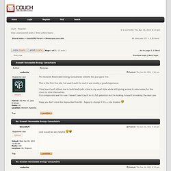

View topic - Ecowatt Renewable Energy Consultants. The ''link'' looks like normal text, unless rollover better if you put Link here >> Looks OK, but i'm no fan.

Firstly I don’t like the style, the way everything is low on quality, its bring the website down. Next the links, nav bar should be made with CSS rather than image. 90% of the people use a mobile phone to browse the internet, make sure its friendly. The first page is the most important page of a website, never ever drag, i tend to find that a small section for what you do and what ur about, what u supply, and a list of prices, even if there base. Split it up into section, its better for the eyes, easy to navigate and deffo will attract more people. In-line documents, always make sure the page is inline with the rest, yours is not as its not flush with the banner, it looks total poo. Its abit low on quality, goods, and in your face, you don’t want a boring website nor do you want one that flashes like a fair ground but looks neat, smart and attracts..
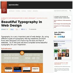
Beautiful Typography in Web Design. Typography is a very important part of web design.

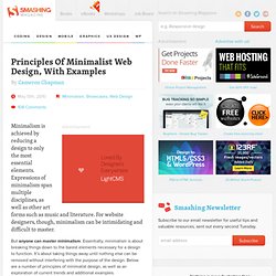
By using different types of typography like big headlines and bold fonts web designers are improving the look and feel of websites. So in this post we have compiled some beautiful typography for your inspiration. kylemkramer wakwaw denisechandler moresoda eeharbor steedicons. Principles Of Minimalist Web Design, With Examples. Advertisement Minimalism is achieved by reducing a design to only the most essential elements.

Expressions of minimalism span multiple disciplines, as well as other art forms such as music and literature. For website designers, though, minimalism can be intimidating and difficult to master. But anyone can master minimalism. Essentially, minimalism is about breaking things down to the barest elements necessary for a design to function. You might also enjoy our previous article “Showcase of Clean and Minimalist Designs1.” Less Is More “Less is more” is probably the most well-known catch phrase of the minimalist movement. In Web design, less is more is achieved by using only elements that are necessary to a given design.
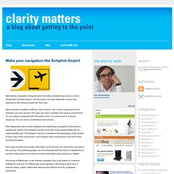
Examples North Kingdom2 Simple, straightforward typography and a bare use of color make for a design that’s aesthetically pleasing but minimal. Sleepover3 A simple design that puts content above all other elements. Omit Needless Things Subtract Until It Breaks. Derk van Mourik. Make your navigation like Schiphol Airport – Clarity matters. Web writers, interaction designers and information architects can learn a lot from Amsterdam Schiphol Airport.

Like the airport, our work depends on good user experience and helping people find their way. Many website navigations offer too many choices. As a result, people get lost. At Schiphol, you can’t get lost. The signs are clear, consistent and easy to comprehend. Paul Mijksenaar and his team designed the wayfinding (navigation) at Schiphol to address the needs of the stressed traveler. Each sign provides just enough information so the traveler can decide the next step in the journey. According to Mijksenaar, a user friendly navigation has a big impact on customer satisfaction and trust. You can do the same when you create the navigation of your next website. Does Good Web Design Really Matter? Portfolio. Web Design, Web Development and Graphic Design Resources. The Ingredients. Modern Comfort Food —