
LIVE Singapore! 10 significant visualisation developments: January to June 2011. The popularity of the data visualisation field continues at a real pace, with outstandingly innovative designs penetrating hitherto uncharted mainstream territories and thoughtful writing providing a binding narrative backdrop.
Of course there continues to be many unanswered questions and challenging issues, not least in the form of the myriad examples of weak, misguided practice. However, its the positives that I’m focusing on and I’d like to mark the half-way point of 2011 with a collection of the 10 most prominent, memorable, significant, progressive and (personally) appealing developments of the year so far.
There may be some surprising selections here, in some people’s eyes, but there’s good reason behind my inclusion of each one – they all contribute directly or indirectly, intentionally or otherwise, to furthering the progress of the field. And so, in chronological order… 1. 2. 3. LIVE Singapore! 4. 5. 6. 7. 8. This work would probably have made it on most peoples’ top ten list. 9.
What’s Your Better Life Index? Your Better Life Index is designed to let you visualise and compare some of the key factors – like education, housing, environment, and so on – that contribute to well-being in OECD countries.
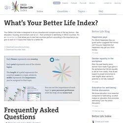
It’s an interactive tool that allows you to see how countries perform according to the importance you give to each of 11 topics that make for a better life. What’s the point of Your Better Life Index? There’s been a lot of debate lately on measuring the well-being of societies – is wealth all that matters, or should we be looking at other things, like the balance between work and the rest of our lives? The Index aims to involve citizens in this debate, and to empower them to become more informed and engaged in the policy-making process that shapes all our lives. Return to top Why choose 11 topics of well-being? Since it was founded in 1961, the OECD has helped governments design better policies for better lives for their citizens.
What countries does the Index cover? Which country is #1? Lots! Credits. The Best Data Visualization Projects of 2011. I almost didn't make a best-of list this year, but as I clicked through the year's post, it was hard not to.
If last year (and maybe the year before) was the year of the gigantic graphic, this was the year of big data. Or maybe we've gotten better at filtering to the good stuff. (Fancy that.) In any case, data graphics continue to thrive and designers are putting more thought into what the data are about, and that's a very good thing. So here are my favorites from 2011, ordered by preference. 1. While creator Mike Bostock made the initial commit to GitHub in late 2010, D3 hit its stride in 2011. 2. Who knew carrying around a stick that detects WiFi vertically could be so informative? 3. Media artist Roger Luke DuBois used online dating data to show the uniqueness of cities in America. 4. From Bloom, Planetary is an iPad app that visualizes your iTunes music as a solar system, bringing your data into a more playful and exploratory context. 5. 6.