
Design-centric Thoughts on Apple's iPad. The veil was lifted this morning on Apple’s latest product (and product category).
So here are a few thoughts from me about the iPad. The Market The iPad is not a laptop nor is it a smart phone. It is a couch device, a bedroom device (don't read that the wrong way), and a kitchen device (swivel it to cook from a recipe you find online). In all these places, a laptop always felt wrong. Instead think of it a digital version of your leisure time activities –reading, chatting, light gaming, surfing, etc. I suspect Apple tried to drill this point home by having all their keynote presenters sit in a big comfy chair while using the iPad. Now some might note that the modern Web is as much about creation as it is about consumption and that people are no longer just consumers of media –they are participants in the conversation.
So what about the inclusion of productivity tools like iWork (word pressing, presentations, spreadsheets) in the iPad release? Tablet-Specific Applications The iPad Case. Adobe Fireworks tutorials and Downloads. Understanding em Units in CSS. Due to developers’ habitual reliance on pixel values, I think some of us may not have a full understanding of what the em unit is, and how it works in CSS.
As is the case with many topics I write about, I’ll probably learn a thing or two while writing this. So I hope this will serve as a nice summary of what em units are all about and how you can use them in your designs. Ah-em — Definition Please The spec gives us a very simple definition for the em unit: Equal to the computed value of the ‘font-size’ property of the element on which it is used. In other words, if you have the following CSS: Then this means 1em defined on that element, or any of its children, would be equal to 20px. So if you did this: Then that means that the width and height of the element (defined here as 4em x 4em) would compute to 80px x 80px (20px * 4 = 80px). 50 Reasons not to use Photoshop for Webdesign.
First things first, I love Photoshop.
It is the world’s best program for image editing. I do not intend to say Photoshop is a bad program, I just wish to clear up the misunderstanding that Photoshop is the right tool to use for web and screen design. Photoshop was designed to be used for image manipulation. It was not designed to create effective pixel-precise layouts for computer screens, or to make quick changes to screen layouts. Photoshop tends to be used for this purpose however, because users are familiar with the program, and are not aware that Fireworks was designed for this specific purpose. Users generally try to compare Fireworks with Photoshop. Password Protect A Web Page Tutorial. HTML5 and CSS3 in Dreamweaver CS5.5 – Part 3: Using CSS media queries to target different screen resolutions. This is Part 3 of a three-part tutorial series exploring the HTML5 and CSS3 features in Dreamweaver CS5.5.
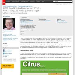
In Parts 1 and 2, you built and styled a web page for a fictional restaurant, Citrus Café, using HTML5 structural elements and CSS3 properties, including rounded corners, and text and box shadows. In this final part, you'll optimize the page for display in devices at smaller resolutions, using CSS media queries and a site-wide media queries file. CSS media queries let you target style rules for different devices by specifying conditions, such as the maximum and minimum screen width. You need only one version of the HTML markup; the main styles are in a style sheet that's served to all devices; those with smaller screen resolutions get different styles that override some properties. To follow this tutorial, you should have completed Parts 1 and 2. At the end of Part 2, you had styled the home page of the Citrus Cafe website for optimal display in a desktop computer (see Figure 1).
Flash CS5 - Smoke tutorial. Pearltrees. WayFinder NYC - Find the nearest and best directions to New York City subway and NJ Path stations on your Android phone. Free Website UI Wireframe Kits & Stencils. Wireframes allow for the development of variations of a layout to maintain design consistency throughout the site.
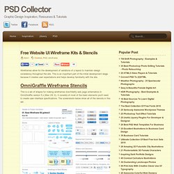
This is an important part of the initial development stage because it creates user expectations and helps develop familiarity with the site. This is a set of shapes for making wireframes (low-fidelity web page schematics) in OmniGraffle version 5.x (Mac OS X). It consists of most of the basic elements you'll need to create user interface specifications. The screenshots below show all of the stencils in this set. Work smarter with Fireworks symbols. Work smarter with Fireworks symbols Working with wireframes can make planning and early layouts more efficient.
But you can make the process even faster by creating your own Fireworks Symbols Library. I've written in previous columns about how working with wire-frames and grey-box page layouts during a site's planning and early design stages can improve efficiency and enable client sign-off points. At Stuff and Nonsense we now work on wireframing for every project and I have found that clients appreciate the thoroughness of the approach. Video - The Problem with Software Definition. Video - Why Visualize? Awesome Things That Firefox’s Web Developer Extension Can Do. Chris Pederick’s Web Developer extension for the Mozilla Firefox browser is one of the best tools in a web developer’s arsenal.
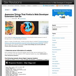
About a couple of months ago, I wrote an article about it entitled "9 Practical Ways to Enhance your Web Development Using the Firefox Web Developer Extension" and I’d like to follow up on that by showcasing even more things you can do with the Firefox Web Developer extension. 1. Determine server information of a website.
Ever wondered what your favorite website uses for their server technology? If so, you can quickly view the website’s HTTP response headers by using "Information > View Response Headers". The following example shows Digg’s response headers: We can see in the above example that Digg uses an Apache server and PHP 5. Heading over to Microsoft’s homepage, we can see that they – in turn – use an IIS 7.0 server and the ASP.NET framework: 2. CodeBurner for Firebug.
SharePoint. Ajax. CSS. HTML5. jQuery Gems. Mobile.