
La Grosse Sélection Typographique. Pkd | On Faire une grosse sélection typographique est un magnifique petit défi.
Bien entendu, cette sélection sera totalement subjective. Vous trouverez donc dans l’article qui suit mes derniers coups de coeurs dans le vaste monde de la typographie. Et c’est pas moins de 16 artistes aux styles différents que je vous présente en image ci-dessous. Thank a Type Designer. Typographer's Glossary. Serif: Serif's are semi-structural details on the ends of some of the strokes that make up letters and symbols.

A typeface that has serifs is called a serif typeface (or seriffed typeface). Some of the main classifications of Serif type are: Blackletter, Venetian, Garalde, Modern, Slab Serif, Transitional, and Informal. Fonts in each classfication share certain similiar characteristics including the shape or appearance of their serifs. Serif fonts are widely used in traditional printed material such as books and newspapers. BERNARD & CHEVILLARD. Trafic design. Typografika. Balla Dora Typo-Grafika. Merci Bernard. BTS design graphique - Page 3 - BTS design graphique. Picto/JO les pictogrammes des JO de Beijing 2008 intègrent l'effet pictographique des gravures sur carapaces, os ou bronzes connues dans l’antiquité Chinoise avec des traits simplifiés de la calligraphie moderne, ce qui fait que ces pictogrammes sont facilement reconnaissables et identifiables. 40 ans plus tôt, le prestigieux graphiste Lance Wyman, créa une série de pictogrammes pour les JO de Mexico en 1968; en s'inspirant de l'art mexcicain; depuis il est reconnu comme l'un des pères de la signalétique environnementale.
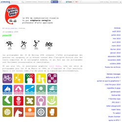
Les pictogrammes sont des repères indispensables pour chacune des disciplines des JO; vous pouvez trouver un aperçu des différents styles de chaque sur le site du musée des Jeux Olympiques. Jason Munn, en avant la musique ! Bordeaux Métropole : 1 système et 28 logos. En 2014, la loi de Modernisation de l'action publique territoriale et d'affirmation des métropoles a validé la création de la métropole du Grand Paris, ainsi qu'une dizaine d'autres en France.
Qui dit nouvelle entité, dit nouvelle identité et en ce début d'année, c'est Bordeaux Métropole qui dévoile une partie de son nouveau logo. Vector Guild. GRAPHISME & COMMUNICATION VISUELLE. Une intrusion dans l'univers des fontes. Alphabet buildings. Hi, Imagine all of the buildings that are around us were in the form of letters that’ll be cool and weird at the same time.
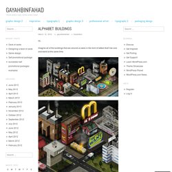
Building the Alphabet. An elaborate lettering project by Jing Zhang.

View more at Behance Network. Graphics © Jing Zhang Link via Behance Network By Adriana de Barros Adriana is founding editor-in-chief and award-winning designer of Scene 360's Illusion. Giornale Nuovo: Steingruber’s Alphabet. The feebles. Dernier Cri. Le Tampographe Sardon. Aristographiste. Diogo Machado. Ivan henao. V-ray HDRi et VraySun. Je vous le dis tout de suite cette technique n’est pas de moi mais de l’excellent Peter Guthrie.
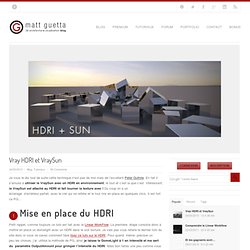
En fait il s’amuse à utiliser le VraySun avec un HDRI en environnement, le tout et c’est la que c’est intéressant, le VraySun est attaché au HDRI et fait tourner la texture avec ! Du coup on a un éclairage d’extérieur parfait, avec le ciel qui se reflète et le tout mis en place en quelques clics. Il est fort ce PG… Petit rappel, comme toujours ce tuto est fait avec le Linear WorkFlow. Cento lodigiani portfolio. My personal take on the 12 basic animation principles, applied to a simple shape: the cube.
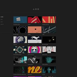
Check also the animated gif gallery here the12principles.tumblr.com/.Animation, Cartooning, Directing2014 Three short stories that take place during the sunset. Tragically, it's going to be the very last sunset experience for all of the main characters involved.Animation, Directing, Film2013 Playatta’s mission is to bring pure, simple FUN to any event. Léon FY. Free. Blog » 10 BEST TYPE FOUNDRIES OF 2013. As Google continues to strive towards world domination, they are dipping their digital fingers into everything, including fonts.
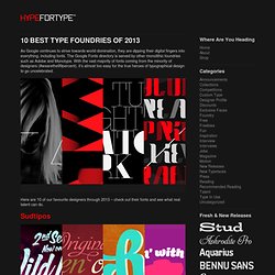
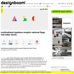
The Google Fonts directory is served by other monolithic foundries such as Adobe and Monotype. With the vast majority of fonts coming from the minority of designers (#wearethe99percent), it’s almost too easy for the true heroes of typographical design to go uncelebrated. Here are 10 of our favourite designers through 2013 – check out their fonts and see what real talent can do. Sudtipos. The Northern Block - Font Foundry. Multinational typeface morphs national flags into letter forms. Apr 29, 2014 multinational typeface morphs national flags into letter forms multinational typeface morphs national flags into letter formsall images courtesy of luis fabra luis fabra and a team of designers have created ‘multinational typeface’, a 106-letter font based on national flags. by abstracting and breaking down the emblematic symbols of various countries to their most basic geometry, the designers brand each global location with both the colors and shapes that represent them most clearly. the letter forms have been designed for the singapore branch of the international advertising firm grey as an identity tool for their own multinational team and as a clear and communicative signage tool for their new offices. the 106 letters based on national flags multinational typeface — @ grey singaporevideo courtesy of grey group singapore geometric forms are amassed into the typeface applied onto the wall, the font can be used to spell various words placed with the office setting.
Interview with wally olins of saffron brand consultants. Feb 20, 2014 interview with wally olins of saffron brand consultants top image: wally olins photographed by tomasz makolski, image courtesy of poland today wally olins was born in london (1930) and educated at oxford, where he read history. upon graduating he entered the world of advertising, before eventually becoming ‘the world’s leading practitioner of branding and identity’, according to the financial times. he is currently the chairman of saffron brand consultants and was formerly the chairman of wolff olins (1965-1997). he has advised many of the world’s leading companies, including renault, repsol, british telecom, volkswagen, TATA and lloyd’s of london and has also worked with many countries, regions and cities. over 250,000 copies of his books have been sold in 18 languages, including the seminal works, corporate identity, wally olins on b®and and the brand handbook. his new book, ‘brand new – the shape of brands to come’ will be published by thames & hudson on 7th april 2014.
Interview with illustrator olimpia zagnoli. Mar 05, 2014 interview with illustrator olimpia zagnoli we recently spoke to the mialn-based illustrator olimpia zagnoli about her work. DB: what was the thing that initially made you want to be an illustrator? OZ: the chance to indulge in daydreaming and ‘graphomania’. Interview with graphic designer rejane dal bello.
Mar 13, 2014 interview with graphic designer rejane dal bello rejane dal bello is a brazilian graphic designer and illustrator currently based in the UK. rejane previously worked at studio dumbar in the netherlands and is now a senior design at wolff olins‘ london office. DB: please could you tell us briefly about how you came to be a graphic designer? RDB: it’s hard to know what made me want to become a designer. Interview with graphic designer ruedi baur. Mar 25, 2014 interview with graphic designer ruedi baur top image: ruedi baur photographed by c.scholz designboom recently spoke to ruedi baur, founder of intégral ruedi baur, a graphic design studio in paris that specializes in identity and wayfinding projects for the cultural sector. Interview with the original champions of design. Mar 27, 2014 interview with the original champions of design we recently spoke to jennifer kinon and bobby c. martin jr. founders of the original champions of design (OCD), a branding and design agency based in new york.
Interview with ije nwokorie, MD at wolff olins london. Apr 02, 2014 interview with ije nwokorie, MD at wolff olins london interview with ije nwokorie, MD at wolff olins london ‘ije nwokorie was born in the US, bred in nigeria, and enlightened in england’ – as managing director of wolff olins london, he leads the team in facilitating and delivering game changing brands and innovation for corporations. at the recent design indaba conference he told designboom more about his work and influences.
DB: please can you tell us about your background, key influences and how you came to work at wolff olins? IW: the job I have today is a mix of brand strategist and a creative tech innovator. typically this means working closely with leaders of big, complex organizations to help them do something radically different so that they stand out in the crowd. Interview with graphic design studio europa.
Apr 17, 2014 interview with graphic design studio europa top image: mia frostner and robert sollis europa is a graphic design studio formed in 2007 and based in london. it is run by mia frostner, robert sollis and paul tisdell, (paul currently lives in australia and is a sleeping partner for time being). for the past six years europa have been designing books, publications, signage and graphic identities for clients who are operating predominately in the public or cultural sector. a significant part of europa’s practice is directed towards education. europa run the second year of the BA graphic design course at camberwell college of art, and have run workshops at the architectural association, danish design school, écal, glasgow school of art, konstfack, london college of communication and typography summer school.
Kate Forrester. Carl DeTorres Graphic Design. Metroplastique. SupaKitch.