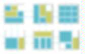
Baseline - a designer framework by Stephanecurzi.me. “Real” baseline grid on the web When I first started to design Baseline, I wanted to base the grid on the work of Josef Müller-Brockmann, unfortunately some missing CSS attributes — like type leading — kept me from implementing a true grid based approach.
I then decided to another look at the basic grid used in print: the baseline grid. Most frameworks and examples of baseline grids simply put the type on a regular line-height, but one problem with this approach is that the text rarely lines up correctly between columns and headlines — H1 through H6. Baseline try to align to the font metric to correctly line up headlines, paragraphs, form labels and any other major elements on the page baseline, creating a harmonious layout. How to use Baseline Baseline can be used in many different ways. Download The .zip file includes the full set of CSS files both for development and deployment, a Photoshop base document and a full set of HTML templates and examples. Going from 0.2 to 0.5 Version 0.5.1. Setting Type on the Web to a Baseline Grid. We web designers get excited about the littlest things.
Our friends in the print world must get a kick out of watching us talk about finally being able to achieve layouts on the web that they’ve taken for granted for years. Let’s face it: it’s easier these days to embed a video on the web than it is to set type consistently or align elements to a universal grid. But we’re scrappy folks, web designers. We don’t give up easy. In the long slow battle with browser support and platform inconsistencies, we’ve been able to bring more and more sophisticated print techniques onto the web—sometimes kicking and screaming. We have the technology#section1 Over the last year or so, there’s been a lot of talk about grid systems and using column grids for website layouts. We can apply the same principles of proportion and balance to the type within those columns by borrowing another technique from our print brethren: the baseline grid. In print, it’s not that hard.
Firing up the grid#section2. A Typographic Approach to Email. In our on-going pursuit of trying to improve readability and usability of digital products and services, one thing that’s always struck us as odd is the way typography of email applications has been left untouched since the early days of the internet.
Even modern applications released in the post-pc era mostly forget about this, focusing on new ways of managing your inbox, various forms of social integration, or on the appearance of a flat surface instead. We believe that email is about two things. Reading and writing. And that focusing on these two is what would truly move email to where it deserves to be. What we propose here is not a redesign of any particular email application. Opening up most of todays email applications, desktop or web, will look somewhat like the image pictured below. A Readable Wikipedia. We love Wikipedia.
The idea of a constantly updated knowledge base where everyone is welcome to read and contribute is staggering, and we dip into this great pool of content on an almost daily basis at 1910. However, having spent the last three years learning more about typography has made us aware of its limitations. While Wikipedia is great for learning, it simply does not provide the best possible environment to do this. Utilité des grilles de mise en page. TypoGraphie Web et Papier. Typographie : La mise en page modulaire. Les ouvrages dits de consultation, les livres scolaires, techniques, scientifiques..., les encyclopédies, les catalogues, les magazines ou revues périodiques, les supports publicitaires (encarts, déliants, brochures....), certains imprimés administratifs et commerciaux, font plus ou moins largement appel à l'illustration afin de préciser, de confirmer, de démontrer, voire d'agrémenter le texte qu'elles accompagnent.
Ainsi, la fonction fondamentale des illustrations consiste bien à servir le texte en le conservant la préoccupation de concevoir, pour le produit de communication, un ensembles de textes/images qui présente au lecteur un ensemble harmonieux et logique. Pour cela, on établira des gabarits, des grilles, des travaux types, des grilles de mise en page modulaire. I. Création et utilisation d'une grille. Calculer une grille de mise en page « typo » avec le nombre d'Or.
100 Principes universels de mise en page ...(extraits)