
Top Ten Signs You're a Designer. Ukipchristmas.wordpress. Responsive Advent Calendar. Free Range Rotisserie Chicken Restaurant & Bar. 7 Tips For Designing On A Budget. In the U.S. alone, sales by small businesses account for 54% of the country’s total sales and provide 55% of all jobs, according to the U.S.

Small Business Administration. National Small Business Week is here and while it’s clear that small business is big in the U.S., resources for marketing and design are often anything but. When the Stanford Persuasive Technology Lab asked consumers how they evaluate a website’s credibility, nearly half said design was the number one criteria. Tumblr’s New App Has 3.3 Billion Unique Designs. Sure, you can change your poster image and your avatar as much as you’d like.

But whether it’s Facebook, Twitter, or virtually any other social-media site, your identity and feed can only fit into one strict template. You are but a series of unique photos trapped in an otherwise universal layout. Tumblr wants to change that with their updated iOS and Android app, launched today. The new app will for the first time enable users to edit their Tumblrs on mobile devices. But a lot of services offer that option already. “Mobile is so young, and there’s so much to be done, but I feel like this is a big step,” says Tumblr creative director Peter Vidani. Users can change their layout by going into the edit tab and then simply touch anything they’d like to change. More importantly, this is just one step in Tumblr’s aggressive strategy to promote mobile-based editing. The challenge will be deciding exactly where to draw lines in the layout sand.
Google's 25 Rules For Building A Better Mobile Site. Some mobile websites are borderline unusable, forcing you to squint and peck around in hopes of finding whatever piece of information you need.

But others seem to fit your phone like a glove. What’s the secret to their success? Researchers from Google and AnswerLab recently hosted 119 hour-long user testing sessions, in which they observed everyday people using 100 different popular (though unnamed) mobile websites, ranging from retail to insurance to news. Users were encouraged to talk about their frustrations in real time while attempting to make a purchase or get a quote—any number of actionable things the industry at large calls user “conversion.”
We’ve shared the 25 points Google learned in its whitepaper on the topic in the gallery above. 1. Why Isn't Facebook Prettier? Facebook Design Director Responds. Why isn't Facebook as pretty as it could be?

More to the point: why isn't the latest design, rolling out now, as pretty as the experimental design teased last year? Julie Zhuo, director of product design at Facebook, explains, as a response to a post written by Dustin Curtis accusing Facebook of having nefarious (read: financially motivated) goals. Curtis, the creator of minimalist blogging platform Svbtle, wrote a post (on Svbtle) accusing Facebook of abandoning what he describes as a superior design in order to wring more pageviews (and thus more advertising dollars) out of users.
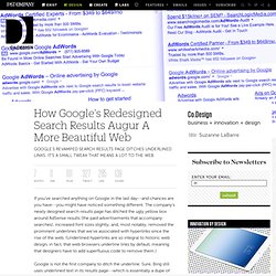
How Google's Redesigned Search Results Augur A More Beautiful Web. If you’ve searched anything on Google in the last day--and chances are you have--you might have noticed something different.

The company's newly designed search results page has ditched the ugly yellow box around AdSense results (the paid advertisements that accompany searches), increased font sizes slightly, and, most notably, removed the prominent underlines that we’ve associated with hyperlinks since the rise of the web. (Underlined hyperlinks are so integral to historic web design, in fact, that web browsers underline links by default, meaning that designers have to add superfluous code to remove them.) Google is not the first company to ditch the underline.
Sure, Bing still uses underlined text in its results page--which is essentially a dupe of Google’s--as do we here at Fast Company. But for much of the rest of the web, to be underlining is to be quoting Seinfeld episodes as last night's must-see TV. The underlined link had good intentions at heart. Read more here. Interface Inventory. Many are familiar with the concept of a content inventory.

Content audits are usually performed in the early stages of a website redesign process to take stock of all a site’s content. It’s a tedious process involving spreadsheets and caffeine, but the hard work pays off. You end up all your content laid out on the table, which gives you a new perspective on what your content is and how to tackle it. Enter the interface inventory. An interface inventory is similar to a content inventory, only instead of sifting through and categorizing content, you’re taking stock and categorizing the components making up your website, app, intranet, hoobadyboop, or whatever (it doesn’t matter).
The New Airbnb Focuses On Pretty Pics Rather Than Searches. Dreaming Everyday About Design. Word Press Themes. The New Design Frontier.