
CartoDB is the easiest way to map and analyze your location data — CartoDB. Computer Scientists Measure the Speed of Censorship On China's Twitter. The Chinese version of Twitter is a microblogging service called Weibo which launched in 2010.
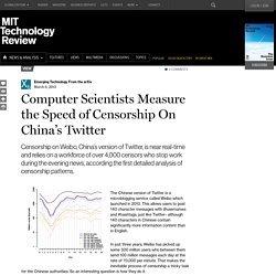
This allows users to post 140 character messages with @usernames and #hashtags, just like Twitter– although 140 characters in Chinese contain significantly more information content than in English. In just three years, Weibo has picked up some 300 million users who between them send 100 million messages each day at the rate of 70,000 per minute. That makes the inevitable process of censorship a tricky task for the Chinese authorities. So an interesting question is how they do it. Today,Dan Wallach at Rice University in Houston, Texas, and a few pals reveal the results of a detailed study of censorship on Weibo. The work is possible because at least some of the content on Weibo is not censored prior to publication, only afterwards. Not all deletions are the result of censorship, however, since a user can delete his or her own posts.
The results of their study are fascinating. CUDA Zone. Datavisualization.ch Selected Tools. GIS and Big Data Visualization for Asset Management and Beyond. By Farallon Geographics Team on October 07, 2014 Over the last few years, the concept of "Big data" has become ubiquitous.
Big data refers to the rapid growth and availability of data, both structured and unstructured that can be analyzed to enable smarter business decision making. Most discussions assume that big data applies only to large enterprises or federal government organizations trying to cope with massive volumes of data. While volume can often be one component, a more useful way to approach big data is as data that can't be managed or analyzed by traditional technologies such as simple databases, spreadsheets or KPI charts-and-graphics dashboards.
Gpucomputing. Gtc-express-map-d-webinar. Hadley/bigvis. HPL-2009-38. IBM And Twitter Announce Partnership. Flickr/IBM/ibmphoto24IBM CEO Ginni Rometty IBM and Twitter just announced a new partnership, something along the same lines as IBM's partnership with Apple.
IBM is going to help businesses use Twitter data to help them understand their customers, businesses and other trends. Twitter CEO Dick Costolo and IBM CEO Ginni Rometty worked "personally" together on the deal, Rometty said in an IBM conference that announced the deal. There are three parts to the partnership. 1. 2. 3. This is not just about watching for a company's name mentioned in Twitter, or analyzing sentiment, the companies said. A blog posted by Twitter's Chris Moody, vice president of data strategy, explained: Something we hear consistently is that companies want guidance on how to incorporate Twitter data into their business operations. This announcement has been years in the making. Flickr/IBM/ibmphoto24IBM CEO Ginni Rometty. Intel Science & Technology Center for Big Data. By Leilani Battle, MIT CSAIL and Justin DeBrabant, Brown University Almost all areas of science are moving to a more data-driven analysis pipeline, where large multidimensional datasets need to be explored and analyzed for possible insights.
The process of exploring large datasets is inherently an interactive process, as the user will react to aspects of the data, which will in turn help determine future queries. Unfortunately, many visualization interfaces were designed with the assumption that much, if not all, of the data to be visualized would reside in memory. As both the quantity and quality of the tools used to collect data have improved, datasets have continued to grow in size, and this assumption often no longer holds. However, interactivity necessitates low-latency access, and the latency required to fetch data from disk for each interaction with the interface is unacceptable. Why New Approaches Are Needed Another method is to find similarities in the underlying data. K-means2. Kinesis - Procesamiento de datos en tiempo real. Machine learning in Python — scikit-learn 0.16.1 documentation. MapD Twitter Demo. Nanocubes. Nbviewer.ipython.org/github/ptwobrussell/Mining-the-Social-Web-2nd-Edition/tree/master/ipynb/
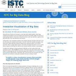
Real-time local Twitter trends - Trendsmap. UW Interactive Data Lab. Using Google Fusion Tables (left) and imMens (right) to visualize a dataset of 4M Brightkite user checkins.
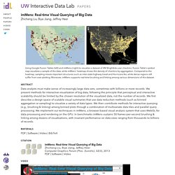
Fusion Table's symbol map visualizes a sample of the data, while imMens' heatmap shows the density of checkins by aggregation. Compared to the heatmap, sampling misses important structures such as inter-state highway travel and Hurricane Ike, while dense regions still suffer from over-plotting. Moreover, imMens supports real-time brushing and linking among various dimensions of the dataset. Abstract.