
Devin Holloway: Flex CollapsiblePanel Component. Devin Holloway: Flex - Complex Form layouts with ContraintLayout. The Form container uses FormLayout, by default, to lay out its FormItem children.
FormLayout extends VerticalLayout to stack the FormItem comtainers in a vertical column. This is all well and good, assuming you want a vertically laid out form, but that's often not the case. Take the example below. Usually, when I see a developer implement such a layout for a form, they'll forego the Form container altogether in favor of a series of nested HGroups and VGroups. Although this works, it's generally a bit clumsy and less than ideal. Devin Holloway: Flex FormattedTextInput Component. Although I've seen this in a few applications, I've never seen this type of component available for Flex.
The idea is that when you click and bring focus in to a TextInput, it shows the raw data for editing. When the value is committed and focus leaves the TextInput, it displays a formatted version of the value. It's very similar to concept of ItemEditors and ItemRenderers in list-based component, where the editor show the raw data and the renderer shows formatted data. In the case of the FormattedTextInput, you simply pass it an instance of IFormatter to the formatter property:
Kachurovskiy/Spark-Tree - GitHub. Gallery – FlexLayouts. Working with Native Mouse Features - For Flash Player 10.2+ in actionScript 3.0. The Flex 4 TitleWindow Component: Adding the missing features at 9MMEDIA Blog. The new Spark components included in Flex 4 are a tremendous step forward in terms of ease of skinning and extensibility, but some of them seem a little barebones out of the box.

In particular the Panel and TitleWindow components are lacking a number of features that I frequently wind up needing (and I'm guessing I'm not alone). I tackled something similar in Flex 3, when I created the BetterTitleWindow component, but I've had a few more ideas for features and I'm all about Flex 4 these days, so I thought I'd give it another go. Here's a quick rundown of all the features I added: - ability to collapse/expand- optional collapse/expand indicator- title bar or indicator clickable- ability to display a close button (which dispatches a CloseEvent)- closeButtonSkin can be specified- titleBarContent property can be used to add components to the title bar- layout of titleBarContent can be manipulated through titleBarLayout property- title bar height settable through a style property. Slides for “Having Fun with Layouts in Flex 4″
Toggling whether transparent pixels are clickable in a Spark Gra. Dynamic form with validators. Displaying images in a Spark List control using a custom item re. Multiple selection in a spark List without the control key. The spark List component in Flex 4 allows you to select multiple items when you set allowMultipleSelection to true.
With this flag set you can select multiple items by using the control/command key. If you want to have a List that allows multiple selection, but does not require the user to hold down the control key when selecting items you can subclass List and override the item_mouseDownHandler() method. The following example demonstrates a subclass of List called CheckList that does just that: View Source This sample uses an item renderer function to use a different renderer based on if the item is a heading or not.
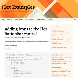
Note: This sample requires Flex SDK 4.0.0.12800 or higher. Formatting a Flex DataGrid control using a custom item renderer. Custom SortableList Component using Flex 4 - InsideRIA. Adding icons to the Flex ButtonBar control. The following example shows how you can add icons to the ButtonBar control in Flex.
Full code after the jump. View MXML View source is enabled in the following example. Bill White’s Blog » Core Flex 4 – Elements vs Children. When I started using Flex 4 I tried to get up to speed by using the new version in a manner similar to its predecessor until I came across roadblocks or when I determined I was able to take advantage of the new features I had heard about such as skinning, states, etc.
I quickly found that there were some obvious Flex questions that I was not able to answer without diving into the API docs and by playing with some examples so I could truly understand what is going on. I knew from past experience that Halo was hiding a lot of the dirty details about what was going on in the display list, but once you start using Spark, you will come to see just how much Halo was really doing under the covers and why Spark is a much more ‘honest’ way of working with the display list. One of the first things I hit was the term ‘elements’. What is an element? Is it the same thing as a child? So I started to really read the API docs, Flex source and blog postings about these topics. View Source View Source 1. Making custom layout for solar planets list with Flex 4. Why not create some kind of List control which represents planets from our Solar System? In their natural layout with orbits, Sun, rotation etc. It will be much more funny than just usual list even with custom item renderers.