

The Rise of HTML5 in WordPress. 2011 was a big year for the advancement of HTML5 in the web development community.
It became pretty widely adopted, especially for the mobile web. There have been major projects that help developers use HTML5, like Paul Irish's HTML5 Boilerplate (technically 2010, but popularized in 2011) and books galore! I would strongly recommend Jeremy Keith's HTML5 for Web Designers, published by the venerable A Book Apart (a service by Happy Cog). But what started as a movement in 2010 became the proper way to do things in 2011, from mobile websites to progressive enhancements, and that includes integrating HTML5 into WordPress themes. Tooltips, Courtesy of HTML5 Data Attributes. Tooltips are relatively simple to implement by just adding a bit of markup to your HTML and employing a bit of CSS.
However, if you've never heard of HTML5 data attributes, you may want to check out this alternative (and much cleaner) approach. Watch Screencast If you've been following the Admin Bar series, this screencast should finish things off nicely.
OFFLINE APPS. BASE. HTML5 selectors API – It’s like a Swiss Army Knife for the DOM. In the infancy of JavaScript, there was little if any concept of an HTML document object model (DOM).
Even though JavaScript was invented to enable web developers to manipulate parts of a web page, and in the original implementation, in Netscape 2.0, developers could only access the form elements, links, and images in a page. Useful for form validation, and first widely used for image rollover techniques (think :hover, before CSS), but far from the general purpose tool to create modern web applications we now know (and love/hate). Newer iterations of the DOM provided developers with access to far more than just that original limited range of elements, as well as the ability to insert, modify and delete elements in an HTML document. But, cross-browser implementations very often differed, and full support for the W3C’s DOM standards have arguably been treated as far more optional than CSS or HTML support. Luckily, the standards and browser developers took notice. I, b, strong, em: uso e semantica in HTML5 di vecchi e nuovi tag HTML.
Uno dei principali punti di forza di HTML5 è stato basarsi sul principio che non si doveva necessariamente "rompere" con il passato per creare un prodotto vincente ma che, piuttosto, proprio partendo dagli errori e conquiste del vecchio HTML si poteva costruire qualche cosa di grandioso e magnifico.
A ciascuno la sua tastiera: input types HTML5 e mobile web. Inserire dati e numeri con la tastiera di un iPhone o di uno smartphone Android non è sempre la cosa più facile: i tasti sono oggettivamente piccoli e la tastiera limitata.
Per mitigare questo problema e rendere più veloce ed efficace l'utilizzo di campi di input nei nostri siti web mobili HTML5 - come al solito - ci viene in soccorso: grazie ai nuovi e diversi "input type", in particolare URL e EMAIL, possiamo dire al telefonino che tipo di input stiamo richiedendo, e il telefonino obbediente mostrerà la tastiera più adeguata Vediamoli adesso uno per uno.
HTML5 Boilerplate - A rock-solid default template for HTML5 awesome. Adaptive & Mobile Design with CSS3 Media Queries. Screen resolution nowsaday ranges from 320px (iPhone) to 2560px (large monitor) or even higher.
Users no longer just browse the web with desktop computers. Users now use mobile phones, small notebooks, tablet devices such as iPad or Playbook to access the web. So the traditional fixed width design doesn't work any more. Web design needs to be adaptive. The layout needs to be automatically adjusted to fit all display resolution and devices. View Demo Responsive Design Download Demo ZIP See It in Action First Before you start, check the final demo to see how it looks like. More Examples If you want to see more examples, check out the following WordPress themes that I designed with media queries: Tisa, Elemin, Suco, iTheme2, Funki, Minblr, and Wumblr.
Overview The page's container has a width of 980px which is optimized for any resolution wider than 1024px. HTML Code I'm not going to go through the details of the HTML code. Introduction to iScroll. In this tutorial I will teach you how to use iScroll 4 to create a simple mobile web site.
The site we create will have a fixed header and a fixed footer with content that can be easily scrolled in-between. As we'll see, achieving this effect on both Android and iOS isn't as easy as you might think! Web based apps are a great place for front end developers to begin their journey into the world of building mobile applications. Using your existing knowledge of HTML, CSS, and Javascript, you can build apps that look-and-feel very close to those made with a native platform SDK. Even better, your applications will be cross-platform compatible and will work on any mobile device with a modern browser. Of course, there are some caveats to developing for mobile browsers.
While there are plenty of frameworks (e.g. jQuery Mobile, SenchaTouch, etc.) that can help get you started with mobile web apps, for now I'm not going to use any of them. Responsive image gallery con HTML5, CSS3 e jQuery PhotoSwipe. In questo articolo applichiamo due principi cardine per lo sviluppo di moderne interfacce web nella creazione di una gallery di immagini: si tratta del responsive design e del progressive enhancement.
In parole povere, il layout della galleria, realizzato in maniera “fluida” con le dimensioni degli elementi espresse in misure percentuali, assicurerà una corretta visualizzazione della pagina su tutti i device (desktop, notebook, smarthone, tablet) adattandosi perfettamente a qualsiasi risoluzione dello schermo. Inoltre, l’impiego attento delle nuove tecnologie HTML5, CSS3 e Javascript consentirà di fornire con i browser più recenti l’esperienza di navigazione più piacevole e avanzata senza precludere la compatibilità e l’accessibilità su dispositivi e software meno aggiornati. Dulcis in fundo, mettere in pratica tutto questo e lo sviluppo dell’esempio finale sono molto semplici.
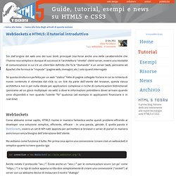
Cominciamo subito! WebSockets e HTML5: il tutorial introduttivo. Sin dall'origine del web uno dei suoi limiti principali (ma forse anche una delle caratteristiche che l'hanno resa semplice e dunque di successo) è l'architettura "stretta" client-server, ovvero una modalità di comunicazione in cui c'è un client ben definito che fa le "domande" e un server (web, pensiamo ad Apache) che fornisce le "risposte" (pagine web, immagini, etc.) solo quand interrogato Se questa struttura è perfetta per un web "statico" fatto di pagine collegate fra loro in cui la richiesta di nuovo contenuto è stimolata dal click su un link da parte dell'utente del browser, questa stessa architettura non è per nulla ideale per applicazioni complesse e ricche di comunicazioni bidirezionali (pensiamo ad un gioco multiplayer via web) o dove le informazioni potrebbero dover arrivare quando sono disponibili e non quando l'utente "fa" qualcosa (ad esempio in applicazioni finanziarie o in real-time) WebSockets Ma vediamo come funziona il tutto.
HTML5 Canvas Tutorials. Corso su WebGL - Introduzione. Adobe MAX slides and resources. CSS: Elastic Videos. While I was coding the Elemin Theme (a responsive WordPress theme that I recently designed), one of the challenges that I faced was to make the embedded videos elastic.
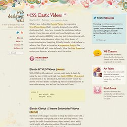
Using the max-width:100% and height:auto trick works with native HTML5 video tag, but it doesn't work with embed code using iframe or object tag. After hours of experimenting and Googling, I finally found a trick on how to achieve this. If you are creating a responsive design, this simple CSS trick will come in handy. View the final demo and resize your browser window to see it in action. Case Study: Page Flip Effect from 20thingsilearned.com.
Introduction In 2010, F-i.com and the Google Chrome team collaborated on an HTML5-based educational web app called 20 Things I Learned about Browsers and the Web (www.20thingsilearned.com). One of the key ideas behind this project was that it would best be presented in the context of a book. Since the contents of the book is very much about open web technologies we felt it was important to stay true to that by making the container itself an example of what these technologies allow us to accomplish today. We decided that the best way to achieve the feeling of a real world book is to simulate the good parts of the analogue reading experience while still leveraging the benefits of the digital realm in areas such as navigation. A lot of effort went into the graphical and interactive treatment of the reading flow - especially how the pages of the books flip from one page to another.
Getting Started Markup. HTML5, SEO e personal branding: tutorial su authorship markup.