
Exclusive interview with Miles Newlyn. Web font services - An Overview - by sprungmarker.de. 25 Best Free Futuristic / Techno Fonts. Typography is a very crucial aspect for any website to land up to the current web standards.
It has the power to convert any normal design into a piece of ravishing artwork. It’s just a single font that reflects the feel of a brand. Typography actually defines the look and appearance of a website that helps us to stand out in the normal flow. Some people think that, only paid fonts have the quality which can define their brand identity however according to me; it’s nothing more than a myth. After spending about one week and checking over 900 to 1000 futuristic/techno fonts, I have come up with the 25 best free techno fonts that can help you in designing websites, graphics, logos and print media with a sense of technology. 1. Download 2. Download 3. Download Download 5. Download 6. Download 7. Download. Designers books. Handpicked free fonts for graphic designers with commercial-use licenses. Book: Emigre (No. 70)
Yippee!
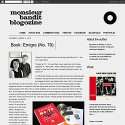
Found a beautiful book a few days ago! Big one to… Yes, yes, happy days! “Emigre No.70 – The Look Back Issue: selections from Emigre Magazine #1 - #69 (1984 - 2009). Celebrating 25 years in graphic design” is what the covers says, and well, that kind of says it all, doesn’t it? In 1984 Rudy VanderLans and his wife Zuzana Licko started Emigre Graphics, the type foundry and at the same time launched Emigre, the magazine (first it was tabloid-sized, later a 8.5/11 inch journal and eventually a soft-cover book).
Back Issue”, through spreads and illustrations, interviews and essays, all reprints from the previous 69 issues. I remember buying a few issues of Emigre back when I was in art school (mid legibility war-period). Mixing Fonts. A palette with wit Use typefaces with complementary moods to evoke an upbeat, energetic air.
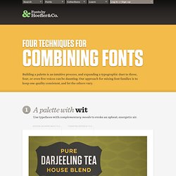
It’s the interplay between fonts that gives them energy. The more distant the moods in a typographic palette, the friskier the design will be. Here, three fonts with distinctive silhouettes have been chosen for their contrasting dispositions: the unabashed toughness of Tungsten is a foil for both Archer’s sweetness, and the cheekiness of Gotham Rounded. Tungsten Gotham Rounded Archer A palette with energy Mix typefaces from the same historical period whose families have different features. Three type families with nineteenth century roots, thrown together in a cheerful typographic riot. . Proteus Project Knockout Sentinel A palette with poise Mix typefaces with a similar line quality if they offer different textures. What do a neoclassical modern, a suave sans serif, and a sporty slab have in common?
HTF Didot Verlag Vitesse A palette with dignity Mercury Text Hoefler Titling Gotham. Benno Wissing Graphic Design (1923-2008) TypoElements 2010.