
How to Generate FiveThirtyEight Graphs in Python. If you read data science articles, you may have already stumbled upon FiveThirtyEight's content.
Naturally, you were impressed by their awesome visualizations. You wanted to make your own awesome visualizations and so asked Quora and Reddit how to do it. You received some answers, but they were rather vague. You still can't get the graphs done yourself. In this post, we'll help you. We'll start here: And, at the end of the tutorial, arrive here: To follow along, you'll need at least some basic knowledge of Python.
Introducing the dataset. 28 Jupyter Notebook tips, tricks and shortcuts. If you want to set this behaviour for all instances of Jupyter (Notebook and Console), simply create a file ~/.ipython/profile_default/ipython_config.py with the lines below. 3. Easy links to documentation Inside the Help menu you’ll find handy links to the online documentation for common libraries including NumPy, Pandas, SciPy and Matplotlib. Don’t forget also that by prepending a library, method or variable with ? , you can access the Docstring for quick reference on syntax. 4. Advanced Jupyter Notebook Tricks — Part I - Data Science Blog by Domino. I love Jupyter notebooks!
They’re great for experimenting with new ideas or data sets, and although my notebook “playgrounds” start out as a mess, I use them to crystallize a clear idea for building my final projects. Jupyter is so great for interactive exploratory analysis that it’s easy to overlook some of its other powerful features and use cases. I wanted to write a blog post on some of the lesser known ways of using Jupyter — but there are so many that I broke the post into two parts. Getting Started with Plotly for Python. Plotly for Python can be configured to render locally inside Jupyter (IPython) notebooks, locally inside your web browser, or remotely in your online Plotly account.
Remote hosting on Plotly is free for public use. For private use, view our paid plans. Offline Use Standalone HTML Offline mode will save an HTML file locally and open it inside your web browser. Learn more by calling help: Visualizing Summer Travels - Geoff Boeing. This is a series of posts about visualizing spatial data.
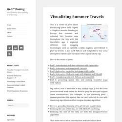
I spent a couple of months traveling in Europe this summer and collected GPS location data throughout the trip with the OpenPaths app. I explored different web mapping technologies such as CartoDB, Leaflet, Mapbox, and Tilemill to plot my travels. I also used Python and matplotlib to run some descriptive statistics and visualize other aspects of my trip. Here is the series of posts: My Python code is available in this GitHub repo.
This series serves as an introduction and tutorial for these various technologies and methods. Interactive maps Here are some brief highlights. I also visualized this spatial data as an interactive map using the Leaflet javascript library, and by rolling my own set of web map tiles then rendering them with Tilemill and Mapbox. Exploring the data set. Step by step Kaggle competition tutorial – Datanice. Kaggle is a Data Science community where thousands of Data Scientists compete to solve complex data problems.
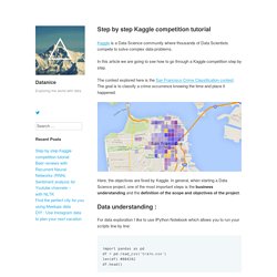
In this article we are going to see how to go through a Kaggle competition step by step. The contest explored here is the San Francisco Crime Classification contest. The goal is to classify a crime occurrence knowing the time and place it happened. Here, the objectives are fixed by Kaggle. In general, when starting a Data Science project, one of the most important steps is the business understanding and the definition of the scope and objectives of the project. Interactive Plotting in IPython Notebook (Part 1/2): Bokeh. Summary In this post I will talk about interactive plotting packages that support the IPython Notebook and allow you to zoom, pan, resize, or even hover and get values off your plots directly from an IPython Notebook.
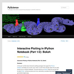
This post will focus on Bokeh while the next post will be about Plotly. I will also provide some very rudimentary examples that should allow to get started straight away. Interactive Plots: +1 for convenience Anyone who’s delved into ‘exploratory’ data analysis requiring a depiction of their results would have inevitably come to the point where they would need to fiddle with plotting settings just to make the result legible (much more work required to make it attractive). Well, with interactive plotting the days of the static plot are dwindling. Bokeh Bokeh is a package by Continuum Analytics, authors of the Anaconda distribution of which I spoke in this previous post.
Creating interactive crime maps with Folium. GitHub - amueller/word_cloud: A little word cloud generator in Python. Bokeh Docs.
The Python Graph Gallery – Visualizing data – with Python. How to make beautiful data visualizations in Python with matplotlib. Want to learn more about data visualization with Python?
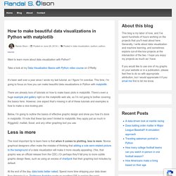
Take a look at my Data Visualization Basics with Python video course on O’Reilly. It’s been well over a year since I wrote my last tutorial, so I figure I’m overdue. This time, I’m going to focus on how you can make beautiful data visualizations in Python with matplotlib. There are already tons of tutorials on how to make basic plots in matplotlib. There’s even a huge example plot gallery right on the matplotlib web site, so I’m not going to bother covering the basics here. Below, I’m going to outline the basics of effective graphic design and show you how it’s done in matplotlib. Less is more The most important tip to learn here is that when it comes to plotting, less is more. At the end of the day, data looks better naked. (click on the GIF for a gfycat version that allows you to move through it at your own pace) Antoine de Saint-Exupery put it best: You’ll see this in the spirit of all of my plots below.
Color matters matplotlibpandas.