
Asciio lets you create ASCII charts graphically - Perl Buzz. An article about Excel. Data Visualization It's possible to carry an analogy too far.
Dashboards for managers are logically similar to dashboards for cars. Both types of dashboards provide key information about current performance. But if you follow the car-dashboard analogy too far, you'll deprive managers of key information they need. That's the problem with gauges for management reporting.
Gauges Hide Trends Gauges have several problems that should concern most managers. In a car, trends don't matter. To illustrate, the following three Excel charts show about the same results for December as the gauge. Again, December performance is identical for each of these three Excel charts, and about the same as the gauge. As the interpretation for the last chart mentions, gauges also fail to show the trend in our opinions about the levels of acceptable performance. In short, the charts reveal information; the gauge conceals it.
Excel, Gauges, and Charts Excel doesn't support gauges directly. AJP Excel Information - Charts. Charting Examples Excel Charting techniques, solutions and examples Chart Pattern Fill PowerPoint Add-In for applying Pattern fills to charts, tables and shapes in PowerPoint 2007 Ratio Plotarea Maintain plotarea ratios Dashboards A collection of tips compiled by guest poster Ceri Williams Polar Plot2 add-in New Polar Plot add-in including examples file Set Square Axis VBA code to create square axis Banding plot area on bubble chart.
Speedometer Chart. One style of chart that Microsoft Excel does not offer is alternatively referred to as a Speedometer Chart, a Gauge Chart, or a Dial Chart.
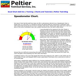
It is possible to achieve the desired effect by constructing a combination chart with a Donut Chart series and one or more XY (Scatter) Chart series. Several years ago I built such a chart as a demo of this kind of combination chart, and I posted instructions here; the chart is shown below. I was astounded by the response to this chart. People in business as well as manufacturing have been talking about "dashboard reports" for some time, and what makes a good dashboard but a few dials, to represent your gas tank, your engine RPMs, your speed, etc.
At first it seemed that I'd filled a need in the Excel charting market, but more recently the speedometer chart has troubled me. One of the most misunderstood terms in business today is "dashboard". What makes a speedometer gauge ineffective for a business dashboard? Google Groups : microsoft.public.excel.charting. Excel Help Forum - Fuel Guage charts. Ch.Dial – dial and gauge charts. ChDial – dial and gauge charts Accepts a scalar or vector of numbers and plots a ‘fuel gauge’ style plot.
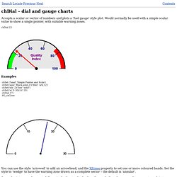
Would normally be used with a simple scalar value to show a single pointer, with suitable warning zones. chDial 23 Examples chSet ('head' 'Simple Pointer and Scale') chSet('axes' 'Black,solid,2')('lfont' 'arb,12') chSet('nib' 2)('line' 'solid') chSet('xr' 0 30)('xt' 10) chDial 17) PG„chClose You can use the style ‘arrowed’ to add an arrowhead, and the XZones property to set one or more coloured bands.
Several pointers can be created if required – the standard colour, line and nib cycles are used to generate each in turn. ChSet('style' 'arrow')('nib' 2 1.2)('line' 'solid')('radii' 100 50) chSet('xr' 0 100)('xt' 20,3)('xzones' 'lime,0,10' '#F99E0F,40,70' 'Red,70') chDial 25 56 The sample chart shows some of the possibilities, laid out as a neat dashboard.
Continue to: chFreq – frequency plots© Copyright Causeway Graphical Systems Ltd 2003. Chart Types and Elements. Dashboard Design: Why Design is Important.