
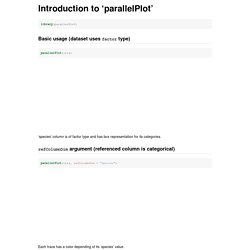
Introduction to ‘parallelPlot’ Basic usage (dataset uses factor type) ‘species’ column is of factor type and has box representation for its categories. refColumnDim argument (referenced column is categorical) Each trace has a color depending of its ‘species’ value. categoricalCS argument Colors used for categories are not the same as previously (supported values: Category10, Accent, Dark2, Paired, Set1). refColumnDim argument (referenced column is continuous) Each trace has a color depending of its ‘Sepal.Length’ value. continuousCS argument Colors used for traces are not the same as previously (supported values: Blues, RdBu, YlGnBu, YlOrRd, Reds).
Basic usage (dataset doesn’t use factor type) Several columns are of numerical type but should be of factor type (for example ‘cyl’). categorical argument categorical <- list(NULL, c(4, 6, 8), NULL, NULL, NULL, NULL, NULL, c(0, 1), c(0, 1), 3:5, 1:8)parallelPlot(mtcars, categorical = categorical, refColumnDim = "cyl") inputColumns argument histoVisibility argument cutoffs argument. More On Slopegraphs. Makeover Jambalaya: Beating Dumbbells into Slopegraphs Whilst Orchestrating EtherCalc. This morning, @kairyssdal tweeted out the following graphic from @axios: If you’re doing the right thing and blocking evil social media javascript you can find the Axios story here and the graphic below:

Creating Slopegraphs with R. Presenting data results in the most informative and compelling manner is part of the role of the data scientist.
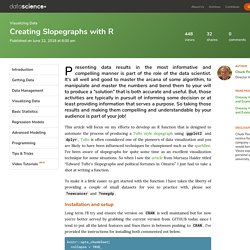
It's all well and good to master the arcana of some algorithm, to manipulate and master the numbers and bend them to your will to produce a “solution” that is both accurate and useful. But, those activities are typically in pursuit of informing some decision or at least providing information that serves a purpose. Slopegraphs and R – A pleasant diversion – May 26, 2018. Visualizing Survey Data : Comparison Between Observations. Cybersecurity is a domain that really likes survey, or at the very least it has many folks within it that like to conduct and report on surveys.
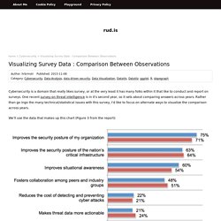
One recent survey on threat intelligence is in it’s second year, so it sets about comparing answers across years. Rather than go ingo the many technical/statistical issues with this survey, I’d like to focus on alternate ways to visualize the comparison across years. We’ll use the data that makes up this chart (Figure 3 from the report): since it’s pretty representative of the remainder of the figures. Let’s start by reproducing this figure with ggplot2: Now, the survey does caveat the findings and talks about non-response bias, sampling-frame bias and self-reporting bias.
They are both roughly 3.65% so let’s take a look at our dodged bar chart again with this new information: Hrm. The report actually makes hard claims based on the year-over-year change in the answers to many of the questions (not just this chart). Spaghetti plots with ggplot2 and ggvis. This post was motivated by this article that discusses the graphics and statistical analysis for a two treatment, two period, two sequence (2x2x2) crossover drug interaction study of a new drug versus the standard.
I wanted to write about implementing those graphics and the statistical analysis in R. This post is devoted to the different ways of generating the spaghetti plot in R, and the statistical analysis part will follow in the next post. Taucharts — Javascript charts with a focus on design and flexibility. New freqparcoord Example. Alluvial diagrams. Parallel coordinates plot is one of the tools for visualizing multivariate data.
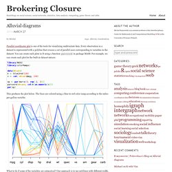
Every observation in a dataset is represented with a polyline that crosses a set of parallel axes corresponding to variables in the dataset. You can create such plots in R using a function parcoord in package MASS. For example, we can create such plot for the built-in dataset mtcars: This produces the plot below. The lines are colored using a blue-to-red color ramp according to the miles-per-gallon variable.
R Graph Gallery. R Graph Gallery. Not unlike the stars() plot, a profile plot allows one to generate a profile of several items and how they compare on various axes. Using this plot one can quickly see how items stack up on multiple dimensions. For example, when attempting to compare three brands of cars, one might want to compare their styles on scales such as "modern vs traditional," "sporty vs elegant," and "compact vs large.
" Steep decline in market capitalization. R Graph Gallery. These are two scripts which I wrote because I did not find any tool, which is able to produce these kinds of graphs. For marketing purposes you need so called profile diagrammes and image profiles. Both types of diagrammes have to show the position of each object, which can be a brand, an enterprise, a person or whatsoever in comparison to other objects. The graph is a kind of traditional XY-graph rotated 90 degrees. Profile diagrammes are used in marketing to show the position of research objects. The research criterea or items are shown on the y-axis and the values on the x-axis. R Graph Gallery.