
Tips for visual journalists. I Infografia. Infographics news. Kelso Cartography. Visual Journalism. Cool Infographics - Cool Infographics. WHAT'S NEXT: INNOVATIONS IN NEWSPAPERS. The New York Times Agency. Dean Tweed illustration. The Map Scroll. Infographics.eu. Radicalcartography. Les 50 meilleures infographics et data visualization.
The Infographics Showcase - Data Visualization - Infographic Design. Creative Infographics to Visualize Information. Reports and analyzing summarizes are not interesting for many people, especially when many Internet users need to get the information rapidly. However, the visualized information are more suitable for the internet users than the text reports.
Also, it helps remembering information through the visual memory for further reference. Infographics use the visual elements to deliver the information in an interesting way and easy to understand charts. Each infographic design changes based on the type of information and the best way to deliver it. The amount of information plays a critical rule in displaying the information because the graphic elements used in the infographic charts should help displaying the information and not distract it. If you like this type of visual information, you may like to check the following article:Introduction to Infographic Design How recipes should look The Spilled Disasters BMW Designworks Preventing a Pirate Attack ASIA Mega Regions.
E-learning & Multimedia Examples — Interactive Graphics, Visual Journalism and Multimedia Storytelling. Newsflick.net - This website is for sale! - newsflick Resources and Information. Simple Complexity — Making Simple Sense From Complex Data. Infographics. Webilus.fr ! En une seule minute, une quantité monstrueuse de données est échangée sur le web.
Chaque minute de chaque heure de chaque journée. L’agence... Lorsque l’on parle de Google, Samsung ou encore Apple, on ne peut qu’avoir les yeux qui brillent quand aux montants qu’ils annoncent.... Le cloud computing est annoncé comme la technologie de demain pour tous les avantages qu’on lui connait. Mais qui utilise réellement cette technologie?... Vous êtes une entreprise et vous souhaitez vous lancer comme vos amis dans les réseaux sociaux. Les réseaux sociaux sont addictifs et personne ne peut dire le contraire. Nous lisons de plus en plus et notamment en ligne. Foursquare est sans contest le réseau social de géolocalisation, leader sur son marché. Une cascade d'infos. The Society for News Design. Noticias de Portugal e do Mundo do Jornal i. Graphics. Libya - SPIEGEL ONLINE - News. Co.Design - Infographic Articles. Galerie de State of the World Infographics. Visualising Data. Data journalism and data visualization from the Datablog.
Maptimize - Markers fusion plugin for Google Maps. Data journalism and data visualization. Infografía y tutoriales. Cartographie. La France, c’est le pays des fromages, des agneaux, des miels, des vins, du cresson, etc… et depuis longtemps, ces productions font l’objet de protection diverses.
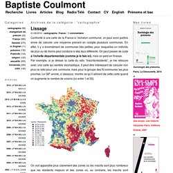
Attention à ne pas produire de Camembert à Roquefort, ou de Champagne à Brie. Deux bases produites par l’INAO (l’Institut national de l’origine et de la qualité), portant sur les aires géographique des AOC-AOP et des IGP, nous donnent un aperçu des France agricoles, si l’on relie ces bases au fichier des communes de l’IGN. Infografía y tutoriales. Historia con Mapas - Atlas & Maps. Behance. Domein gereserveerd - LVB Networks.
Wall Street Journal Multimedia Interactive Features on Economy, Politics, Sports, Environment, Business - Wsj.com. Graphic detail. Richard Johnson. Drawing Toronto - September Welcome to Drawn T.O., the Toronto Urban Sketch Blog.

Urban sketching is a global phenomenon. So pick up your pencils and let’s do it in Toronto Graphic: Survivors’ Stories from the Nairobi Mall Kenyan security forces are locked in a stand-off with the terrorists almost 36 hours after they launched an attack on a suburban mall which killed almost seventy people. Graphic: Options for Striking Syrian Chemical Weapons Facilities The argument as to whether the United States or other countries should punish Syria for the alleged use of chemical weapons against its own citizens continues. Graphics. National PostDigital Access | Sign in | Register today Graphics China is building man-made islands in the South China sea.

Here’s how they’re doing it Graphic: How the Syrian migrant crisis is playing out across Europe Four years on and 220,000 killed: visualizing the lives lost as conflict in Syria wears on The secret life of your luggage in the U.S.A. Data Visualization, Information Design and Infographics. Infographics' "infodesign" favorite pictures on waterflow on VisualizeUs. Infografia. 20 infographics from 20 Brazilian publications. Brazil’s main infographic event, INFOLIDE, is set to open its doors tomorrow (18/10), in São Paulo.
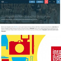
Among the many attractions, Jaime Serra, the Spanish infographic designer elected as the best of the past 20 years, at Malofiej20. Serra is set to speak Saturday about his experience for an audience of information design students and professionals. He will also be giving a workshop untitled “Infographics can’t be Art, but Art can be Infographic“. Jaime Serra is joined by other important figures of the Brazilian editorial and information design scene to help accomplishing what the organization expects to be the best event of its kind in the country, and even perhaps in South America . Formerly known as LIDE, the name change translates the continuing growth and success of the past five editions, and reflects a new moment, one in which information design takes its rightful place as the center theme of the event. Obamômetro | Folha de S.Paulo. La sécurité routière en France. Le chômage en France. Violences et mouvance nationaliste en Corse.
Country profiles in depth. Each country leads the world in different things, from good to bad things to awkward ones.
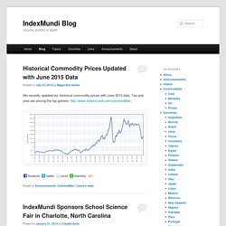
According to the map above, France leads the world in tourism, India in making movies, Saudi Arabia in oil reserves, the United States in producing Nobel laureates, Greece in olive oil consumption, Switzerland in the rate of employment, Norway in democracy, Brazil in FIFA world cup titles, and Costa Rica in happiness, to name a few. Other countries lead in not so positive things. Инфографика — вместо слов. Data Visualizations, Challenges, Community. Infographic Thinking in Singapore. “America in Africa: guardia e ladri” (“America in Africa: cops and robbers”), published in IL, September 2012 and “Ayatollah”, published in IL, March 2013 won the Silver Medal for Best Information Graphic at the 2013 Society of Publication Designers (SPD) 48th Annual Award.
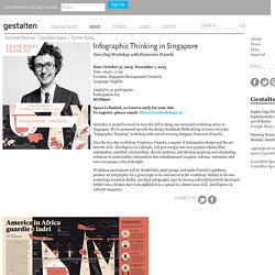
Both infographic spreads were developed collaboratively between IL Art Director Francesco Franchi and participants of the two “Infographic Thinking” workshops by Gestalten. The evolution of information stands at the intersection between the visualization and critical interpretation of data. With technology advancing at such rapid speed, and the way we consume and digest information constantly evolving, designers are challenged to embrace new editorial formats, platforms, and visual languages.
An emergence of visual journalists and graphic editors are tackling this task and reinventing news on paper through a new form of journalistic expression. 70 прекрасных примеров инфографики. Infographics pictures on VisualizeUs. Infographics.