
Infographic « Technology Ideas for the Classroom. Inforgraphic on the Supermoon from space.com and NASA Wow!

Today’s access and availability of multimedia on the Internet has made it easier for any person to clearly understand various Scientific phenomena like supermoons and earthquakes. Wikipedia plays its role in simplifying scientific explanations and keeping the world updated on the facts. Thousands of photos are uploaded on Flickr showing evidence of the recent supermoon and the earthquake that hit Japan. Hundreds of videos are uploaded on Youtube showing actual capture of people fleeting, cars being swept away, tsunami waves travelling at 10Kph, and even animal survivors from the Japan earthquake.
Credible sources such as BBC, CNN, NHK and RT (Japan TV) have shared their footage online to give people immediate information on the events that transpired during the earthquake. Similarly, NASA has shared an interesting video and this infographic to explain the Supermoon phenomena, the largest moon in the past 18 years. Related Articles. k12 - Data Visualization Encyclopedia. Reading Digitally Infographic. Our summer pilot “Reading Digitally” focused on exploring the world of ebooks and online reading.

The experience was quite engaging and powerful for those involved, and I highly recommend others host a similar experienceespecially if you are having discussions about ebooks, etextbooks, transliteracy, literacy, etc. Without this experience, our perceptions and beliefs become the focus instead of our actual experience. Two Important Notes 1. It is important to note that our experience was not one where we brought together “edtech” folks. 2. The Infographic Click Reading Digitally Infographic for a pdf of the infographic that looks at our data gained at the end of the experience.
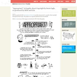
"Appropriart!" A Graphic about Copyright by Susie Cagle, co-produced by MDF and GIA. MDF has partnered with Grantmakers in the Arts to produce Appropriart!

, a graphic about copyright developed by Susie Cagle. The graphic was originally published in the GIA Reader. Click here (or on any of the images) to download a PDF of the full graphic. The Design of Symbols. Infographic: Write It Down. The Don’ts of Infographic Design. Written by Amy Balliett of Killer Infographics, the post in question is basically tips for how to create linkbait that doesn't work.

Or at least I hope it doesn't. Let's take it from the top. Infographics are visual representations of information, or "data viz" as the cool kids call it these days. The term "data viz" comes from "data visualization," which implies that sets of data will be displayed in a unique way that can be seen, rather than read. I'm not going to get into the semantics. Next up, which refers to the graphic above: What’s wrong with this infographic? What? Most run-of-the-mill infographics take a few data points and make it look like a lot with big things. It gets worse. Two alternatives to the above are offered. Balliett's suggestion was to use the speedometer, basically because it looks awesomer.
I hope you didn't answer graph A. If you answered Graph B, you’re catching on. It's that obsession with unique again. Strata NY 2011 [Data Visualizations] - The Subjectivity of Fact. This post was written by Mimi Rojanasakul.
![Strata NY 2011 [Data Visualizations] - The Subjectivity of Fact](http://cdn.pearltrees.com/s/pic/th/visualizations-subjectivity-16729056)
She is an artist and designer based in New York, currently pursuing her MFA in Communications Design at Pratt Institute. Say hello or follow her @mimiosity. Last but not least, here's a round-up of talks that were focused on data visualization at Strata. Most of the presentations covered the standard do's and don'ts, parading humorously incomprehensible examples around of those who would forget to label their axis, or use a pie chart to show change over time.
Naomi Robbins, the consummate modernist, spends her presentation extolling clarity, objectivity, and a form follows function philosophy that comes with a number of simple guidelines to follow. Robbins makes a point of distinguishing more technical graphics from art. Noah Iliinsky, of Complex Diagrams and Designing Data Visualizations, takes our focus from the clear and factual to good storytelling. Four Icon Challenge – Fantastic Voyage. All icons either Public Domain or CC by Attribution from the Noun Project ( “Reduce a movie, story, or event into it’s basic elements, then take those visuals and reduce them further to simple icons.” Those aren’t my words, but rather the instructions from the Four Icon Challenge ds106 assignment. Since this coming semester’s ds106 theme is apparently that of a “fantastical voyage” (the opening post for the course is “journey to the center of the internet”), I thought it might be appropriate to pay homage to the 1966 Academy Award winning film, Fantastic Voyage.
For those of you who may be new readers of my blog, I am an open participant in the most excellent storytelling course, DS106. A completely open, collaborative effort by a growing number of universities, DS106 (digital storytelling 106) is an exploration of media, technology, and story telling in a way that challenges its participants to create, remix, and manipulate images, sound, and video to tell a narrative. Internet Catalogue.
Internet Catalogue.