
Section 18: Scientific Visualization. Publication of this NSF report prompted researchers to investigate new approaches to the visualization process and also spawned the development of integrated software environments for visualization.
Besides several systems that only addressed specific application needs, such as computational fluid dynamics or chemical engineering, a few more general systems evolved. Where Australia's immigrants were born. This map reveals the top three birthplaces for immigrants in suburbs and towns across Australia.

You can also access a map revealing birthplaces excluding English and New Zealand immigrants. Rollover suburbs with your mouse for detailed info. Zoom and drag for a view of other cities and the nation as a whole, or click on the following links: Sydney | Melbourne | Brisbane | Adelaide | Perth | Hobart | Darwin | Canberra. Out of Sight, Out of Mind: A visualization of drone strikes in Pakistan since 2004. Oranges and Blues — BoxOfficeQuant. When I launched this site over two years ago, one of my first decisions was to pick a color scheme – it didn’t take long.

www2.nict.go.jp/isd/ISDS-contents/wds-kyoto-2011.org/pdf/IS703.pdf. Living with lag - an oculus rift experiment. Amazing Technology Invented By MIT - Tangible Media. The Poetics of Metadata and the Potential of Paradata (Revised) [This is the text, more or less, of the talk I delivered at the 2011 biennial meeting of the Society for Textual Scholarship, which took place March 16-18 at Penn State University.
I originally planned on talking about the role of metadata in two digital media projects—a topic that would have fit nicely with STS's official mandate of investigating print and digital textual culture. Datavisualization. Larping Off the Grid. Courtesy of Isaac Eddy.
Object Breast Cancer. Shamanic Tumor Extraction Process - a shorter edited version of a piece made for the Out of Hand show at the Museum of Art and Design, NY.
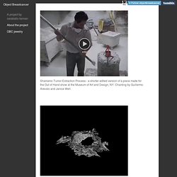
Chanting by Guillermo Arevalo and Janice Weil. Carcinodaemon Serpentina These carcinodaemons fuse three different imaging techniques. A shaman manages to see figures that are said to inhabit you using a technique called ‘extraction’, in which the shaman identifies malignant figures and casts them out. An MRI images the breast cancer tumor, identifying its size and location, before the surgeon extracts it. Once again, the answer is confirmed, resoundingly: Yes, art can impact science. Janet Echelman: Taking imagination seriously. Who owns your personal data?: The incorporated woman. The Internet in Real-Time. Facebook: Do not to release your new app feature that listens to users’ conversations. www.perceptualedge.com/articles/visual_business_intelligence/information_visualization_and_art.pdf.
Data Visions. Points of light illuminate a dark screen, erupting like digital fireworks.
A clock counts down the night-time hours towards dawn. www.emc.com/collateral/analyst-reports/idc-the-digital-universe-in-2020.pdf. User-driven visual mashups in interactive public spaces. Searching and presenting rich data using mobile devices is hard given their inherent I/O limitations.
One approach for alleviating these limitations is device symbiosis, whereby the interaction with one's personal mobile device is augmented by additionally engaging with more capable infrastructure devices, such as kiosks and displays. The Celadon framework, previously developed by our team, builds upon device symbiosis for delivering zone-based services through mobile and infrastructure devices in public spaces such as shopping malls, train stations and theme parks. Relation browser. This radial browser was designed to display complex concept network structures in a snappy and intuitive manner. It can be used to visualize conceptual structures, social networks, or anything else that can be expressed in nodes and links. CIA world factbook demo This demo displays the relations of countries, continents, languages and oceans found in the CIA world factbook database. Click the center node for detail information or click adjacent nodes to put them in the center.
Project Syndicate: Economics, finance, politics, and global affairs from the world's opinion page. What happened: Death of Jean Charles de Menezes. Grounded: Life on the No Fly List. Picture this: You arrive at the airport, full of cheer ahead of a work trip to visit to a client.

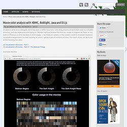
What you're not being told about Booz Allen Hamilton and Edward Snowden - Truthloader. This floating black ball is the creepiest thing you'll see all day. Movie color analysis with XBMC, Boblight, Java and D3.js. It's been a while since I blogged, but it has been a rather busy time.
Lots of big projects at work that need my complete attention, and lots of personal stuff going on. What Architecture Reveals About Secret Drone Strikes. This week, United Nations Special Rapporteur Ben Emmerson gave a presentation to the organization's Human Rights Council on how drone strikes impact civilians. The report, which focuses mainly on U.S. drone strikes, calls for nations that use drones to conduct investigations and release public explanations in cases where unexpected civilian injuries and fatalities occur. Emmerson has been working with Forensic Architecture, a project at Goldsmiths University in London that images and maps sites of violence, and SITU Research, a New York–based interdisciplinary architecture and design firm, to visually reconstruct these covert operations. Together, they've pieced together disparate evidence, including digital models of buildings damaged in attacks, to create an interactive site that catalogs 30 drone strikes, which reportedly resulted in civilian injuries or deaths, in five different countries.
See the interactive report here. FOOTWEAR INTELLIGENCE TECHNOLOGY. Product Magazines (hktdc.com) Specific buy and sell recommendations provided. Sunrise Technologies, Winston-Salem, NC. 135 likes 5 talking about this 6 were here. The Fitflop footwear brand This BI blog is a good resource on Business Intelligence technology. NewsMine News, Commentary, Digests, Press Releases; Technology. Find american footwear company logo image and details. New Technologies and Contemporary Art. Visualizing the impact a simple cup can have on our environment According to sustainabilityissexy.com, over 6.5 million trees are consumed each year to produce the 16 billion disposable coffee cups that are being thrown away out into landfills. For about every 50,000 paper coffee cups produced, a tree is destroyed. DESCRIPTIONA Simple Cup visualizes the impact disposable coffee cups have on our environment by simulating a real-time growing forest on a web site every time a mug of coffee is placed onto a networked coffee cup coaster.
The interactive visualization encourages coffee drinkers to drink out of their coffee mugs by rewarding them with saved trees and energy onto a virtual ecosystem (that may be accessed globally online) every time they don’t drink out of disposable paper cups when they have a cup of coffee. The objective of A Simple Cup is to raise awareness over the impact disposable coffee cup production has on our environment’s natural resources.
StAllio! mp3s. Martin Wattenberg: Art.
visualizinginfo.pbworks.com/f/db-system-culturalform.pdf. Endless War: On the database structure of armed conflict. Republished in slightly edited form from VVVNT. Image courtesy of Graham Harwood. Infographics. Mapping. Data art. Surveillance. Liquid Surveillance, the soft power of UBERMORGEN. The AlloSphere at the California NanoSystems Institute, UC Santa Barbara. Data bodies. The Data Body on the Dissection Table: Jamie Allen. Telling stories with network data: Spring on Instagram.
A Periodic Table of Visualization Methods. www.gapminder.org/GapminderMedia/wp-uploads/Gapminder-World-2012.pdf. Data Journalism: From the Inbox any. Data journalism: how to find stories in numbers. Government spending over £25,000: download the data and help analyse it with our new app. ninalp.com/ART/Papers/artistic-infovis.pdf. The Slow Journalism Magazine. The Slow Journalism Magazine. This Interactive Sochi Calendar Completely Reinvents How We Understand Scheduling.
Facts are Sacred: the power of data. What is data science? Figuring Data (Datascape Catalog Essay) This essay was commissioned for the exhibition Datascape, at the Cube Gallery, QUT in April 2013. An Interpretive Framework for Contemporary Database Practice in the Arts. An Interpretive Framework for Contemporary Database Practice in the Arts (Original, 2004), first presented at the College Art Association 94th annual conference, Boston MA. Panel - From Database and Place to Bio-Tech and Bots: Relationality versus Autonomy in Media Art Thursday, February 23, 12:30 PM, 2:00 PM Hynes Convention Center, Third Level, Room 304 Chair: Marisa S. Olsen, University of California, Berkeley.
FCJ-067 Art Against Information: Case Studies in Data Practice. Mitchell Whitelaw, University of Canberra Canberra, Australia Introduction. Information Visualization Manifesto. Posted: August 30th, 2009 | Author: Manuel Lima | Filed under: Uncategorized | – “The purpose of visualization is insight, not pictures” Ben Shneiderman (1999) – www.cc.gatech.edu/~john.stasko/papers/infovis07-casual. danm.ucsc.edu/~wsack/Writings/wsack-infoaesthetics.pdf.
VisualEyes. Humanities Scholars Embrace Digital Technology. unstats.un.org/unsd/wsd/docs/UK_wsd_KnowledgeIsPower. Digging Into Data > Home. Big Data. Big data: The next frontier for innovation, competition, and productivity.