
Predictions for Journalism 2016 » Collections » Nieman Journalism Lab » Pushing to the Future of Journalism. The End of the News as We Know It: How Facebook Swallowed Journalism. Good afternoon, everyone.
Thank you for coming. It is a great pleasure and honour to be in Cambridge this week as part of the Humanitas CRASSH visiting lecture programme. I must thank my former Observer colleague Professor John Naughton for proposing that I do this, and to the Humanitas committee for bringing me here. I would also like to thank St.
Capturing Value: Data Journalism as a Revenue Supplement. By Jake Batsell The byproducts of journalism rarely have value to anyone besides the reporters who gather and assemble the information.
(Exhibit A: The troves of spiral notebooks, manila folders and microcassettes left over from my newspaper days, still gathering dust in my garage.) The inverted pyramid of data journalism. I’ve been working for some time on picking apart the many processes which make up what we call data journalism.
Indeed, if you read the chapter on data journalism (blogged draft) in my Online Journalism Handbook, or seen me speak on the subject, you’ll have seen my previous diagram that tries to explain those processes. I’ve now revised that considerably, and what I’ve come up with bears some explanation. I’ve cheekily called it the inverted pyramid of data journalism, partly because it begins with a large amount of information which becomes increasingly focused as you drill down into it until you reach the point of communicating the results. What’s more, I’ve also sketched out a second diagram that breaks down how data journalism stories are communicated – an area which I think has so far not been very widely explored. But that’s for a future post. In the age of big data, data journalism has profound importance for society - Data. The promise of data journalism was a strong theme throughout the National Institute for Computer-Assisted Reporting’s (NICAR) 2012 conference.
In 2012, making sense of big data through narrative and context, particularly unstructured data, will be a central goal for data scientists around the world, whether they work in newsrooms, Wall Street or Silicon Valley. Notably, that goal will be substantially enabled by a growing set of common tools, whether they’re employed by government technologists opening Chicago, healthcare technologists or newsroom developers. How to be literate in what’s changing journalism. Recalculating the newsroom: The rise of the journo-coder? Credit: Image by Arbron on Flickr.
Some rights reserved This is an edited version of a chapter fromData Journalism: Mapping the Future, being launched tomorrow by Abramis academic publishing, republished with kind permission. Data journalism: Mapping the future (RRP £15.95) is available at a reduced rate of £12 for Journalism.co.uk readers. Contact richard@abramis.co.uk for further information. Ctrl + ← The Best Data Journalism Of 2014. Each week, we let you in on the most-read FiveThirtyEight articles and share our favorite data journalism from elsewhere on the Internet in Ctrl + ←.
Seeing as it’s Dec. 28 and the new FiveThirtyEight has now reached the ripe old age of 287 days, we thought it was worth rounding up all the roundups and taking a look at 2014’s biggest and best data journalism pieces, starting with our own. LGBT rights: Same-sex marriage made some major gains in the United States this year, but this interactive feature from The Guardian reminds us that being lesbian, gay, bisexual or transgender is still illegal in 79 countries around the world. Feilding Cage, Tara Herman and Nathan Good explored the legal status of sex, marriage, civil partnerships, adoption, workplace discrimination and protection against hate crimes for the world’s LGBT population. “Data”? What the New York Times's 'Snow Fall' Means to Online Journalism's Future.
The New York Times debuted a new multimedia feature Thursday so beautiful it has a lot of people wondering — especially those inside the New York Times — if the mainstream media is about to forgo words and pictures for a whole lot more.
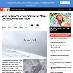
Unlike a standard words-on-page article that doesn't diverge too much from print in the design department, "Snow Fall," a multi-"chapter" series by features reporter John Branch, integrates video, photos, and graphics in a way that makes multimedia feel natural and useful, not just tacked on.
This tale of last February's Tunnel Creek avalanche — which is also worth reading, not just looking at — opens with full-screen video on loop (we know it looks like a GIF, but it's not) of snow blowing off a mountain. Scrolling down, Branch's text gets peppered with videos and even more striking, big images. Which, of course, has been done before, as plenty of sites play around with how to design a long-form story online — or how to grab a Pulitzer. A fundamental way newspaper sites need to change.
A blog entry titled 9 Ways for Newspapers to Improve Their Websites has been making the rounds lately.
I don’t write about the online news industry on this site as much as I used to, but this article inspired me to collect my current thinking on what newspaper sites need to do. Here, I present my opinion of one fundamental change that needs to happen. For background: I have a journalism degree, for what it’s worth, and I’ve worked for newspaper Web sites since 1998 (including the college paper and internships).
Vox is our next. Early last year, Melissa Bell, Matt Yglesias and I began wrestling with a question that had bugged all of us for a long time: why hadn't the Internet made the news better at delivering crucial context alongside new information?
This year, we're founding a new publication at Vox Media in order to do something about it. New information is not always — and perhaps not even usually — the most important information for understanding a topic. The overriding focus on the new made sense when the dominant technology was newsprint: limited space forces hard choices. You can't print a newspaper telling readers everything they need to know about the world, day after day. At Circa, it’s not about ‘chunkifying’ news but adding structure. You sometimes hear what we do at Circa described as “chunkifying” — taking the news and presenting it in mobile-friendly chunks.
And while on the surface this observation is correct, it misses the bigger picture. Yes, each “point” of Circa is a single unit of news — something designated as a fact, quote, statistic, event or image. If There Was Already an Ocean of Data in 2007, How Much is there Now? I’ve been trying to figure out how to convey the scale of the ‘Big Data‘ phenomenon — the recent worldwide explosion of the volume of data encoded in digital form. Inspiration came from Randall Munroe’s fantastic “What if?” Comics, which provide “Serious Scientific Answers to Absurd Hypothetical Questions.” Everyblock. APIs: The new distribution. The Guardian just announced that it is releasing all its content through an API as well as making available many different data sets through a data store, all of which can be mashed up into others’ sites and applications. They join other organizations – the BBC, National Public Radio, and The New York Times – in releasing APIs; notes that it’s the creme of news that sees the wisdom in APIs.
The Guardian’s offers more than headlines: articles, video, galleries, everything. It also adds one more important element to its offering: a business model, creating an ad network for users of the API. Upendra Shardanand, my partner at and the founder of Daylife, has been saying for a few years that APIs are the future of distribution. The Guardian says its API will put its content “into the fabric of the internet.” Institute: Get Smart About Your Readers.
A fundamental way newspaper sites need to change. Database journalism – a different definition of “news” and “reader” Politifact is an innovative journalism project built by Matt Waite, as a project of the St. Petersburg Times, inspired by Adrian Holovaty’s 2006 manifesto on “database journalism”. Waite and Holovaty both focus on the “shape” of the information presented by database journalism – stories that have a consistent set of data elements that can be gathered, presented, sliced, and re-used. This structure is foreign to traditional journalism which thinks of its form as the story, with title, date, byline, lede, body. (Re)Structuring Journalism. So what is this Structured Journalism thing anyway? It’s not database-driven journalism, although there are elements of that. It’s not Wiki-driven journalism, although there could be elements of that, too. And it’s not writing to a template, although there will be some of that.
Using Data Visualization as a Reporting Tool Can Reveal Story’s Shape. Readers have come to rely on interactive presentations to understand complicated stories, using them to zoom in on periods of time and highlight areas of interest. Yet to investigate these stories, reporters often create what amounts to handcrafted investigative art: flow charts with circles and arrows, maps shaded with highlighters and stuck with pins. More and more, though, some reporters are using data visualization tools to find the story hidden in the data. Those tools help them discover patterns and focus their reporting on particular places and times.
#ijf11: Lessons in data journalism from the New York Times. The inverted pyramid of data journalism. Voices: News organizations must become hubs of trusted data in a market seeking (and valuing) trust. How to be a data journalist. The growing importance of data journalism. Les données pour comprendre le monde. Michelle Minkoff » Bringing data journalism into curricula. 5 tips for getting started in data journalism.