
The Great Typekit Table – Sleepover. The New Web Typography - Vimperator. December 21, 2011. 10 Essential Books on Typography. By Maria Popova What Arab culture has to do with industrial ideals, midcentury design and Victorian hand-lettering.
Whether you’re a professional designer, recreational type-nerd, or casual lover of the fine letterform, typography is one of design’s most delightful frontiers, an odd medley of timeless traditions and timely evolution in the face of technological progress. Today, we turn to 10 essential books on typography, ranging from the practical to the philosophical to the plain pretty. In 1967, iconic typography pioneer Emil Ruder penned Typographie: A Manual of Design — a bold deviation from the conventions of his discipline and a visionary guide to the rules of his new typography. From texture to weight to color to legibility spacing and leading, the 19 chapters gloriously illustrated in black-and-white with some in red, yellow and blue explore insights from the author’s studies and experiments.
Images via Display Our full review, with more images, here. Did I love this book? A Visual History of the Alphabet - Maria Popova - Life. A book uses lavish illustrations and typography to tell how cultures transformed sounds into letters, why letters look the way they do, and why they'll never change I'm endlessly fascinated by the intersection of sight and sound and have a well-documented alphabet book fetish.
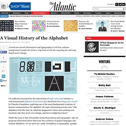
So I absolutely love Shapes for sounds by Timothy Donaldson, exploring one of the most fundamental creations of human communication, the alphabet, through a fascinating journey into "why alphabets look like they do, what has happened to them since printing was invented, why they won't ever change, and how it might have been. " While the tome is full of beautiful, lavish illustrations and typography—like 26 gorgeous illustrated charts that trace the evolution of spoken languages into written alphabets—it's no mere eye candy.
"The alphabet is one of the greatest inventions; it has enabled the preservation and clear understanding of people's thoughts, and it is simple to learn. How to Actually Make Text Look Interesting: Minimalist Web Design — Space. Lettercase. Font sizing with rem. Determining a unit of measurement to size our text can be a topic of heated debate, even in this day and age.
Unfortunately, there are still various pros and cons that make the various techniques less desirable. It's just a matter of which less-desirable is most desirable. There are two main techniques that are extolled: Size with pxSize with em Let's review these two approaches before I reveal the magical third. Sizing with px In the early days of the web, we used pixels to size our text. I, personally, have been of the camp that px-based layouts provide the consistency I prefer and users have enough tools available to adjust their view that accessibility is less of a concern. Sizing with em That whole inability to resize text in IE has been a continuing frustration. The technique modifies the base font-size on the body using a percentage. The problem with em-based font sizing is that the font size compounds. Sizing with rem But what pitiful browser support do we have to worry about?
Google Web fonts E - N. 8 Essential Web Typography Resources.