
How to learn D3.js with no coding experience. In November 2019 we competed against each other, live and on stage, at the Iron Viz competition to build a complete visualization in just 20 minutes.

After the competition was over we discussed what our goals were for the coming year. We both were working as Tableau developers and had experience working with data and designing visualizations. However, we both realized we had a desire to learn how to create beautiful, interactive visualizations outside of the tool. Fundamentals of Data Visualization. This is the website for the book “Fundamentals of Data Visualization,” published by O’Reilly Media, Inc.
The website contains the complete author manuscript before final copy-editing and other quality control. If you would like to order an official hardcopy or ebook, you can do so at various resellers, including Amazon, Barnes and Noble, Google Play, or Powells. The book is meant as a guide to making visualizations that accurately reflect the data, tell a story, and look professional. It has grown out of my experience of working with students and postdocs in my laboratory on thousands of data visualizations. Over the years, I have noticed that the same issues arise over and over. The entire book is written in R Markdown, using RStudio as my text editor and the bookdown package to turn a collection of markdown documents into a coherent whole. This work is licensed under the Attribution-NonCommercial-NoDerivatives 4.0 International License.
E90E50charts - Excel Charts Gallery. Obama's 2014 budget proposal Iceberg chart Pie+ring Arrow chart - Critical step.
Getting Animated With Tableau’s New Feature – Part 1: Line Charts. In this blog post I’m going to discuss one of the headline features announced at Tableau Conference 2019 and newly released in version 2020.1, mark animations.
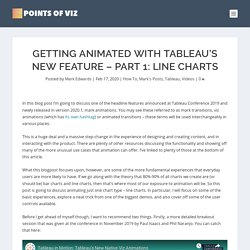
You may see these referred to as mark transitions, viz animations (which has its own hashtag) or animated transitions – these terms will be used interchangeably in various places. This is a huge deal and a massive step-change in the experience of designing and creating content, and in interacting with the product. There are plenty of other resources discussing the functionality and showing off many of the more unusual use cases that animation can offer. I’ve linked to plenty of those at the bottom of this article. What this blogpost focuses upon, however, are some of the more fundamental experiences that everyday users are more likely to have. Before I get ahead of myself though, I want to recommend two things. Secondly, Tableau’s official blog has an extensive write-up, which I recommend you should also read alongside this.
Fundamentals of Data Visualization. There are three fundamental use cases for color in data visualizations: (i) we can use color to distinguish groups of data from each other; (ii) we can use color to represent data values; and (iii) we can use color to highlight.
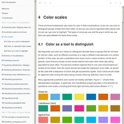
The types of colors we use and the way in which we use them are quite different for these three cases. Color as a tool to distinguish We frequently use color as a means to distinguish discrete items or groups that do not have an intrinsic order, such as different countries on a map or different manufacturers of a certain product. In this case, we use a qualitative color scale. TIBCO Spotfire. Playlists.
Tableau. Front Page - Quickdata. Meet Pentagram New York's first new partner in 7 years. 3 Ways to Make Handsome Highlight Tables in Tableau - Playfair Data. Information dashboard design : the effective visual communication of data : Few, Stephen : Free Download, Borrow, and Streaming. Connexion : comptes Google. Conducting Effective Institutional Research. Anscombe's quartet. All four sets are identical when examined using simple summary statistics, but vary considerably when graphed Anscombe's quartet comprises four datasets that have nearly identical simple descriptive statistics, yet appear very different when graphed.
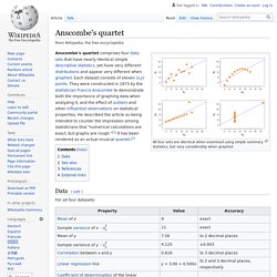
Each dataset consists of eleven (x,y) points. They were constructed in 1973 by the statistician Francis Anscombe to demonstrate both the importance of graphing data before analyzing it and the effect of outliers on statistical properties. He described the article as being intended to attack the impression among statisticians that "numerical calculations are exact, but graphs are rough. Data[edit] The beauty and the beast - how to animate numbers.
Introducing Tableau Public 2018.3: Heatmaps, transparent sheets, and more. Making Data Meaningful. Four practical guides to help managers, statisticians and media relations officers in statistical organizations use text and visualizations to bring statistics to life for non-statisticians; find the best way to get their message across or define strategies for improving statistical literacy.
Part 1: A guide to writing stories about numbers The first guide provides guidelines and examples on the use of effective writing techniques to make data meaningful. Making Data Meaningful. Part 1: A guide to writing stories about numbers (1.6Mb)Часть 1: Как написать статью о цифрах. Методическое руководство (1.8Мb)Cómo hacer comprensibles los datos. D3. What you should know: Integrating Tableau and R for Data Science. Introduction to D3. Proportional Pie Chart of the World’s Most Spoken Languages [2000x3261] Exploring Histograms. Gather your data A histogram is based on a collection of data about a numeric variable.
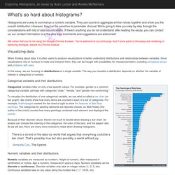
Our first step is to gather some values for that variable. The initial dataset we will consider consists of fuel consumption (in miles per gallon) from a sample of car models available in 1974 (yes, rather out of date). We can visualize the dataset as a pool of items, with each item identified by its value—which in theory lets us "see" all the items, but makes it hard to get the gestalt of the variable. What are some common values? Sort into an ordered list A useful first step towards describing the variable's distribution is to sort the items into a list. Draw the number line A common convention is to use a number line, on which higher values are displayed to the right and smaller (or negative) values to the left. Livros clássicos da Geografia para DOWNLOAD - Projeto Geografando. Learn GIS for free: The complete course.
Learn GIS for free: The complete course In this post you can find a link compilation of “Learn GIS for free” course.

A complete course to map your data with open source GIS: explore GIS tools, learn concepts and terminology of spatial analysis, learn how to analyze data, symbolize data and make your own maps, how to work with projections, vectorial and raster data, etc. The course is recommended to everyone who hasn’t worked on GIS and want to introduce to this type of technologies, as well as users that have knowledge about it already and want to increase it. The course is made on gvSIG 2.1 version, and currently the last version is gvSIG 2.3.1 (we are working on the new 2.4 version already). We recommend you to use the last version published because it will have all the functionalities of the previous versions… and several improvements too. gvSIG Desktop is completely free to download, use and share. It’s usual to have doubts when you follow the course. Tableau for Beginners - Data Visualisation made easy. Early Data Visualization Pioneers - Geolounge.
A History of DataViz – info we trust. After examining the history of data visualization greats I have decided to collect my learnings in the style of history’s data visualization greats.
The first of these visual summaries is presented and discussed below. You can explore the entire series here. A map to guide you through the early developments of data visualization, including cartoons of 84 key charts, in the style of John Ogilby’s 1675 Road Atlas. This image is sized for web-consumption and is only a fraction of the actual piece which can be properly enjoyed via: ACCESS BIG 31mb JPG HERE John Ogilby published his BRITANNIA road atlas, the first of its breadth and quality, in 1675. The Making of the Weighted Pivot Scatter Plot. Analytics - Business Intelligence - Visualization. DataVis.ca. 8 great data visualizations from TED Talks. Information Is Beautiful. Information is Beautiful Awards. GNS Home. Borkin_etal_MemorableVisualization_TVCG2013.
Distribution of Hispanic or Latino Population by Specific Origin: 2010. Within the larger category of Hispanic or Latino Origin, people responding to the Census questionnaire reported many different specific origins. The clustering and dispersion of people in those categories can be explored in this interactive graphic. The area of each circle shown reflects the proportion of the group that lives in a given county. Click on one of the 22 groups listed above to see its national distribution. SOURCE: Powered by the Census API, Census 2010 SF1 table PCT11 NOTE: Data are for counties. Data are not shown for counties with fewer than 1,000 people in a given group.