
Frises du temps multimédias. Infographies / visualisations. Cartographie information. Visualisation et dataviz. Process. How Two Designers Visualize Amazon's Data Differently. Data visualization is just as much an art as it is a science, which is why there are many different ways that a single set of data can be visualized.
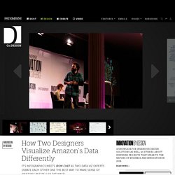
At today's Innovation By Design 2014 conference, two New York-based data viz studios showed us their indivdual approaches to interpreting Amazon's complex bestseller database. It was the Iron Chef of data viz, and the resulting work couldn't have been any more different. First up was Giorgia Lupi, founder and creative director of Accurat. Accurat decided to approach Amazon's dataset thoroughly, resulting in three complex, poster-sized visualizations that attempted to represent a wide range of data including the retail price, genre, chart position, and color palette of over 1,500 books spread across five countries. "We don’t think complex analysis can be made through very simple bar charts and pie charts," Lupi told the audience.
Marc Maleh, the managing director of R/GA, took a very different approach to the same visualization. How To Build A Data Visualization From Scratch. There's no single formula for creating a great data visualization.
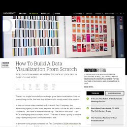
Like so many things in life, the best way to learn is to simply watch the experts. In this exclusive video created by R/GA with Fast Company, the advertising agency's data team explains the basics of the art and science of data viz. "We have a mantra that we say: ‘The data is the brief,'" says R/GA managing director Marc Maleh. "The data is what’s going to tell the story—everything else comes second to that. " In a month-long project created for Fast Company's 2014 Innovation By Design conference, R/GA's designers mined a data story from Amazon's book sales API to create a stunning visualization. 3-Visualizations & mapping. Data visualization.
Les spécialistes de la DataVIz. La perception graphique. Exemples de dataviz. Nos vies gérées par les données. Nous prenons des décisions avec des informations partielles.
Souvent, nous ne savons pas répondre aux questions les plus simples : où étais-je la semaine dernière ? Depuis combien de temps ai-je cette douleur au genou ? Combien d’argent dépensé-je habituellement chaque jour ? … Pour répondre à cela, certains documentent leurs existences pour obtenir des informations précises et concrètes sur leur quotidien, comme c’est le cas de Robin Barooah, un concepteur de logiciel de 38 ans, qui vit à Oakland, Californie. Image : les journées de Ben Lipkowitz. Je me mesure, donc je suis “Ces gens semblent avoir un comportement anormal.
Pourtant, les nombres s’infiltrent dans le domaine de la vie personnelle. Image : cliché d’une réunion du Quantified Self. La montée des capteurs de soi Cette autodocumentation est un rêve d’ingénieur. Pour cela, il faut prendre en compte quatre changements importants. Image : Le Zeo et un exemple de mesure de sommeil obtenu depuis cet appareil. Hubert Guillaud.