
FontExplorer® X - Professional font management software.
Free High Resolution Textures - Lost and Taken. The 30 best free fonts for designers. In this freshly updated free fonts for designers post, we bring you the world's best free fonts.
We've filtered out the diamonds from the thousands of less perfectly designed free fonts available online, for you to use in your designs and illustrations. Get Adobe Creative Cloud now This list represents the 55 best free fonts we've found in eight categories. You can use the drop-down menu at the top of the page, or the boxout, right, to jump to the section you want. Don't forget, we have many other articles covering specialist font types including handwriting fonts, kids' fonts, cursive fonts, beautiful fonts, web fonts, professional fonts and more. Most of the typeface collections listed here can be used in your projects for free, but please be sure to check the terms.
Serif fonts 01. This free serif display font takes inspiration from the late 18th century European Enlightenment and the work type designer John Baskerville. 02. Lora is a free font that has its roots in calligraphy. 03. Pro tips: 20 steps to the perfect website layout. When designing a website layout there are some common mistakes that often pop up, especially with interns and new designers.
In this list of steps to the perfect website layout, we cover what every new website builder working within a digital agency should know and do before starting a new project, and what they should pay attention to during the process to avoid making these mistakes. These principles cover not only design aspects but also general workflow tips that will get the job done nicely.
Follow them and you'll soon be on your way to creating professional website layouts. 01. Define what success means Before starting the work you need to know what is it you are designing for. Good redesigns are not necessarily the most flashy ones but the ones that improve performance over time. 02. This seems very obvious but I've found too often that designers jump straight into their work before giving any thought to the problem they are trying to solve. 03. 04. It's as simple as it sounds. The 200 best design moments ever, part 1. Back in 1995 the first issue of Computer Arts was launched, and 17 years and 199 issues later the team compiled what they believe to be 200 of the best design moments within our lifetime.
Without further ado, and in no particular order, here are the first 50... 01. The launch of Computer Arts December 1995: The first issue of Computer Arts is a hit, looking at software and hardware for people passionate about creating imagery using a Mac or PC, and showing them how to do it. The striking cover image here relates to one of the main features - a quirky guide to image manipulation. 02. Internationally known, thanks to his work on UK style magazines The Face and Arena, Neville Brody oversees a redesign of The Times as head of Research Studios. 03. 1996's Trainspotting provides an influential book, film, soundtrack and attitude for the late 1990s. 04. 05. 06. Despite the democratisation of type thanks to FontLab and Fontographer, it's difficult to really compete against the big foundries. 07. Web Design Blog - Webdesigner Depot.
Dynamic Graphics+Create - magazine for graphic design professionals with tips and information on software, projects, and careers. Get Your Print to Pop + Freebie Pop Color Library! by COLOURlovers. Designing promotional materials for print as a small business or freelancer can be daunting; but shouldn't be.
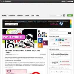
With business cards, post cards, fliers and such - your canvas is small so keep it simple, direct and most of all - attention grabbing! Apple has taken the clean white look (which has been copied over and over), your bank has taken the look using stock photos of "happy customers", your competitor is using "cute" clipart on their fliers... so what are you going to do to stand out? When your postcard turns up in the mail, what will keep your recipients attention? Source Without getting in to too much detail of Pop Culture itself, I'm going to focus on color (of course). Do not mistake Pop Color for simply tossing bright colors down to grab attention. For example, Andy Warhol's famous Marilyn Monroe piece very marvelously displays a combination of colors that almost defy how colors should be used together - but it obviously grabbed attention. Andy Warhol - Marilyn Monroe Team. The Grid System.