
Simple scalable CSS based breadcrumbs. A few days ago I was implementing breadcrumbs in a website I’m working on.

Not that I sincerely believe every site needs this, but on some occasions and to some users breadcrumbs are practical. Anyhow, it gave me the idea to write an article about it because it’s been a while since I last wrote about anything CSS-related. The one I’ll share with you is a very simple one. It uses only one simple graphic. The rest is basic CSS styling with an unordered list as HTML code. The one I implemented in the project I'm working on looks a bit similar, but was more complex to code. The HTML code Here is our HTML code. Make OL list start from number different than 1 using CSS. If you need to create an OL list that starts from number different than 1, here is an elegant solution.

This is very useful if you need to display a listing on more pages (eg. there are 100 search results, and you want to display 10 results per page). In this case, if you are using OL list, it will start from number 1 on every page, and that is not a good solution because it will look like this: In order not to use deprecated < ol start=”6″ > parameter in my second list, we’ve searched the Web for an adequate solution which complies with W3C standards – and we found it.
Automatic numbering with CSS Counters. Introduction When writing documents, it is often useful to number sections and have a table of contents.

You can number these by hand, directly in the markup, but this can be time consuming if the order changes and you have to edit all the numbers. CSS 2.1 gives us a automated way to generate numbers using CSS counters, and this article will walk you through how to use them. One word of note before we start is that CSS counters are not yet implemented in IE, although they are on the roadmap for IE8. Setting up the counter The first step is to reset the counter to its base value and give it a name. This says that the counter will be reset to zero on the <body> element, and the counter identifier is section. The reason for setting it at 4 is that it always increments the counter just before it displays it. Incrementing the counter The next step is to specify when the counter increments and by what value.
Best CSS Forms. CSS has transformed the way forms used to get designed.
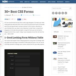
CSS helps you make really good and attractive forms. Prior to this (CSS) the forms found on the web were very boring and were not able to attract a lot of visitors. Attractive or user-friendly forms can divert a lot of attention to itself. Even a simple form designed on CSS look slick and stylish. Using CSS form, you do not need to design the form from scratch. Forms. Mise en forme CSS d'un formulaire accessible - CSS Debutant.
Par défaut, les formulaires ne sont pas folichons.
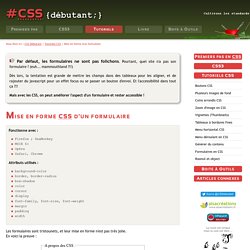
Pourtant, quel site n'a pas son formulaire ?
Le modèle des boîtes. Contenu Le modèle des boîtes de CSS décrit les boîtes rectangulaires qui sont générées pour les éléments de l'arbre du document et qui sont assemblées selon le modèle de mise en forme visuel.

La boîte de page, qui en représente un cas particulier, est décrite plus en détails au chapitre sur les médias paginés. 8.1 Les dimensions des boîtes Chaque boîte possède une aire de contenu (ex. une texte, une image, etc.) entourée en option par une aire d' Border-radius: create rounded corners with CSS! Home / CSS3 Previews / Border-radius: create rounded corners with CSS!

The CSS3 border-radius property allows web developers to easily utilise rounder corners in their design elements, without the need for corner images or the use of multiple div tags, and is perhaps one of the most talked about aspects of CSS3. Since first being announced in 2005 the boder-radius property has come to enjoy widespread browser support (although with some discrepancies) and, with relative ease of use, web developers have been quick to make the most of this emerging technology. Here’s a basic example: This box should have a rounded corners for Firefox, Safari/Chrome, Opera and IE9. The code for this example is, in theory, quite simple: However, for the moment, you’ll also need to use the -moz- prefix to support Firefox (see the browser support section of this article for further details):
CSS text-decoration property. CSS Font Properties. Generateur. Menu. Radio checkbox. Couleur. Div. Initiation au positionnement CSS : 3. position absolue et fixe. La position absolue et la position fixe permettent de placer une boîte par rapport aux limites de la zone d’affichage ou du conteneur.

Comment les utiliser dans une mise en page CSS ? Cet article fait suite à l'initiation au positionnement CSS: 2.position float. Une boîte en positionnement absolu peut être placée n'importe-où dans le code HTML et s'afficher à l'endroit de votre choix. World Wide Web Consortium (W3C)