
HOW TO: Create An Intricate Display Font - HypeForType Tutorial. It’s all very well creating beautiful, intricate illustrated letterforms, but how do you convert them into a usable display font without sacrificing detail or quality?
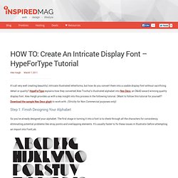
HypeForType explains how they converted Alex Trochut’s illustrated alphabet into Neo Deco, an D&AD award winning quality display font. Alex Haigh provides us with a key insight into this process in the following tutorial. (Want to follow this tutorial for yourself? Download the sample Neo Deco glyph to work with. (Strictly for Non Commercial purposes only) Step 1: Finish Designing Your Alphabet So you’ve already designed your alphabet. Step 2: Considering Extended Characters It’s worth considering creating an extended character case when putting your typeface together. Step 3: Create A New FontLab Project Once all your characters are ready, open FontLab, and go to File>New. Step 4: Size First Step 5: Your First Glyph You can now move your letter into a glyph cell in FontLab.
Step 6: Making Use Of Decender Space. Ultimate Guide of Web Typography Tutorials, Tips and Best Practices. Web typography is nothing but implementing typography on web page.

This is very important in order to identify oneself in the designing world. It is equally important that understanding and implementing typography successfully on your web page. This is an evolution in web designing to stand apart from all other websites. It offers many tips, tutorials, tools, guides and practices to make the better use of web typography.
Those are CSS typography tutorials like typo contrast and flow, emphasizing text, snazzy pullquotes for your blog, better CSS font stacks, gradient text effect and types like emphasize on the typeface, using the grid white space balance, size does matter etc. Tips & Tutorials Create-a-letterpress-effect-with-css-text-shadowThis article describe about letterpress effect which is becoming popular in web designing. Better CSS Font StacksIn this article you will see the description of font stacks. Best practices Typography apps and tools Websafe Fonts Conclusion.
“What Font Should I Use?”: Five Principles for Choosing and Using Typefaces - Smashing Magazine. Advertisement For many beginners, the task of picking fonts is a mystifying process.

There seem to be endless choices — from normal, conventional-looking fonts to novelty candy cane fonts and bunny fonts — with no way of understanding the options, only never-ending lists of categories and recommendations. Selecting the right typeface is a mixture of firm rules and loose intuition, and takes years of experience to develop a feeling for. Here are five guidelines for picking and using fonts that I’ve developed in the course of using and teaching typography. 1. Many of my beginning students go about picking a font as though they were searching for new music to listen to: they assess the personality of each face and look for something unique and distinctive that expresses their particular aesthetic taste, perspective and personal history. The most appropriate analogy for picking type. For better or for worse, picking a typeface is more like getting dressed in the morning. 2. 1. 2. Calligraphie par Claude Mediavilla. Typography Served.