
Combining Fonts. A palette with wit Use typefaces with complementary moods to evoke an upbeat, energetic air.
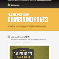
It’s the interplay between fonts that gives them energy. The more distant the moods in a typographic palette, the friskier the design will be. Here, three fonts with distinctive silhouettes have been chosen for their contrasting dispositions: the unabashed toughness of Tungsten is a foil for both Archer’s sweetness, and the cheekiness of Gotham Rounded. Tungsten Gotham Rounded Archer A palette with energy Mix typefaces from the same historical period whose families have different features. Three type families with nineteenth century roots, thrown together in a cheerful typographic riot. . Proteus Project Knockout Sentinel A palette with poise Mix typefaces with a similar line quality if they offer different textures.
What do a neoclassical modern, a suave sans serif, and a sporty slab have in common? HTF Didot Verlag Vitesse. 10 Examples of Combining Fonts for Effective Design. Helvetica Neue and Open Sans Mogreet combines two sans typefaces, Helvetica Neue and Open Sans.

They are very similar so it may be hard to tell the difference. Helvetica however provides better use for large text and headers whereas open sans works better at smaller sizes. Adelle and Helvetica Neue Meltmedia combines the increasingly popular Adelle typeface with the extremely common Helvetica Neue. FuturaBT Light Condensed and FuturaBT Medium Combining two types of the same font is a solid way of making a great match.
Lato and Lato Bold Etch have used the Lato typeface across their entire site, by using different weights they have given it an entirely different feel. Museo Slab and Brandon Grotesque Combadi have achieved a sophisticated and clean look with their use of design supported by a combination of the slab font Museo Slab and sans font Brandon Grotesque. Adelle and Museo Sans Skolor and Freight Sans Pro. Best Practices of Combining Typefaces. Advertisement Creating great typeface combinations is an art, not a science.
Indeed, the beauty of typography has no borders. While there are no absolute rules to follow, it is crucial that you understand and apply some best practices when combining fonts in a design. When used with diligence and attention, these principles will always yield suitable results. Today we will take a close look at some the best practices for combining typefaces — as well as some blunders to avoid. Combine a Sans Serif with a Serif By far the most popular principle for creating typeface combinations is to pair a sans serif header typeface with a serif body typeface. In the example below — a typical article layout — we have Trade Gothic Bold No.2 paired with Bell Gothic on the left side. Putting these two together creates an unwanted conflict in the design.
Now let’s look at the example on the right. Avoid Similar Classifications Now notice the example on the right side. Assign Distinct Roles Don’t Mix Moods. 19 top fonts in 19 top combinations. Sign up and download immediately to take your typography to the next level!
This classic contains some great stuff: An exceptional glossary of typography terms Killer tips on establishing typographic color Choosing and using the right typefaces 20 Action-packed info-dense pages! A Beginner’s Guide to Pairing Fonts. Pairing fonts can be a challenge.
Selecting two or more fonts which work well is one thing - selecting two which work together to achieve your typographic aims may have you reaching for the aspirin. Let's see if we can alleviate any headaches. This guide will help you get started with font pairing for the web. Luckily, typography has been around a lo-oong time. Typographic rules and conventions have had plenty of opportunity to establish themselves and there are loads of resources to help you out.
Here's a quick breakdown of what we'll cover in this guide: Your Aim Keep the essentials in mind. How Many Fonts Should I Use? How many fonts you throw into the mix is entirely up to you, but bear in mind the overall effect you're trying to achieve. Make sure that there is some charisma in the group though; eight people with little to say just results in a toe-curling wait for the speeches.. 10 Great Google Font Combinations You Can Copy. The average man considers which flavor of Doritos will taste good with his Heineken.
The sophisticated man considers which cheese will pair well with his choice of wine. The designer of course considers which two fonts will look great on the same page. Today we’re going to use the Google Font API as a playground for mixing fonts and finding ideal pairings. You’ll be able to skim through and instantly grab out selections that you think are appropriate for your projects. The best part? A couple of times each month, we re-publish one of our popular posts from the archives. Why Google Fonts? The web font game was up in the air a few years ago. Here’s why @font-face wins. Now, within the @font-face world there are many competitors. However, I’ve used this solution several times on Design Shack before so I wanted to switch things up today and use something else. Hoefler Titling Fonts.