
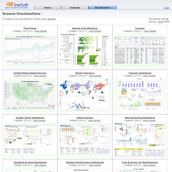
Www.lucasinfografia.com. Resources. Data Visualization, Infographics, and Statistics. Data Visualization, Infographics, and Statistics. Free Visualization Software. Thumbnails: ON off Sort by: name DATE To create a new visualization, choose a base dataset.
Loading datasets and visualizations... Instructor's guide. Centro Knight concluye MOOC en infografía con 5,000 participantes, su clase más grande a la fecha. El Centro Knight para el Periodismo en las Américas concluyó esta semana su clase más grande hasta la fecha: La segunda edición de su primer Curso Masivo y Abierto en Línea (o MOOC), "Introducción a la Infografía y Visualización de Datos" con el instructor Alberto Cairo.

El MOOC atrajo a más de 5,000 participantes de 138 países (la primera edición del curso alcanzó a 2,000 personas de 109 países el año pasado). El MOOC comenzó el 12 de enero y originalmente iba a terminar el 23 de febrero, pero fue extendido dada la intensa participación de los estudiantes y la necesidad de más tiempo para terminar las asignaturas. El curso concluyó oficialmente el 5 de marzo con las últimas interacciones de Cairo con los estudiantes.
El curso fue una continuación de la nueva iniciativa MOOC del Centro Knight, la cual comenzó en octubre del año pasado, y representó un aumento exitoso del número de estudiantes el Centro Knight aceptaría al mismo tiempo. The top 20 data visualisation tools. Programas y herramientas para mostrar información de forma visual. 20 superb data visualisation tools for web designers. It's often said that data is the new world currency, and the web is the exchange bureau through which it's traded.
As consumers, we're positively swimming in data; it's everywhere from labels on food packaging design to World Health Organisation reports. As a result, for the designer it's becoming increasingly difficult to present data in a way that stands out from the mass of competing data streams. Get Adobe Creative Cloud One of the best ways to get your message across is to use a visualization to quickly draw attention to the key messages, and by presenting data visually it's also possible to uncover surprising patterns and observations that wouldn't be apparent from looking at stats alone.
And nowadays, there's plenty of free graphic design software to help you do just that. As author, data journalist and information designer David McCandless said in his TED talk: "By visualizing information, we turn it into a landscape that you can explore with your eyes, a sort of information map. A Periodic Table of Visualization Methods. Data Visualization, Infographics, and Statistics. Frequently asked questions (FAQ) Can I buy the software to make my own animations?
What software does Gapminder use to create online surveys? I would like to suggest a new indicator for Gapminder World I have data, can Gapminder help me to share it? Can I download Gapminder World? How do I use Gapminder graphics in my presentation? What kind of program does Hans use to make his videos? Can I buy the software to make my own animations? Gapminder World is free and comes with built in data. What software does Gapminder use to create online surveys?
When we create our surveys online, we use a survey software called SurveyGizmo. I would like to suggest a new indicator for Gapminder World Please go to Look if your indicator already has been suggested, if it has you can vote for it. Circular Segment. Explore Data Visualizations. Visualizing Data at the Oxford Internet Institute. Over 100 Incredible Infographic Tools and Resources (Categorized) This post is #6 in DailyTekk’s famous Top 100 series which explores the best startups, gadgets, apps, websites and services in a given category.

Total items listed: 112. Time to compile: 8+ hours. Follow @DailyTekk on Twitter to make sure you don’t miss a week! 12 Visualizations That Will Change the Way You View Scale in Your World. Scale is a simple concept.
From a very early age, children know about big and small, heavy and light, more and less. Extreme scales, however, are another story. Try to imagine, for example, the size of the universe… or $1 trillion made up entirely of dollar bills. Exactly. Grasping the actual quantities involved in extreme scales can be difficult, which makes managing scale in visualizations an interesting problem. Below are 12 visualizations that try to show things at extreme scales. 1. 2. 3. 4. 5. 6. 7. 8. 9. Infographic originally published on Mashable.com. A Carefully Selected List of Recommended Tools on Datavisualization.
When I meet with people and talk about our work, I get asked a lot what technology we use to create interactive and dynamic data visualizations.
At Interactive Things, we have a set of preferred libraries, applications and services that we use regularly in our work. We will select the most fitting tool for the job depending on the requirements of the project. Sometimes a really simple tool is all you need to create something meaningful. On other occasions, a more multifaceted repertoire is needed. Jet Propulsion Laboratory - Infographics. About education news missions galleries public events Follow JPL Facebook Twitter YouTube Instagram All not signed in • login • sign up share this page:
