

The 100% Easy-2-Read Standard. By Oliver Reichenstein Most websites are crammed with small text that’s a pain to read.
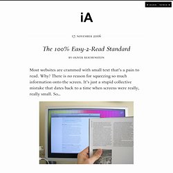
Why? There is no reason for squeezing so much information onto the screen. It’s just a stupid collective mistake that dates back to a time when screens were really, really small. So… Screen vs. magazine: 100% is NOT big; image by Wilson Miner. Don’t tell us to adjust the font size We don’t want to change our browser settings every time we visit a website! Don’t tell us busy pages look better Crowded websites don’t look good: they look nasty. Don’t tell us scrolling is bad Because then all websites are bad. Don’t tell us text is not important 95% of what is commonly referred to as web design is typography. Don’t tell us to get glasses Rather, stop licking your screen, lean back (!)
Five Simple Rules 1. The font size you are reading right now is not big. 15 Essential Checks Before Launching Your Website. Advertisement Your website is designed, the CMS works, content has been added and the client is happy.
It’s time to take the website live. 50 Useful Design Tools For Beautiful Web Typography. Advertisement Typography is elegant when it is attractive and communicates the designer’s ideas.
When chosen wisely and used carefully, it can be very effective in supporting the overall design. Designers are always exploring different techniques with type: some use images or sIFR to produce very beautiful typography, while others prefer CSS alone to get the typography just right. Today, we will look at 50 most useful typographic tools, techniques and resources for creating effective and expressive designs. We will also look at some hands-on typography tools that help designers and developers learn how to style their Web content, test it interactively and see the changes instantly. Below we cover typographic tools, useful typographic references, font browsers, typographic CSS- and JavaScript-techniques, hyphenation techniques, sIFR tools and resources, grids and related tools, free and commercial fonts, a guide to Web typography, examples of great Web typography. and follow us on Twitter.
10 Simple and Impressive Design Techniques. Advertisement Complex design techniques are often time-consuming and, well, complex.
Some of these advanced effects1 can add plenty of depth to designs, but when used in the wrong place, they do little more than distract viewers from the project’s intended focus. These effects may be precisely what a design needs to have the impact it requires, but even in these cases, they should be complemented by simpler effects. Simple effects and techniques are the building blocks of today’s designs. For example, what good is a stellar lighting technique2 if you can’t decide which colors to use or which text-based effects to use in conjunction with the effect? With a “less is more” mentality, we’ve selected 10 very simple and impressive design techniques that can drastically improve the performance and appearance of your designs.
For more techniques, you may want to look at our previous articles: The basics first. 1. Sadly, adding extra contrast is one of the most overlooked and under-used techniques. How To Use Icons To Support Content In Web Design. Advertisement Why use icons?
Design is all about communication: it doesn’t matter how important or exciting the information that you’re sharing is if you fail to hook your visitors. When initially viewing a website, most users will first scan the page for visually interesting content, and only after something grabs their attention will they actually begin reading.
Icons are a simple, effective way to draw users into the content of your website. Icons serve the same psychological purpose as paragraph breaks: they visually break up the content, making it less intimidating. In this article we showcase beautiful examples and best practices of using icons to support content in web design. 1. The primary goal of using icons should be to help the user absorb and process information more efficiently. Spice up feature lists Listing services is a practical and necessary part of effective marketing, but lists are inherently bland and boring. 280 Slides5 Coda6 List different applications and products.
10 Steps To The Perfect Portfolio Website. Advertisement You may have a personal portfolio website for a number of reasons.

If you’re a freelancer, then you’d need one to showcase your work and allow people to contact you. If you’re a student (or unemployed), then you’d need one to show prospective employers how good you are and what you can do, so that they might hire you. If you’re part of a studio, then you might use one to blog about your design life, show people what you’re doing and build your online presence. A personal portfolio website is all about promoting you. You may want to take a look at the following related articles: What makes for a good personal portfolio website? 1. Your logo is usually the first thing a user sees.