
Fonts Logo. Ryan Hamrick. Typefaces. Awesome. Which Are More Legible: Serif or Sans Serif Typefaces? Update March 2012 See my expanded critique of Colin Wheildon’s legibility research.

Back in 1998 when Times New Roman was still widely used on the web, my then boss made sure we always designed our web sites with Arial, as she hated the look of serif fonts on the web. Was it the case that sans serif fonts were more legible, or was it just a matter of taste? In 2003 as part of my master’s degree I reviewed over 50 empirical studies in typography and found a definitive answer. Introduction An argument has been raging for decades within the scientific and typographic communities on what seems a very insignificant issue: Do serifs contribute to the legibility of typefaces, and by definition, are sans serif typefaces less legible?
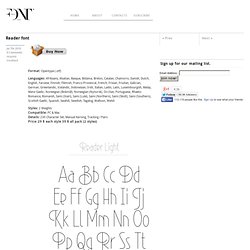
Work. Tyrsa. Rob Clarke Typography. Lettering vs Calligraphy, a battle between Martina Flor & Giuseppe Salerno. Jon Contino, Alphastructaesthetitologist. Typo/graphic posters. Kern Type, the kerning game. Luke Lucas – Typographer. James T. Edmondson Type and Lettering. Free Fonts Download, Fonts for Free. Reader font. Format: Opentype (.otf) Languages: Afrikaans, Alsatian, Basque, Bislama, Breton, Catalan, Chamorro, Danish, Dutch, English, Faroese, Finnish, Flemish, Franco-Provencal, French, Frisian, Friulian, Galician, German, Greenlandic, Icelandic, Indonesian, Irish, Italian, Ladin, Latin, Luxembourgish, Malay, Manx Gaelic, Norwegian (Bokmål), Norwegian (Nynorsk), Occitan, Portuguese, Rhaeto-Romance, Romansh, Sami (Inari), Sami (Lule), Sami (Northern), Sami (Skolt), Sami (Southern), Scottish Gaelic, Spanish, Swahili, Swedish, Tagalog, Walloon, Welsh Styles: 2 Weights Compatible: PC & Mac Details: 230 Character Set, Manual Kerning, Tracking / Pairs Price: 29 $ each style 39 $ all pack (2 styles) This post is tagged reader fon, retro font.

Typographie.