
Spatio-temporal data handling and visualization in GRASS GIS. TimeViz Browser. Imrich, P.; Mueller, K.; Imre, D.; Zelenyuk, D.
& Zhu, W.: Interactive Poster: 3D ThemeRiver. Poster Compendium of IEEE Symposium on Information Visualization (InfoVis), IEEE Computer Society, 2003. Imrich, P.; Mueller, K.; Imre, D.; Zelenyuk, D. & Zhu, W. (2003), © 2003 IEEE. Used with permission. Image courtesy of Ben Fry, MIT Media Laboratory, Aesthetics + Computation Group, © 1999-2005. Anemone by Fry, B. (2000) is a technique related to the visualization of structured information. Image courtesy of Michael Zornow. Patterns in sequences of data values can be visualized using arc diagrams. Adapted from Harris, R. Bar graphs are a well known and widely used type of representation where bars are used to depict data values. Generated with the BinX tool with permission of Tamara Munzner. Large time-series require the application of abstraction methods in order to reduce the number of time points to be displayed, thus keeping visualization costs at a manageable level.
Adapted from Keim, D. CartoDB <3 Qlik: Get to the heart of your data-driven decisions with CartoDB for Qlik. Qlik Sense users no longer have to rely on just the classic way of visualizing important decisions.
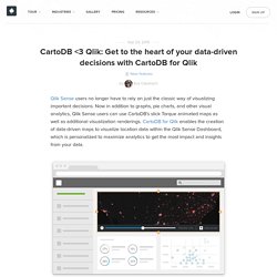
Now in addition to graphs, pie charts, and other visual analytics, Qlik Sense users can use CartoDB’s slick Torque animated maps as well as additional visualization renderings. CartoDB for Qlik enables the creation of data-driven maps to visualize location data within the Qlik Sense Dashboard, which is personalized to maximize analytics to get the most impact and insights from your data. The CartoDB for Qlik app lets you animate your temporal location data directly on an interactive map and understand how your data has grown, moved, or changed over time and space. The mortality rates and the space-time patterns of John Snow’s cholera epidemic map.
In order to derive the estimated mortality rates for each house location and the space-time pattern of disease spreading, a series of historical documents is consulted from which a set of GIS data is prepared.
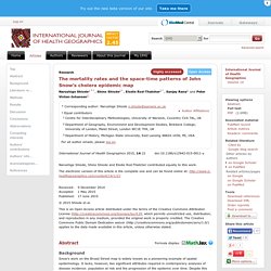
These data are subsequently visualised in map forms, and analysed using KDE as well as NetScan [8]. NetScan is a recently developed method for detecting statistically significant concentrations along street networks to render information for interpreting where and when such events have unfolded. A brief description of KDE and NetScan is provided below.
Kernel Density Estimation (KDE) KDE is a density estimation method that uses known recorded values to produce a density surface across the study area. Using TimeManager for WMS-T layers. This is a guest post by Karolina Alexiou (aka carolinux), Anita’s collaborator on the Time Manager plugin.
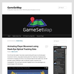
As of version 2.1.5, TimeManager provides some support for stepping through WMS-T layers, a format about which Anita has written in the past. From the official definition, the OpenGIS® Web Map Service Interface Standard (WMS) provides a simple HTTP interface for requesting geo-registered map images from one or more distributed geospatial databases. Integration of Temporal and GeoSemantic components into GI and GIS. AMD_IJGIS_cfp.pdf. Analysis of Movement Data. Analysis of Movement Data. Towards a GIS-based Analytical Time-geographic Framework for Physical and Virtual Activities. MIT Senseable City Lab. Hubcab With an ever-increasing trove of real-time urban data streams, we are able to see precisely where, how, and at what times different parts of our cities become stitched together as hubs of mobility.
By using these pervasive, interconnected, and "smart" technologies, we can begin to unravel the complexity of our travel patterns and identify how we can reduce the social and environmental costs embedded in our transportation systems. In HubCab we target taxicab services as a way to understand the linkages between our travel habits and the places we travel to and from most often. Download hi-res video HubCab is an interactive visualization that invites you to explore the ways in which over 170 million taxi trips connect the City of New York in a given year.
The HubCab tool expands and changes the perception of urban space using a large-scale data set. The sharing benefits displayed on the map refer to total. International Journal of Spatial, Temporal and Multimedia Information Systems (IJSTMIS. This site uses some unobtrusive cookies to store information on your computer.
43816490.2013.pdf. Damien Demaj. Late last year we published an interactive game tree celebrating Rafael Nadal’s historic 2013 season.
The Game Tree allows users to visually explore how easily, or not, Nadal won each of his 666 service games in the Masters 1000 Tournaments, Grand Slams and World Tour Finals he played in 2013. _paper_preprint.pdf. Nanocubes: Fast Visualization of Large Spatiotemporal Datasets. iGeolise lets you measure distance by time rather than as the crow flies. The next time you're looking for a place to buy or rent, will you choose it by the distance from where you work – or by the time it takes you to get to work by bus, train, tube or car?
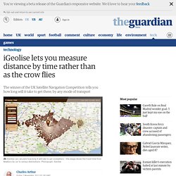
Most people actually want to choose by the latter. Now a British company called iGeolise is promising to commercialise that idea for all modes of transport – and expand it from the UK to Europe and the US. Since this summer it has already helped TalkTalk decide where it ought to relocate its offices to – when it was considering moving a thousand employees – and a major high street store is considering offering it on its site to help web searchers find their nearest outlet, measured by time rather than the usual distance as the crow flies. The market for such a service is growing: rival Mapumental offers time-based maps for travel on public transport. Exploring Mobility Data Using Time Manager. Plot your course in space & time.