
9 CAPTCHA Alternatives That Won’t Wreck Your UX. CAPTCHA stands for “Completely Automated Public Turing test to tell Computers and Humans Apart,” a name that encompasses its function and goal: a robot-administered test that verifies authentic users and weeds out evil bots that inject spam and harvest emails.
Since 2000, CAPTCHAs have been understood as annoying-but-bulletproof, but this understanding is being challenged today (at least the “bulletproof” part). One San Francisco-based startup has claimed to have created an algorithm that cracks CAPTCHAs with 90 percent accuracy. Google Maps’ clever street address-reading algorithm has beckoned the downfall of CAPTCHAs with 99.8 percent accuracy. The robots may be winning. Traumatic CAPTCHA fails are an almost universal web experience, disrupting interactions like shopping, banking or sending messages.
Yet the need and desire for online security measures is only growing. CAPTCHAs as Works of Art. Slingshot - Android Apps on Google Play. Stop Gratuitous UI Animation. Introduction Attitudes toward (digital) visual design have been evolving since the first raster graphics illuminated the original CRT screens of the 70s and 80s.
Unlike other artistic fields, the trends that emerge in digital design are tightly bound to the evolution of the tools we work with. UX Design for Passwords and Registration Forms. Image: Mike Licht Forms are a crucial part of the web design in 2015, especially since the rise of mobile has forced us to concentrate that much harder on smoothing our user experiences.

They are central to driving conversions in ecommerce sites and good from design is often the difference between a successful user registration and losing them from the site permanently. From a user perspective, forms need to clearly communicate to the user what is required from them. Building better context-specific menus — How We Build Fedora. Why I Want to Move On from Medium to a Typewriter — The BOLD. Stop writing about why you moved your blog to Medium.
I have been single for three years and two months now. I want to share my dramatic love story—from how I kissed a girl in the elementary school to how I almost caught having sex in the school toilet—here on Medium. It is not about my love story. Dropdowns Should be the UI of Last Resort. All too often mobile forms make use of dropdown menus for input when simpler or more appropriate controls would work better.
Here's several alternatives to dropdowns to consider in your designs and why. Expectations impact conversion No one likes filling in forms. And the longer or more complicated a form seems, the less likely we are to jump in and start filling in the blanks -especially on small screens with imprecise inputs (like our fingers). While there's two extra fields in the "painful" version above, the primary difference between these two flight booking forms is how they ask questions. Interacting with dropdown menus on mobile and the desktop is a multi-step process often requiring more effort than necessary.
Steppers. [Étude] Profils de consommateurs face à l'utilisation des données personnelles ? L'étude " Value Me " publiée par Microsoft Avdertising est un des 8 volets d'une étude globale sur les tendances du digital en 2015.
![[Étude] Profils de consommateurs face à l'utilisation des données personnelles ?](http://cdn.pearltrees.com/s/pic/th/consommateurs-personnelles-112034508)
Réalisée en partenariat avec The Future Foundation, un cabinet d'études consommateurs, l'étude de Microsoft se penche sur l'épineuse question de l'utilisation des données des consommateurs. Car si, en France, 82% des consommateurs français sont conscients de l'intérêt que représentent leurs données pour les marques, seuls 23% d'entre eux se disent prêts à partager leurs données - les français font d'ailleurs partie des plus réticents. Très documentée, l'étude présente 6 profils de consommateurs ayant des positionnements différents face à l'utilisation et au partage des données personnelles (illustration ci-dessous). L'étude " Value Me " est disponible en PDF ici (en français). Designing with Emotion Means Being Brave. Emotional connections are two-way streets.
Evoking real and meaningful emotion from our customers requires that we, as designers, bring real and meaningful emotion to the table too. I work for Intuit, where we’re making emotional connections with our customers a top priority. In an earlier article, I talked about the need to establish a deeper emotional connection to create Magical and Meaningful experiences. Understanding what delight feels like and the supporting principles to design for delight is a big step forward, but it’s not enough. Getting Magic and Meaning from our hearts into our customers’ hands means changing the way we work, the way we share ideas, and the way we define success. Three Acts of Bravery to Increase Emotion for Customers 1.
Good design makes us feel. A Wide Perspective for Designing User Experience — JotForm — Form Builder. A Wide Perspective for Designing User Experience The UX diagram above is the clearest one I’ve ever seen on the web.
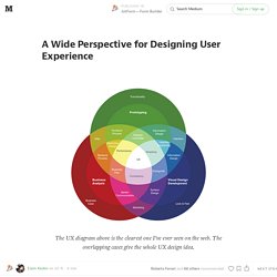
The overlapping cases give the whole UX design idea. Image Source: Stop Getting In My Way! — Non-blocking UX. This simple brainstorming session isn’t here to break any new ground.
Designing Musical User Interfaces. Using harmonies and chords to go beyond visuals and enhance the user experience.
Gradual Engagement Boosts Twitter Sign-Ups by 29%
Why Left Search Buttons Perform Faster Than Right Ones. By anthony on 11/11/10 at 8:50 pm Every website on the web today, places their search field before their search button. It’s done this way because to do a search, the user enters a search word first before clicking the button. While placing the search field before the button might make sense, it isn’t the best practice for many reasons. Research shows that right search buttons slow users down because they create more and longer visual fixations.
Placing the search button on the left of the text field reduces visual fixations and the time it takes to do a search. With right search buttons, the visual distance from the search word to the button is longer. Infos Achat. Infos pour creation livre.