Simon Pascal Klein — Graphic & web design professional. Achieving good legibility and readability on the Web. Published • 22 Mar 2011 My last piece on web typography provided an exhaustive look at getting type to the Web, covering the ins and outs of the @font-face technology. Now that we can get the fonts we want rendered on the Web, let’s examine legibility and readability more closely by covering the elementary typographic factors that affect them. At first, typography can seem like an inherently dull field — dealing with fonts and sizes, bolding this, and italicising that could come across as rather arbitrary, or as difficult: where does one start?
Definition and purpose Definitions avoid confusion, and purpose gives us a light at the end of the tunnel. Quite simply, typography is the art of creating and setting type with the purpose of honoring the text it sets. You will have already made a “typographic” decision by selecting an adequate typeface (digitally, a font) for whatever project you have in mind. Each of us probably has a good grasp of what we think constitutes good typography.
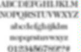
Sizing. WhatTheFont! Interactive Guide to Blog Typography. The majority of websites are composed of a bright, usually white background and dark text. Then there's the small minority of the web: dark websites, colorful websites. Why is the bright background used by the majority of websites? Utilitarian Motivation The common use for small caps is for abbreviations longer than 2 letters, such as CSS, HTML and WYSIWYG excluding AM, PM, BC and similar. Research shows that consumers with a utilitarian motivation find a low-arousal environment more pleasurable than a high arousal one. The degree of arousal refers to how exciting the environment is to our senses. Hedonistic Motivation Hedonism is defined as the pursue of pleasure, especially the pleasure of our senses. Example outside the web: nightclubs.
A Closer Look At Font Rendering. Advertisement The Web font revolution that started around two years ago has brought up a topic that many of us had merrily ignored for many years: font rendering. The newfound freedom Web fonts are giving us brings along new challenges. Choosing and using a font is not merely a stylistic issue, and it’s worth having a look at how the technology comes into play. While we cannot change which browser and OS our website visitors use, understanding why fonts look the way they do helps us make websites that are successful and comfortable to read in every scenario. Now that we have a great choice of fonts that can be used on websites, it becomes clear that the translation of a design into pixels is not something that happens naturally or consistently.
Rendering Strategies Ideal shape, black-and-white and grayscale rendering Rasterization In digital type, characters are designed as abstract drawings. Black And White Rendering Grayscale Rendering Subpixel Rendering Subpixel rendering on an LCD screen. PXtoEM.com: PX to EM conversion made simple.