
Mac App Store hands-on. You may have heard that admist the craziness of CES, Apple decided to launch its Mac App Store on this fine January morning.
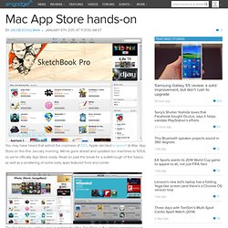
We've gone ahead and updated our machines to 10.6.6, so we're officially App Store ready. Read on past the break for a walkthrough of the basics, as well as a smattering of some early apps featured front and center. The first thing you notice upon launching the Mac App Store is the striking resemblance it bears to the iPad App Store. This, of course, shouldn't come as a surprise considering what we've been shown of the next iteration of Apple's desktop OS, Lion. It seems Apple has chosen to take many design cues from iOS "back to the Mac" indeed. The only obvious difference we see at first glance is the omission of the "Genius" feature from the Mac App Store, which has been replaced with a "Purchases" button.
When you actually buy an app, the icon sort of jumps down into your dock, where it starts downloading with a little status bar beneath. App highlights Comments. Read the fucking HIG. I guess its time to start posting shit again because this crap is really getting out of fucking hand End of line as you may have not noticed i am not maintaining read the fucking hig anymore since having shot myself in the head. i might again in the future. if you feel up to maintaining it give @readfuckinghig a reply on twitter first and probably last non-screenshot image. this was too appropriate to pass up on. thanks, anonymous submitter. shame on the developer who makes a semi decent twitter client (twittelator) and then goes off to do this. what the fuck?
Haha oh fuck me they really had to make a second title after you know, the fucking titlebar, and they chose to set it in this font. what is this, just baiting me to post this? Thanks iamjordanlittle i am pretty sure no religion or philosophy, including the more relaxed asian ones will let you escape developer hell if you publish this random arrangement of buttons and stock photography to an app store Break thanks octothorpe.
Mac App Store UI is so hideous that it makes me want to kick a swan » Revert to Saved: Candid commentary on games, DVDs, music and technology by Craig Grannell. So the Mac App Store just showed up as part of Mac OS X 10.6.6 (check Software Update if you don’t already have it installed).
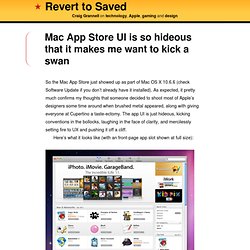
As expected, it pretty much confirms my thoughts that someone decided to shoot most of Apple’s designers some time around when brushed metal appeared, along with giving everyone at Cupertino a taste-ectomy. The app UI is just hideous, kicking conventions in the bollocks, laughing in the face of clarity, and mercilessly setting fire to UX and pushing it off a cliff. Here’s what it looks like (with an front-page app slot shown at full size): There are two major problems with the Mac App Store as it stands: The toolbar. There’s no standard ‘blank’ drag strip, enabling you to drag the window about. Still, Adobe might be happy, since Apple’s effectively validated the dire ‘Application Frame’ in the Creative Suite applications by doing the same thing itself (i.e. icons in the toolbar). Clarity. I should point out that in terms of general use, the Mac App Store is fine.