CSS Flip Animation. You've all asked for it and now I've added it: Internet Explorer support!
Annoyingly enough, the change involves rotate the front and back elements instead of just the container. Skip to this section if you'd like the Internet Explorer code. IE10+ is supported; IE9 does not support CSS animations. CSS animations are a lot of fun; the beauty of them is that through many simple properties, you can create anything from an elegant fade in to a WTF-Pixar-would-be-proud effect. One CSS effect somewhere in between is the CSS flip effect, whereby there's content on both the front and back of a given container.
Quick note: this is not the first tutorial about this effect, but I've found the others over-complicated. The HTML The HTML structure to accomplish the two-sided effect is as you would expect it to be: There are two content panes, "front" and "back", as you would expect, but also two containing elements with very specific roles explained by their CSS. Photoshop's Timeline Rocks. This is another of my anti-tutorials, where I share how I stumbled my way through something.
It's not necessarily how things should be done and I'd love any feedback from people that really know what they're doing. The new timeline for animating things in Photoshop really rocks, but it takes some getting used to and some Googling to figure out how to use it. Adjusting to new things is not always easy so I'm sharing this in my sarcastic tone that I use in my head to get through the day.
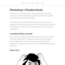
I needed a Jif for an email As a front-end dev, I mostly use Photoshop for extracting things these days, except for when I need an animated GIF. What is this? This was the look on my face as I tried to open the animation panel. Bringing my Google search back up, I then decided to watch How to make a simple GIF Animation in CS6 and now I knew how to get rolling. Super Tweening™ Super tweening™ is probably the biggest feature. Less Sharing, More Action First Frustrating Things First. Discover your Patronus – Active Theory – Medium.
Pottermore.com launched the Patronus experience in September 2016, allowing fans to access one of the most famous magical elements in J.K.
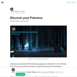
Rowling’s Wizarding World. This is the one and only authentic Patronus experience, devised with detailed input and direction from J.K. Rowling who has had a very clear and well-documented vision of what a Patronus is, how it behaves and what it looks like, for almost twenty years. Pottermore’s challenge, was to take that detailed, intricate description — a piece of J. Textillate.js + bounce.js. Davatron5000/Lettering.js. Animar con animateMotion. Hemos visto que <animateTransform> nos permite animar objetos SVG en línea recta. attributeName="transform" type="translate" El elemento <animateMotion> nos permite, además de esto, animar objetos SVG a lo largo de trayectorias complejas definidas con <path>.
Un ejemplo básico En el siguiente ejemplo dibujamos un circulo azul con <path>, y un pequeño triángulo rojo con <polygon>. Para simplificar las cosas dibujamos tanto el trazado <path> como el triángulo <polygon> a partir del origen del lienzo SVG, lo ponemos todo en un contenedor común <g> y trasladamos el contenedor en el punto donde queremos que esté. Queremos animar el pequeño triángulo rojo a lo largo del círculo dibujado con <path>. Path="m0,0 a70,70 0 1, 0 0,-1 z" html Dibujar arcos elipticos con <path> En el siguiente ejemplo haremos que el pequeño triángulo rojo se desplace en el sentido del reloj.
Path= "m0,0 a70,70 0 1, 1 0,-1 z" // en el sentido del reloj path= "m0,0 a70,70 0 1, 0 0,-1 z"// en el sentido contrario. Balloon.css — CSS tooltips for HTML elements. Simple tooltips made of pure CSS Balloon.css lets you add tooltips to elements without JavaScript and in just a few lines of CSS.
Github ProjectDownload CSS Positioning For positioning, use data-balloon-pos attribute with one of the values: up, down, left or right. Progress.js - Themeable progress bar library. Meet Luminous & Drift—New Lightbox & Zoom Viewer Libraries. Superplaceholder.js - super charge your input placeholders. Connoratherton. Hamburgers by Jonathan Suh. Table of Contents Usage Using Hamburgers for your site is easy (well, that was my intention anyway).
Sass .scss source files are available if you use Sass as your CSS precompiler. It’s customizable and modular. Hamburgers is available via npm, yarn and Bower.npm install hamburgers yarn get hamburgers bower install css-hamburgers Also available as a Ruby gem to use within your Rails application—see below for more information. . * Be sure to run the CSS through Autoprefixer since the Sass doesn’t account for vendor prefixes. Install for Ruby on Rails Add Hamburgers to your Gemfile.gem 'hamburgers' Run bundle install. ** More information on why Sass’s native @import + why you should ditch Sprockets directives altogether. Customization To override default settings, declare them before importing Hamburgers: $hamburger-padding-x: 20px;$hamburger-padding-y: 15px;$hamburger-types : (collapse); @import "hamburgers";
Daneden/animate.css. Animate.css. Reveal Animations When Scrolling — WOW.js. Link to the CSS animation library.