
Microsoft BI. Google Visualization API Wrapper. This page is about a library I made for the Google Visualization API . Get all the details at your own reading pace, or jump straight to the source code and the examples . Sometime ago, Google released their Visualization API that lets users take structured data from a variety of sources (regular user-provided data, a Google spreadsheet or as a gadget ) and create interactive visualizations and reporting applications. I have been using MotionChart for a while now, it is a beautifully crafted visualization tool, but at the same time, the code required to generate the chart is quite repetitive and unnecessarily complicated. Not exactly in line with the simplicity mantra Google is known for. The sample given by the google developers looks like this: See a live example here There are 5 lines added for each datapoint, alot of duplicated code and plenty of numbers to increment and keep track of.
Lowering the ratio Both snippets produce the chart embedded below : Open example in new window. Www.vivideconomics.com/uploads/reports/aggregating-presenting-and-valuing-climate-change-impacts/climate_change_impacts_-_appendices.pdf. Waterfall chart. A typical waterfall chart A waterfall chart is a form of data visualization that helps in determining the cumulative effect of sequentially introduced positive or negative values. The waterfall chart is also known as a flying bricks chart or Mario chart due to the apparent suspension of columns (bricks) in mid-air. Often in finance, it will be referred to as a bridge. Waterfall charts were popularized by the strategic consulting firm McKinsey & Company in its presentations to clients.[1][2] Overview[edit] The waterfall chart is normally used for understanding how an initial value is affected by a series of intermediate positive or negative values. Applications[edit] A waterfall chart can be used for analytical purposes, especially for understanding or explaining the gradual transition in the quantitative value of an entity which is subjected to increment or decrement.
Waterfall chart showing profitability analysis Inventory analysis using waterfall chart. Excel Waterfall Charts (Bridge Charts) Waterfall charts are commonly used in business to show how a value changes from one state to another through a series of intermediate changes.
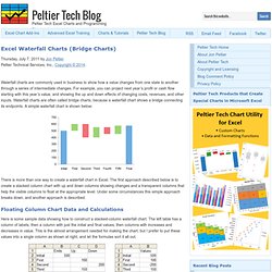
For example, you can project next year’s profit or cash flow starting with this year’s value, and showing the up and down effects of changing costs, revenues, and other inputs. Waterfall charts are often called bridge charts, because a waterfall chart shows a bridge connecting its endpoints. A simple waterfall chart is shown below: There is more than one way to create a waterfall chart in Excel. The first approach described below is to create a stacked column chart with up and down columns showing changes and a transparent columns that help the visible columns to float at the appropriate level. Floating Column Chart Data and Calculations Here is some sample data showing how to construct a stacked-column waterfall chart.
Cell C2: =B2. How to create a McKinsey-style waterfall chart. The "water fall" chart is an effective way to summarize the quantitative impact of a number of drivers.

For example, you need to put the following story in a chart: "Our profits went up by 7, the positive effect of higher prices and lower cost was offset by a lower sales volume. " A waterfall chart would look something like this: For illustration purposes I left the light grey color and data labels of the supporting series in so you can see how to make the chart: it is basically a stacked bar chart with 3 series: A "white" series to support the driversOne series for the driversOne series for the (sub)totalsThe data table for this chart (Powerpoint 2007): For a final touch, make the color of the light grey series white, take out the data tables and that's it.
There is the temptation to make automated tools (in Excel) that do the work for you. Prezi - The Zooming Presentation Editor. Junar · The Open Data Platform.
Tourism research. Wyndham Worldwide Facilites Portal. Home. Home - Global Analytics. End User Support. Employee Service Center. Microsoft Outlook Web Access.