
CSS Style Guides. As we wrap up our recent poll on ordering CSS properties, it brings up the larger issue of CSS style guides.
Ordering properties is just one choice you have to make that makes up a complete styling strategy. Naming is a part of it. Sectioning is a part of it. Commenting, indentation, overall file structure... it all makes up a complete CSS style guide. Let's round up some existing ones. But first... I love pattern libraries. The List I'll list some excerpts from each that I like below. GitHub GitHub CSS Style Guide → As a rule of thumb, don't nest further than 3 levels deep. Unit-less line-height is preferred because it does not inherit a percentage value of its parent element, but instead is based on a multiplier of the font-size. Google Google HTML/CSS Style Guide → Use ID and class names that are as short as possible but as long as necessary. E.g. E.g. .demo-image not .demoimage or .demo_image Idiomatic CSS Nicolas Gallagher's Idiomatic CSS → Configure your editor to "show invisibles".
ThinkUp. Learn HTML5, CSS3, Javascript - video style tutorials. Make an accordian style slider in CSS3. Transform-function. The <transform-function> CSS data type denotes a function to apply to an element's representation in order to modify it. Usually such transform may be expressed by matrices and the resulting images can be determined using matrix multiplication on each point.
Coordinates for 2D graphics There are several coordinates model used when describing transformation. The most usual are the Cartesian coordinates and the homogenous coordinates. Cartesian coordinates In Cartesian coordinates each point of the Euclidian space is described using two values, the abscissa and the ordinate. Each linear function is described using a 2x2 matrix like: Applying the transformation consists in doing, for each point, the matrix multiplication between both: It is possible to apply several transformation in a raw: With this notation, it is possible to describe, and therefore composite, most usual transformations: rotations, scaling or skewing. Coordinates for 3D graphics Functions defining transformations matrix() Syntax.
CSS drop-shadows without images. Drop-shadows are easy enough to create using pseudo-elements.
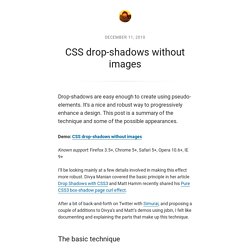
It’s a nice and robust way to progressively enhance a design. This post is a summary of the technique and some of the possible appearances. Demo: CSS drop-shadows without images Known support: Firefox 3.5+, Chrome 5+, Safari 5+, Opera 10.6+, IE 9+ I’ll be looking mainly at a few details involved in making this effect more robust. After a bit of back-and-forth on Twitter with Simurai, and proposing a couple of additions to Divya’s and Matt’s demos using jsbin, I felt like documenting and explaining the parts that make up this technique. The basic technique There is no need for extra markup, the effect can be applied to a single element.
The pseudo-elements need to be positioned and given explicit or implicit dimensions. The next step is to add a CSS3 box-shadow and apply CSS3 transforms. One of the pseudo-elements then needs to be positioned on the other side of the element and rotated in the opposite direction. CSS3 Gradient background. Animate.css - a bunch of plug-and-play CSS animations.